How to Choose a Bedroom Color Palette You Won’t Regret in 6 Months

Introduction
Few home decorating decisions feel as high-stakes as choosing a bedroom color palette, and few are as commonly regretted six months later. A color that looked perfect on a paint chip or in someone else’s sunlit Pinterest photo can read completely differently once it’s covering your own four walls under your own lighting conditions.
The good news is that choosing a palette you’ll still love well beyond the initial excitement comes down to a specific, repeatable process rather than luck or trend-chasing. Below are 25 steps covering everything from understanding undertones to testing samples properly, so your bedroom color choice holds up long after the “new paint” feeling fades.
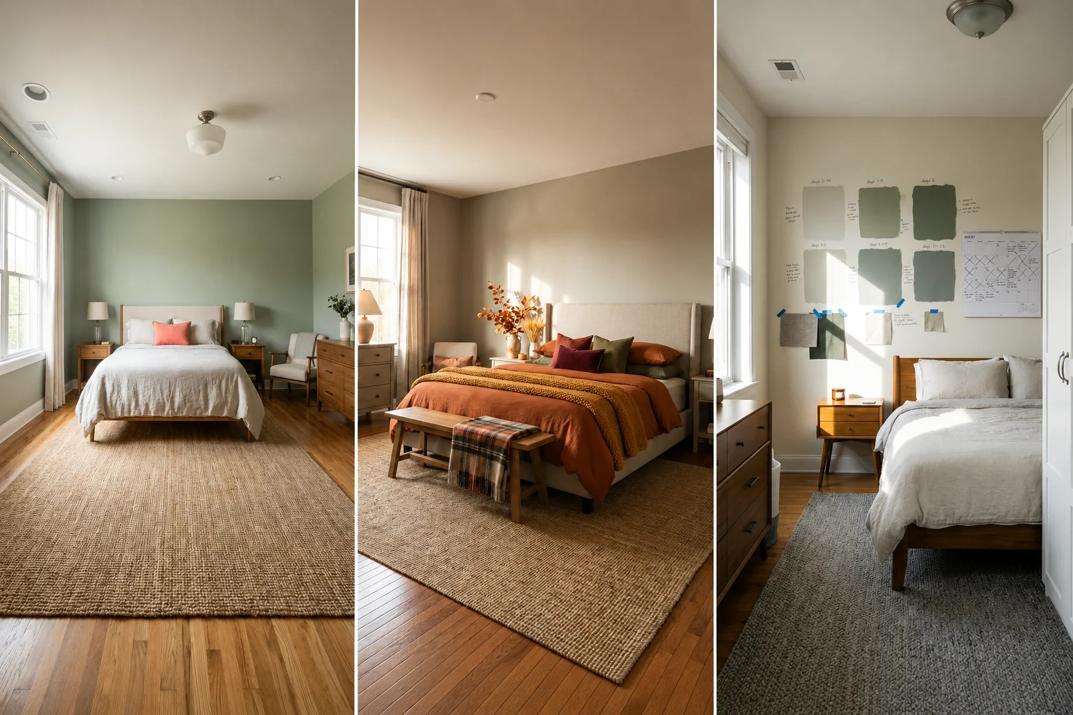
Pro Tip: Before committing to any color, live with a large painted sample directly on your wall for at least a full week, checking it in morning light, midday light, and evening lamp light. Colors shift dramatically across these conditions, and this single step prevents more regretted paint choices than any other on this list.
1. Understand Undertones Before Choosing Any Color
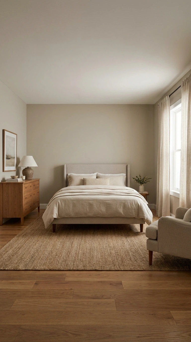
Every color, even seemingly simple whites and grays, carries an underlying undertone, whether warm (yellow, pink, orange) or cool (blue, green, gray). Choosing a color without accounting for its undertone is one of the most common reasons a paint job looks different than expected once it’s actually on the wall.
Hold your paint swatch against white paper and view it in natural daylight to identify its true undertone before committing. A gray that reads warm and cozy in one lighting condition can suddenly look cold and blue in another, so understanding this property upfront saves considerable frustration later.
2. Test Paint Samples in Your Room’s Actual Lighting

A color chip or a photo online can never fully predict how a shade will look in your specific room, since lighting conditions vary enormously from house to house. Testing large swatches directly on your own walls remains the single most reliable step in this entire process.
Paint a section at least two feet square, and view it throughout the day as natural light shifts, as well as under your evening lamp light. This step alone catches the vast majority of color regrets before a single gallon of paint has been fully applied.
3. Consider Your Room’s Natural Light Direction

North-facing rooms tend to receive cooler, bluer light throughout the day, while south-facing rooms get warmer, more golden light. East-facing rooms are brightest in the morning, and west-facing rooms glow warmest in the late afternoon and evening.
Choosing a color that works with your room’s specific light direction, rather than fighting against it, prevents a common regret where a color that looked warm in the store turns cold and flat once painted. A north-facing room, for example, generally benefits from warmer paint tones to counteract its naturally cooler light.
Warning: Choosing a cool-toned color for an already north-facing, naturally cool room is one of the most common color regrets in bedroom decorating. The combination can make the space feel noticeably colder and less inviting than intended.
4. Don’t Choose Based on Photos Alone

A bedroom photographed online was likely shot with professional lighting, careful editing, and specific camera settings that don’t translate directly to your own space. Falling in love with a color purely from a photo, without testing it in your actual room, is one of the fastest paths to later regret.
Use inspiration photos to identify a general direction or mood you’re drawn to, then always verify the specific shade with a physical sample in your own space. This distinction between inspiration and final decision-making protects you from a common and completely avoidable mistake.
5. Start with a Neutral Foundation Color

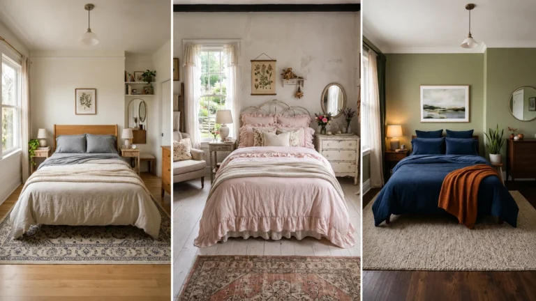
Building your palette around a dominant neutral, covering the largest surface area, typically your walls, creates a flexible foundation that’s easier to live with long-term than committing your largest surface to a bold, trend-driven color. This foundation approach gives you room to experiment with accents that are far easier and cheaper to change later.
Warm whites, soft greiges, and gentle beiges all serve this foundational role well, providing a calm backdrop that lets furniture, art, and textiles do more of the visual work. This approach is specifically what most designers recommend as the safest, most regret-resistant starting point.
6. Choose Warm Neutrals Over Stark, Cool Ones

A truly stark white or an overly cool gray can start to feel clinical and unwelcoming in a bedroom, a space whose entire purpose centers on comfort and rest. Warm whites and greiges, carrying subtle undertones of yellow, pink, or beige, create a noticeably more inviting glow than their starker counterparts.
This distinction matters more in a bedroom than almost any other room in the house, given how much time is spent there specifically trying to relax. Choosing warmth over starkness is one of the most reliable ways to avoid the common regret of a bedroom that photographs beautifully but never quite feels cozy in person.
7. Use the 60-30-10 Rule for Balance

The 60-30-10 rule remains one of the simplest, most reliable frameworks for building a palette that feels balanced rather than chaotic: 60 percent of the room in a dominant color, usually the walls, 30 percent in a secondary color, and the remaining 10 percent reserved for accent pops.
This structure prevents the common regret of a room that feels either too flat and monotone, or conversely too busy and mismatched. Applying this framework loosely, rather than measuring exact percentages, still provides a useful check against your overall color plan before committing to anything permanent.
8. Consider Color Psychology for Your Room’s Purpose
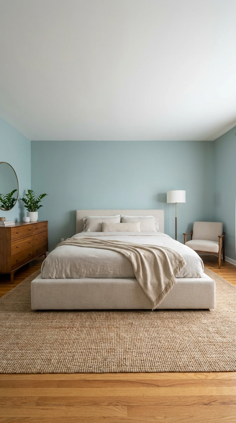
Different colors genuinely affect mood and physiological state, with cooler tones like blue and green scientifically associated with lower heart rates and improved relaxation, while warmer tones like burgundy and terracotta tend to evoke coziness and comfort. Choosing colors aligned with how you actually want to feel in the room matters as much as their visual appeal.
If restful sleep is your primary goal, leaning toward calming blues, greens, or soft neutrals tends to serve that purpose better than high-energy, highly saturated colors. This alignment between color psychology and your room’s actual function is one of the most overlooked factors in avoiding later regret.
9. Think About How Long You’ll Actually Live With This Color
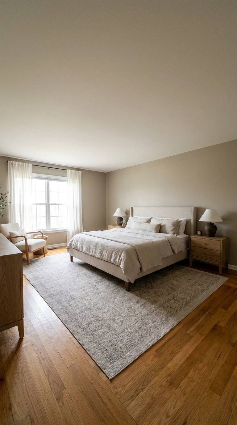
A rented apartment you’ll leave within a year calls for a very different level of commitment than a primary bedroom in a home you plan to stay in for a decade. Being honest about this timeline upfront shapes how much risk is genuinely worth taking with a bold or unusual color choice.
If you expect to move or redecorate again relatively soon, a more neutral, resale-friendly palette protects your investment and reduces the sting of an eventual repaint. If you’re planning to stay long-term, you can justify a bolder, more personal choice you’ll have years to genuinely enjoy.
Important: A bold, personal color choice is really only “regrettable” if your circumstances or taste change faster than expected. Being honest about your actual timeline in the space, rather than assuming you’ll stay indefinitely, helps calibrate how much risk is genuinely reasonable.
10. Avoid Chasing Colors Purely Because They’re Trending
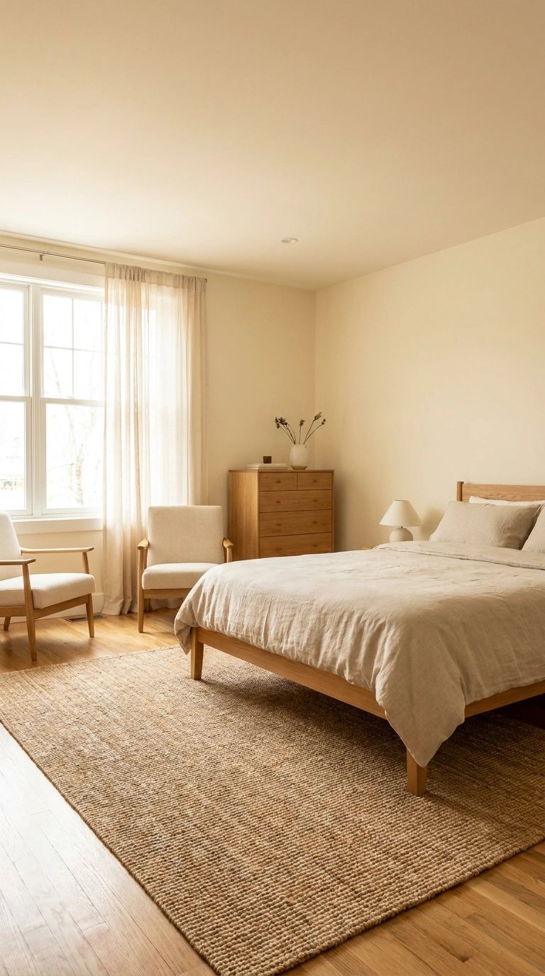
A color that’s heavily featured across social media and design blogs right now carries real risk of feeling dated within just a few years, once the broader trend cycle moves on. This doesn’t mean avoiding trending colors entirely, but it does mean pausing to ask whether you genuinely love the shade itself, separate from its current popularity.
If a trending color still appeals to you after that honest reflection, it’s likely a personal preference rather than pure trend-following, and worth pursuing. If your interest feels more tied to seeing it everywhere online than to your own genuine taste, that’s a signal worth taking seriously before committing.
11. Pair a Timeless Base with Trendy Accents Instead

Rather than committing your largest, hardest-to-change surface, the walls, to a trend-driven color, consider keeping that foundation timeless and introducing trendier colors through easily swappable elements like pillows, art, or a single accent wall. This approach lets you enjoy current trends without the larger commitment or expense of repainting an entire room when tastes shift.
A neutral wall color paired with this season’s trending accent shade in your bedding or decor delivers the best of both approaches. This strategy is specifically what protects against the most common and most expensive form of color regret: an entire room built around a shade that feels dated within just a couple of years.
12. Test Your Color Against Existing Furniture and Flooring

A paint color needs to genuinely coordinate with elements you’re not planning to replace, your existing bed frame, flooring, and any built-in features, rather than being chosen in complete isolation. Holding your paint sample directly against these fixed elements reveals clashes or awkward pairings before they become a permanent, expensive mistake.
This step matters especially for wood tones, since a paint color that seemed neutral in isolation can suddenly clash noticeably against a specific wood’s undertone. Checking this combination directly, rather than assuming compatibility, protects against one of the more common and disappointing color regrets.
13. Account for Ceiling Height and Room Size

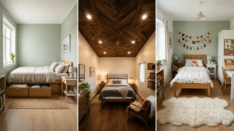
Darker, more saturated colors tend to make a room feel more intimate and enclosed, which reads as cozy in a spacious bedroom with good ceiling height, but can feel oppressive or cave-like in a smaller, lower-ceilinged space. Matching your color’s depth and saturation to your room’s actual proportions prevents a common regret where a beautiful, moody color simply doesn’t suit the space it’s applied to.
If your bedroom is on the smaller side, lighter and more mid-tone colors generally serve the space better than very dark, dramatic options. Reserving deeper, richer colors for rooms with more generous scale and natural light protects against feeling boxed in once the paint has dried.
14. Approach Dark, Moody Colors with Adequate Light in Mind

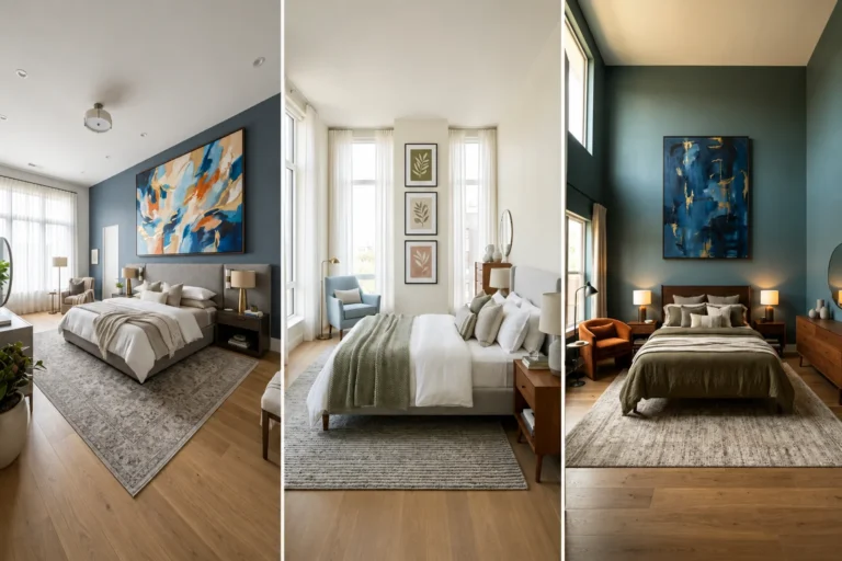
Deep, saturated colors like navy, charcoal, or forest green can create a genuinely sophisticated, cocoon-like atmosphere, but only when paired with sufficient natural or layered artificial lighting. Without that lighting consideration, a dark color risks feeling flat and heavy rather than intentionally moody.
Rooms with good ceiling height and multiple windows handle dark colors particularly well, while smaller, dimmer rooms risk feeling cave-like with the same choice. If you’re drawn to a dark, dramatic palette, plan your lighting layers, table lamps, sconces, dimmers, alongside the color decision itself rather than as an afterthought.
What’s the Right Depth of Color for Your Room?
| Room Characteristic | Best Color Depth | Why It Works |
|---|---|---|
| Small room, low ceiling | Light to mid-tone neutrals | Prevents a cramped, closed-in feeling |
| Large room, high ceiling | Mid-tone to deep, moody colors | Creates cozy intimacy without feeling oppressive |
| North-facing, cool light | Warm-toned colors | Counteracts naturally cool, flat daylight |
| South-facing, warm light | Cool or neutral tones | Balances already warm, golden natural light |
15. Avoid Clashing with Fixed Elements Like Trim and Doors

Existing trim, door colors, and flooring are often more expensive or disruptive to change than wall paint, which means your color choice needs to genuinely work alongside these fixed features rather than fighting them. A beautiful wall color that clashes badly with existing white trim or wood floors becomes a source of ongoing visual frustration.
Bringing physical samples of your flooring or a trim paint chip with you when selecting wall colors ensures compatibility before committing. This small extra step during the selection process prevents a mismatch that would otherwise only become obvious once the wall paint has already dried.
16. Live With Samples for Several Days, Not Hours
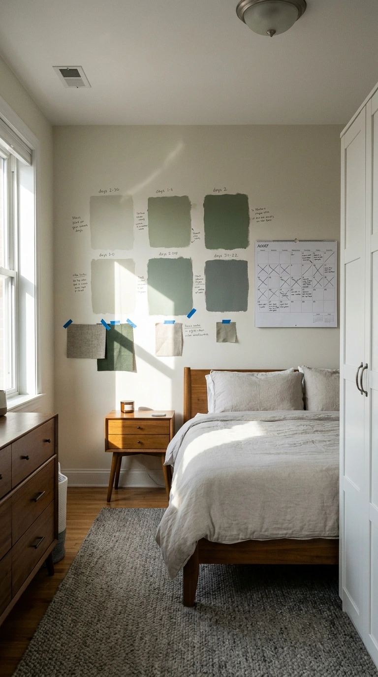
A color decision made after glancing at a swatch for a few minutes carries far more regret risk than one made after genuinely living with a large sample for several days. Colors can look completely different depending on the day’s weather, the season, and even your own mood.
Painting a large section and observing it across at least a week, including both sunny and overcast days, gives you a far more complete and reliable picture. This patience-requiring step is specifically what separates confident, regret-free color decisions from rushed ones.
17. Get a Second Opinion Before Committing

Because color perception can vary somewhat between individuals, and because it’s easy to develop tunnel vision after staring at the same swatch repeatedly, getting a second opinion from someone with a fresh perspective can catch issues you might have missed. This doesn’t mean deferring entirely to someone else’s taste, but rather using their reaction as one additional data point.
Ask a friend or family member to view your sample in the room without telling them your leaning beforehand, and note their honest first impression. This step is particularly valuable for anyone who’s spent so long deliberating that they’ve lost some objectivity about how the color actually reads.
18. Consider Resale Value if You Might Sell Soon

If there’s a realistic chance you’ll sell your home within the next few years, an extremely bold or unusual bedroom color can become a genuine liability, since potential buyers often struggle to picture their own belongings against a highly personal palette. This doesn’t mean avoiding all color, but it does mean weighing boldness against your actual selling timeline.
A more neutral, broadly appealing base color, paired with personality introduced through easily removable decor, protects your resale flexibility without sacrificing your ability to enjoy the space now. This consideration matters considerably less if you have no near-term plans to sell.
Warning: An extremely bold or unusual wall color chosen without any resale consideration can become an expensive problem if your selling timeline changes unexpectedly. If there’s meaningful uncertainty about how long you’ll stay, err toward a more universally appealing base color as a practical safeguard.
19. Choose a Palette That Adapts to Seasonal Decor Changes
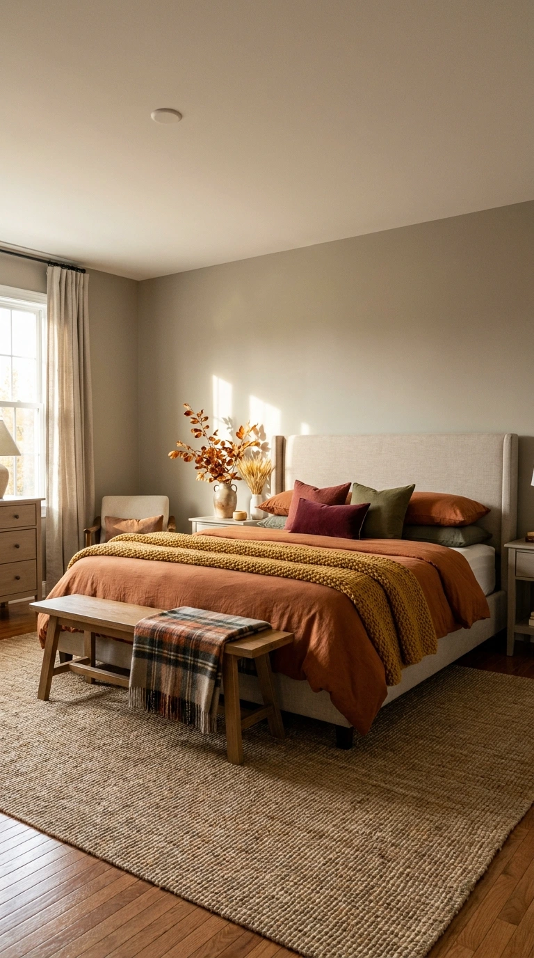
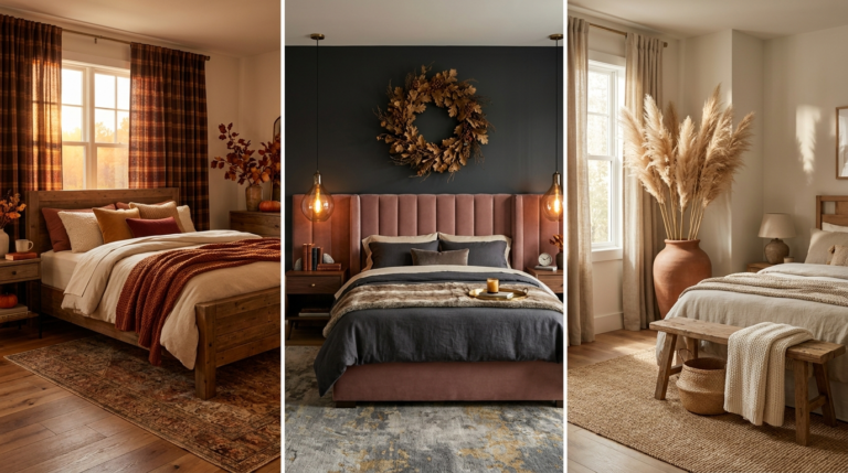
A wall color that only looks good paired with one very specific seasonal decor scheme will start to feel limiting once you want to refresh your bedding or accents for a new season. Choosing a versatile neutral or muted tone as your base allows seasonal decor swaps, cooler tones in summer, warmer layers in winter, without ever needing to repaint.
This flexibility protects against a subtler but genuinely common form of color regret: loving a palette initially, then feeling stuck with limited styling options as your seasonal decor preferences naturally shift. A truly versatile base color remains one of the strongest defenses against this specific frustration.
20. Consider Color Across All Surfaces, Not Just Walls
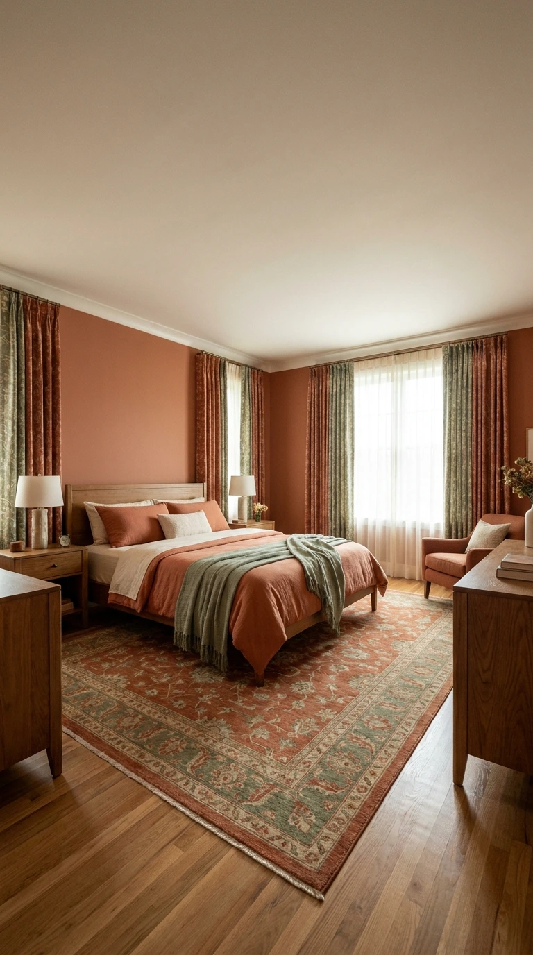
Your bedroom’s overall color story includes far more than just the walls: flooring, bedding, curtains, and furniture all contribute to the room’s total color impression. Choosing wall paint in complete isolation from these other elements is a common reason a seemingly good color decision doesn’t translate into a cohesive finished room.
Laying out fabric swatches, a flooring sample, and your paint chip together before finalizing anything reveals whether the full palette genuinely works as a complete picture. This holistic view prevents the common regret of a wall color that looked great alone but doesn’t actually harmonize with everything else in the room.
21. Balance Saturation Levels Across Your Palette

A highly saturated, intense color used as your room’s dominant tone can quickly feel overwhelming and difficult to live with day after day, even if it looked exciting in a small paint sample. Muted, slightly desaturated versions of the same color family tend to age far better as a primary wall color.
Reserve your most saturated, boldest colors for smaller accent applications, like pillows or a single decorative object, rather than covering your largest surface with the most intense version of a shade. This balance between muted foundations and bold accents is one of the most reliable strategies for avoiding “too much” color regret.
22. Consider the Practical Maintenance of Your Chosen Sheen and Color
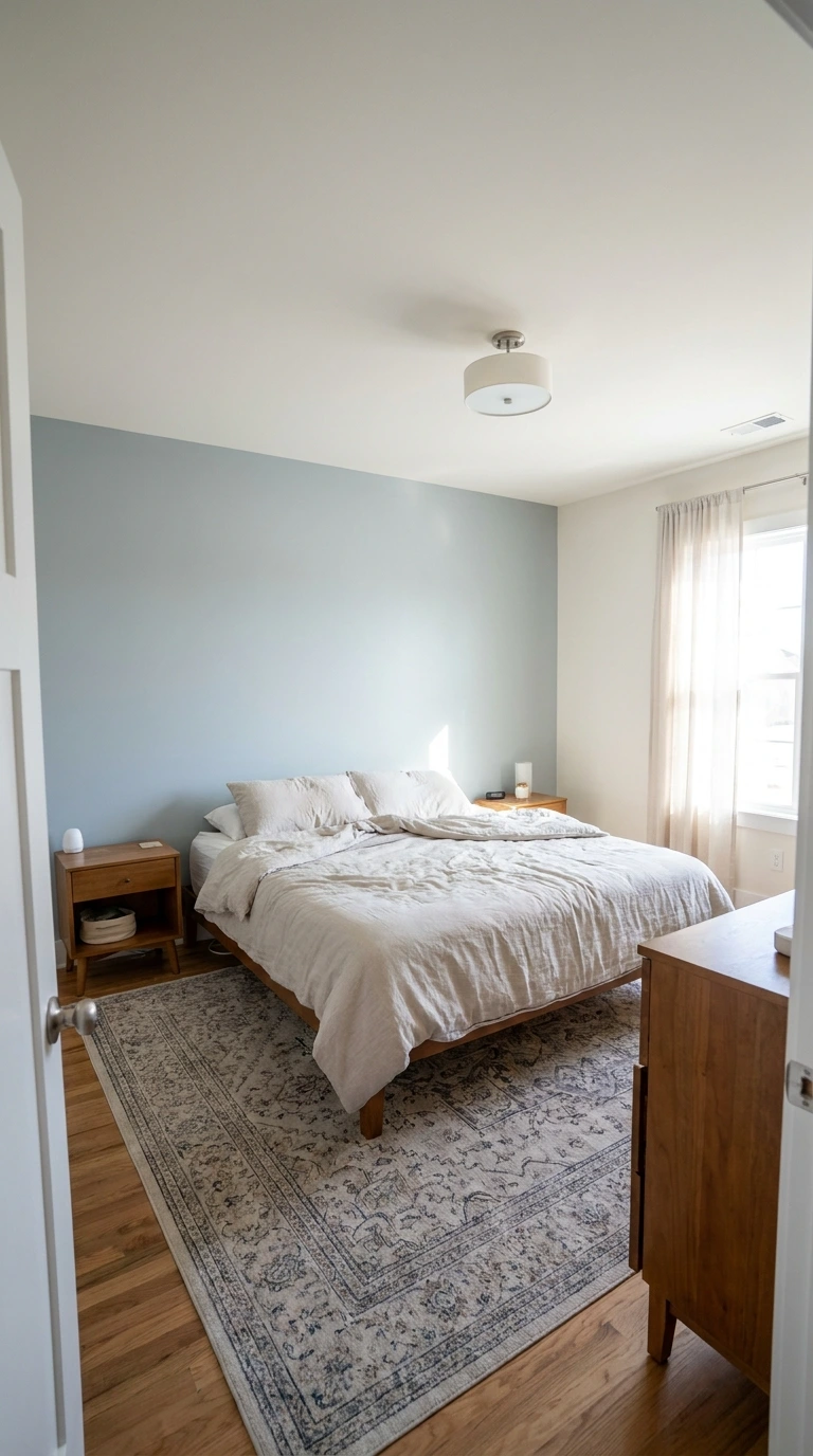
Beyond the color itself, paint sheen affects both appearance and durability, with flatter finishes showing fewer imperfections but scuffing more easily, while glossier finishes clean up better but reveal wall flaws more visibly. Very dark or very light colors also show scuffs, fingerprints, and wear differently, which matters for a room used daily.
Choosing an eggshell or satin finish for most bedroom walls strikes a reasonable balance between durability and a soft, non-reflective appearance. This practical consideration is easy to overlook amid pure color excitement, but it directly affects how well your choice holds up to years of actual daily use.
23. Match the Palette to Your Room’s Actual Function
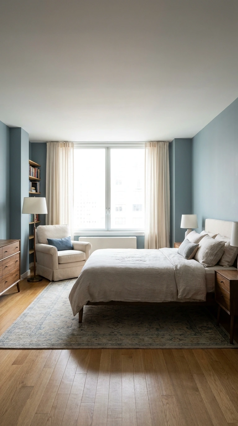
If your bedroom doubles as a reading nook, a home office corner, or simply a quiet retreat, let that specific function inform your color choice alongside general aesthetic preference. A room meant purely for rest benefits from different color psychology than one that also needs to feel alert and focused during working hours.
Being honest about how the space is actually used, rather than only how you’d like it to look in photos, produces a more genuinely satisfying long-term result. This alignment between function and color choice is a subtle but meaningful factor in avoiding the vague, hard-to-articulate regret of a beautiful room that somehow doesn’t quite work.
- ✅ Test large paint samples in your room’s actual light for at least a week
- ✅ Choose a warm, versatile neutral as your dominant wall color foundation
- ✅ Check your color against existing flooring, trim, and furniture before committing
- ✅ Match color depth and saturation to your room’s actual size and light conditions
- ✅ Separate genuine personal preference from purely trend-driven excitement
24. Don’t Rush the Decision
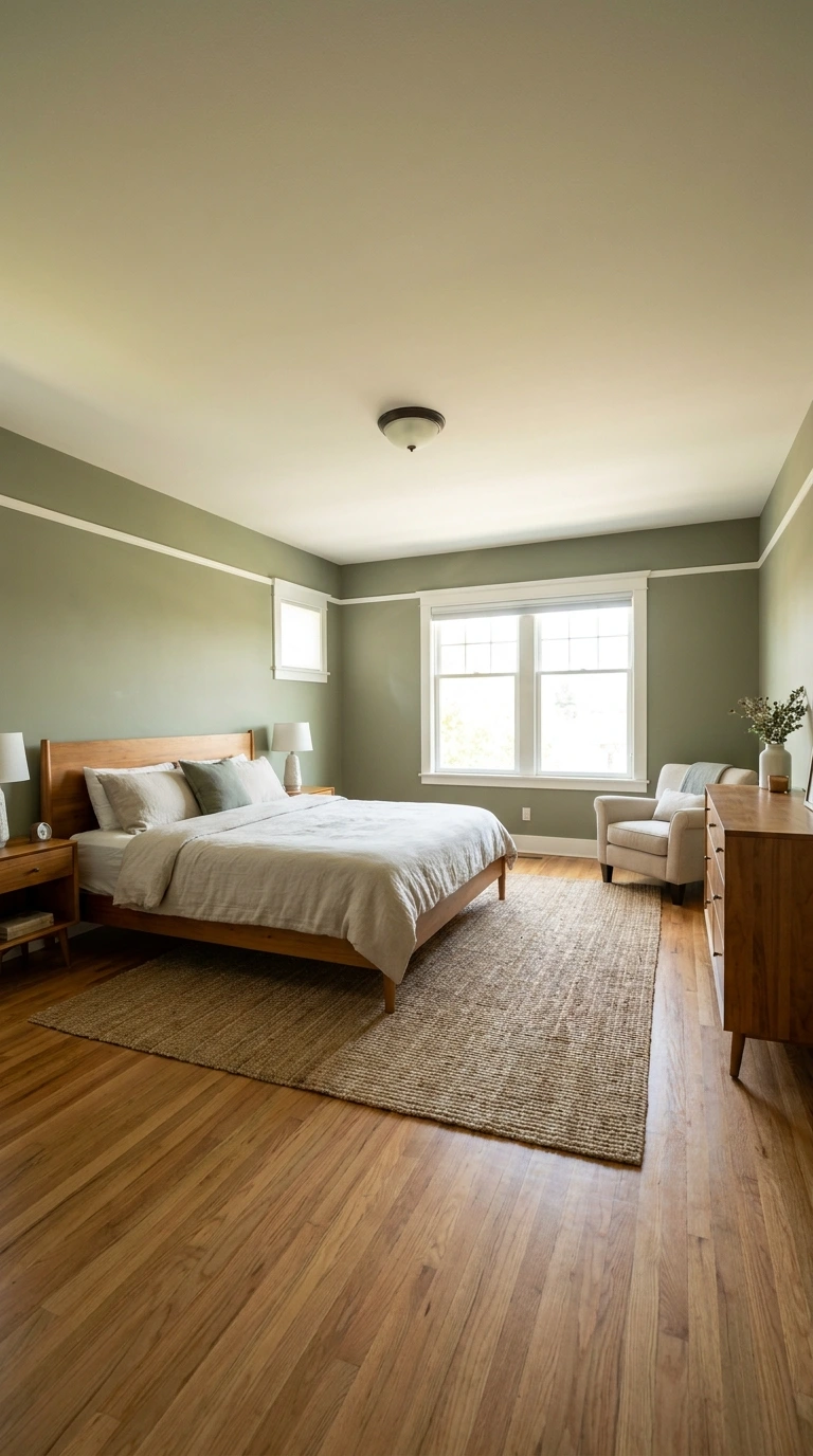
Choosing a bedroom color palette in a single afternoon of impulsive excitement is one of the most reliable predictors of later regret. Genuine confidence in a color decision typically requires weeks, not days, of testing, living with samples, and revisiting your reaction across different conditions.
Give yourself permission to take real time with this decision, since the cost of rushing, a full repaint, or years of quiet dissatisfaction, far outweighs the minor inconvenience of a longer selection process. This patience is ultimately what separates a color choice you’ll still love in six months from one you’ll be actively planning to change.
25. Trust Your Own Genuine Preference Over Strict Trend Alignment

After working through every practical consideration on this list, undertones, lighting, room size, resale value, the final decision still deserves to come down to what you genuinely, personally love. A technically “correct” color choice that doesn’t actually resonate with you will still leave you unsatisfied, regardless of how well it followed every other guideline.
Trust your own reaction to a color you’ve tested thoroughly over your instinct to follow whatever’s currently trending or universally recommended. The bedrooms people love years later are almost always the ones built around genuine personal taste, informed by careful testing, rather than pure trend-following alone.
Frequently Asked Questions
1. What’s the biggest mistake people make choosing a bedroom color?
Choosing a color based purely on a paint chip or an online photo, without testing a large sample in the room’s actual lighting, is the single most common and most regretted mistake. Lighting conditions vary so much between spaces that this step alone prevents the majority of color disappointments.
2. How long should I test a paint sample before committing?
Ideally at least a full week, viewing the sample across different times of day and different weather conditions. This timeframe reveals how the color genuinely behaves in your specific space, rather than relying on a single, potentially misleading glance.
3. Should I choose a trendy color or a timeless one for my bedroom walls?
Most designers recommend keeping your largest surface, the walls, in a timeless, versatile neutral, then introducing trendy colors through easily changeable elements like bedding, pillows, or a single accent wall. This approach lets you enjoy current trends without the expense and commitment of repainting when tastes shift.
4. Are dark, moody bedroom colors a bad idea?
Not necessarily, but they work best in rooms with generous ceiling height and ample natural or layered lighting. In smaller or dimmer rooms, the same color can feel cave-like rather than intentionally cozy, so matching the color’s depth to your room’s actual proportions matters considerably.
5. Does my bedroom’s natural light direction really matter for color choice?
Yes, significantly. North-facing rooms receive cooler, bluer light and generally benefit from warmer paint tones to compensate, while south-facing rooms already get warm light and can handle cooler tones without feeling cold.
6. Should I consider resale value when choosing my bedroom color?
It depends on your timeline. If you plan to sell your home within the next few years, a more neutral, broadly appealing base color protects your resale flexibility, while a longer-term homeowner can justify a bolder, more personal choice.
7. What’s the safest color choice if I genuinely can’t decide?
A warm white, soft greige, or gentle beige remains the safest, most versatile foundation for nearly any bedroom, working well across lighting conditions, furniture styles, and changing personal tastes. This neutral base still allows plenty of personality through bedding, art, and accent decor.
Conclusion
Choosing a bedroom color palette you’ll still genuinely love in six months comes down to patience and process rather than luck. Understanding undertones, testing real samples in your actual lighting, and being honest about your room’s specific proportions and light direction all protect against the disappointment of a color that looked perfect in theory but never quite worked in practice.
Give yourself real time to test, live with, and reconsider your options before committing to anything permanent, and let your own genuine reaction, informed by that careful process, guide the final decision. A bedroom color chosen this thoughtfully tends to feel just as right a year later as it did on the day the paint finally dried.