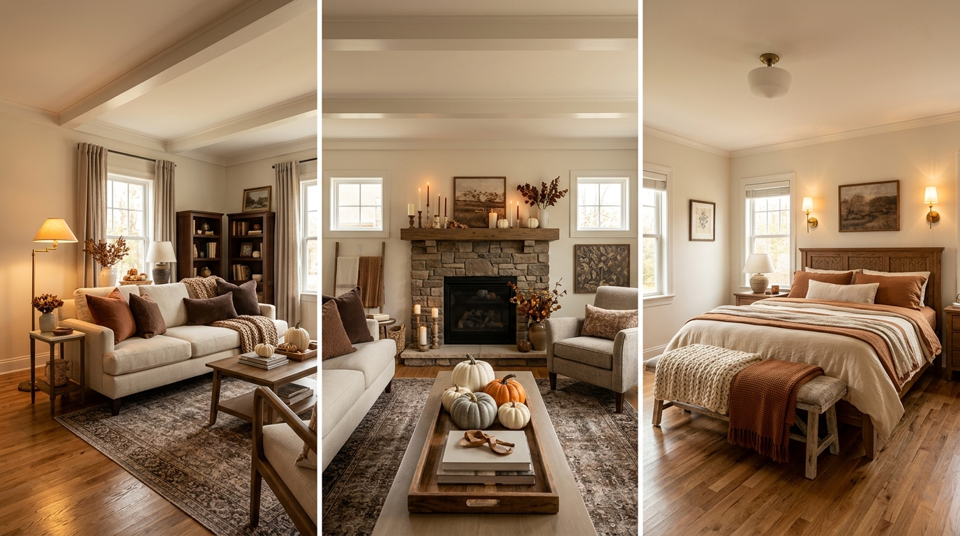
40 New Deco Fall Room Decor Ideas Featuring Rich Brown & Cream Tones

Introduction
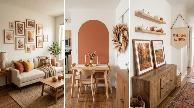
A room built entirely around bright orange and traditional fall colors can start to feel dated fast, but rich brown and cream is a palette that reads as elevated and current while still carrying every bit of the season’s warmth. A cream sofa layered with chocolate and rust pillows. A dark wood console styled with brass and neutral pumpkins. This combination works because it leans on depth and texture rather than color contrast to create that cozy fall feeling.
What makes this palette so versatile is how well it transitions. Brown and cream do not scream “seasonal decor” the way orange and black often do, which means most of what you style into the room this fall can comfortably stay through winter with only small adjustments. It is a palette built for longevity as much as for the moment.
This list breaks down exact furniture choices, textile layering, and small styling details that build a rich brown and cream fall room without ever tipping into anything overly matched or flat. Some ideas take five minutes with pillows you already own. Others involve a larger furniture or lighting choice. Pick what fits your space and start layering the warmth in from there.
1. Layer Rust and Chocolate Brown Pillows on a Cream Sofa
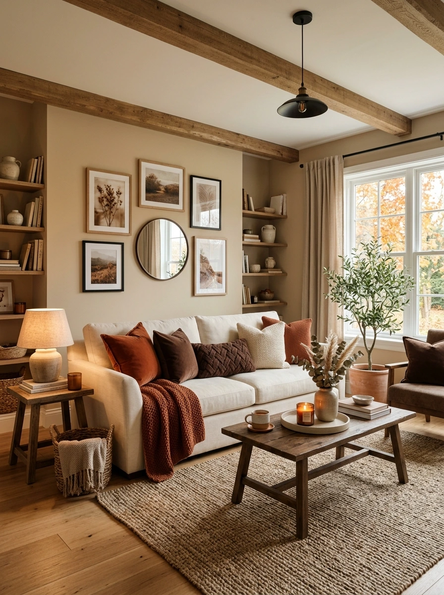
A cream sofa on its own can look a little plain, but a mix of rust velvet and deep chocolate brown pillows against it creates immediate warmth and contrast. The lighter sofa base lets the darker pillow tones stand out clearly, rather than competing for attention the way they might on a darker sofa.
Keep one or two pillows solid cream to give the eye a resting point between the darker, richer tones on either side.
2. Drape a Chunky Cream Knit Throw Over One Arm
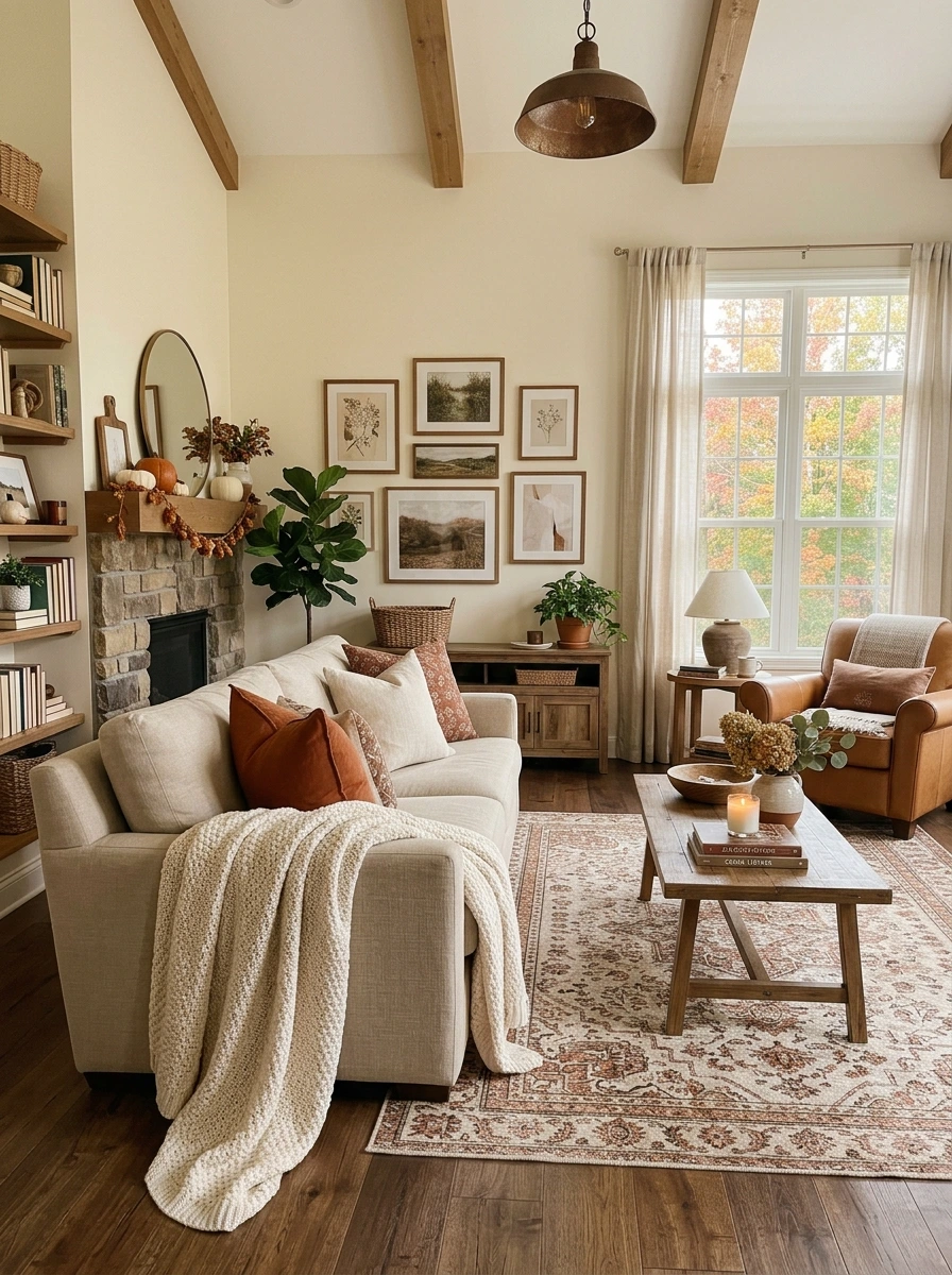
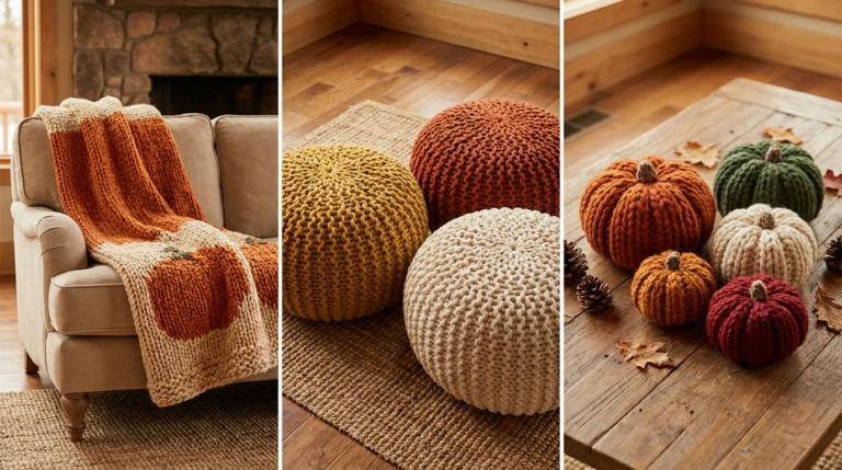
A solid cream throw draped over one arm of the sofa adds texture without introducing a new color, letting the rust and brown pillows stay the main focal point. The oversized, chunky knit style is what makes it read as cozy rather than just an extra blanket left out.
💡 Quick Tip
Drape the throw so it cascades slightly off the arm rather than folding it into a tight square, since a bit of natural drape looks more lived-in and intentional.
Choose an off-white or oatmeal cream over a stark white one, since the slightly warmer tone blends more naturally with the room’s overall brown palette.
3. Add a Fringed Brass Table Lamp for Warm Ambient Light
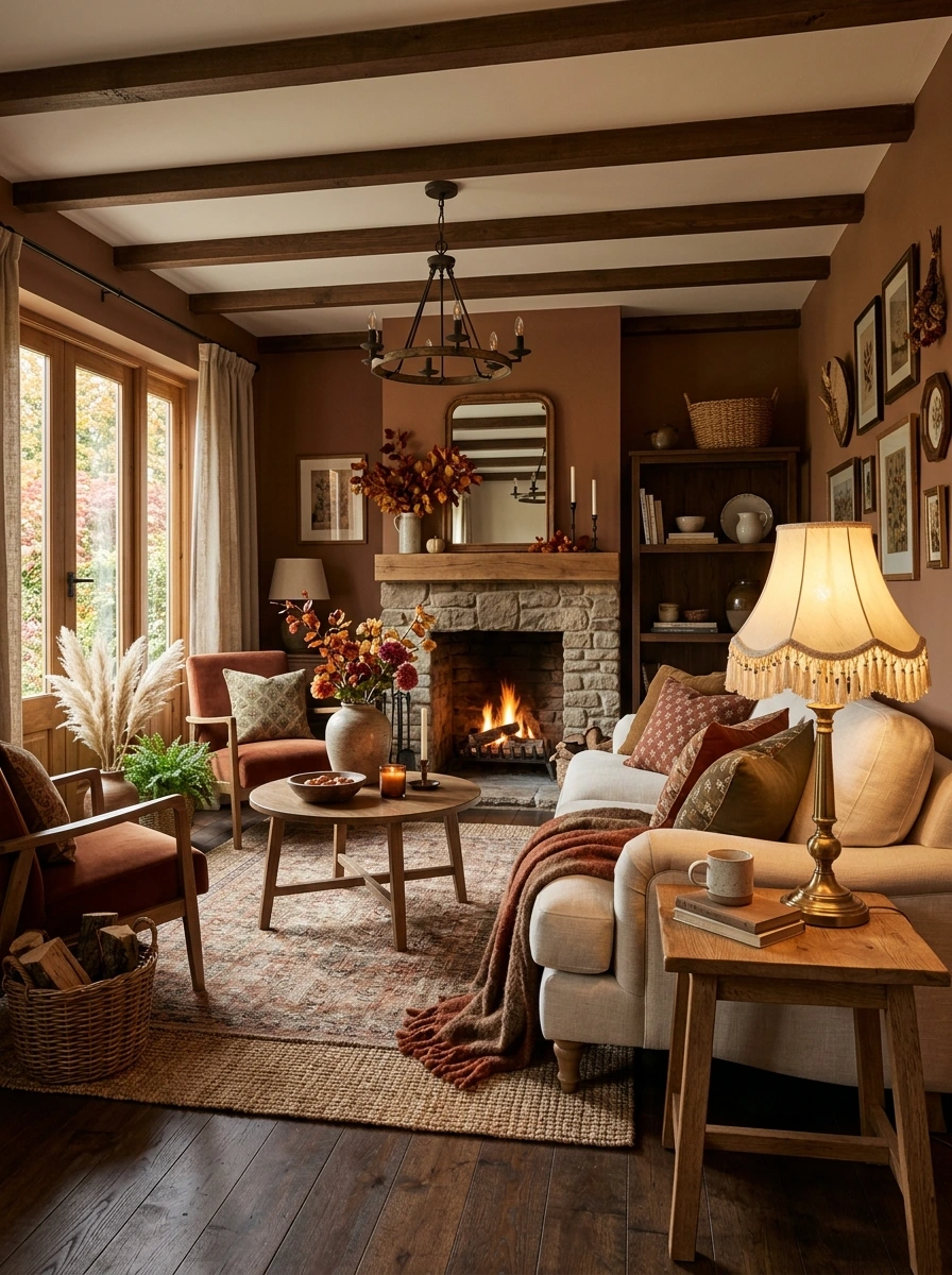
A plain white lampshade can look a little flat against a room full of rich, textured brown and cream tones. A brass lamp base with a fringed linen shade adds both warmth and texture, and the metallic finish catches the same warm bulb glow that makes the whole room feel cozier once evening sets in.
Position the lamp beside the sofa rather than in a far corner, so its warm glow directly hits the pillows and throws it is meant to complement.
4. Style a Wood Tray With Mini Pumpkins in Mixed Neutrals
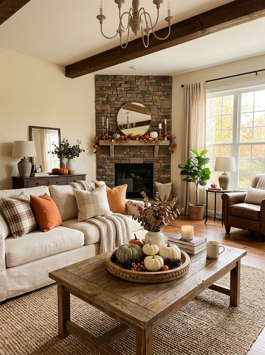
A tray of matching orange pumpkins can feel a little predictable in a room built around a more muted, elevated palette. Mixing in white, grey, and charcoal mini pumpkins alongside one or two orange ones keeps the seasonal touch while staying consistent with the room’s overall neutral, brown-toned direction.
Choose four to five mini pumpkins in white, grey, and charcoal tones.
Add just one traditional orange pumpkin as the accent piece.
Group everything on a dark wood tray to contain the display.
A woven basket tray works just as well as wood here, since either material ties into the room’s other natural textures without competing with the pumpkins themselves.
5. Choose Framed Abstract Art in Warm Brown Tones
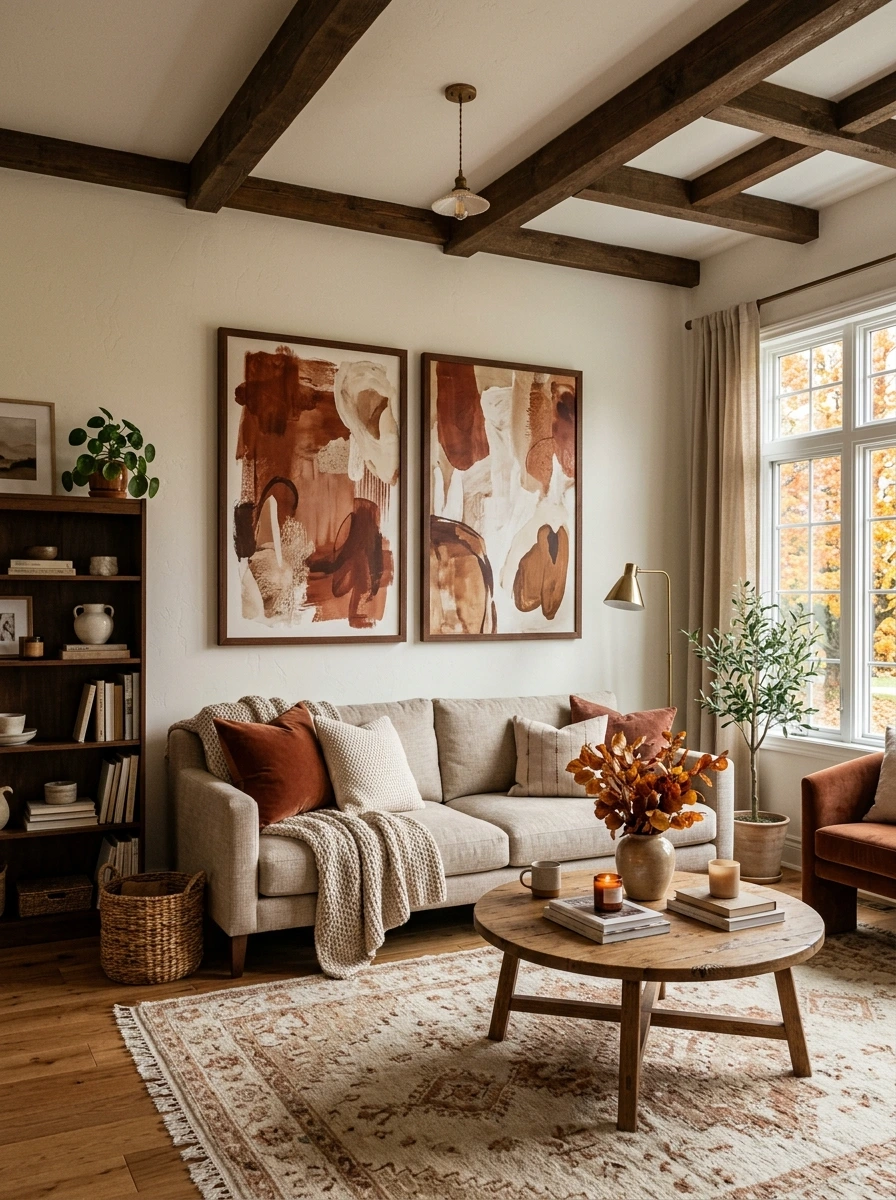
A busy, literal landscape print is not the only way to bring fall color onto the walls. Abstract art in the same rust, cream, and chocolate palette already used on the sofa and throws ties the whole room’s color story together, without needing the art itself to be seasonal or thematic.
A bare wall or artwork in colors unrelated to the room’s warm palette.
Abstract art in matching rust and cream tones ties the wall into the room’s color story.
Choose two smaller framed pieces side by side rather than one large one if the wall is wide, since a pair reads as more gallery-like against a large expanse of neutral wall.
6. Add a Jute or Woven Rug in a Warm Neutral Tone
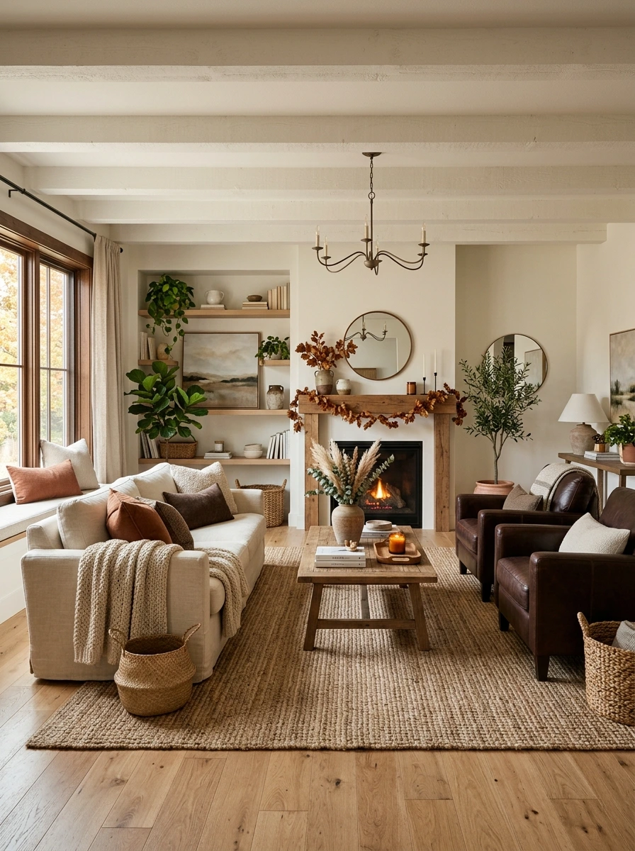
A cool grey or stark white rug can undercut all the warmth built into the room’s furniture and textiles. A jute or woven rug in a warm oatmeal or taupe tone grounds the space in the same neutral, natural palette, and its texture pairs naturally with brass and wood accents already in the room.
A low pile jute rug also handles heavy foot traffic and pet claws better than a plush option, making it a practical choice as well as a visually warm one.
7. Mix Velvet and Boucle Textures on the Same Sofa
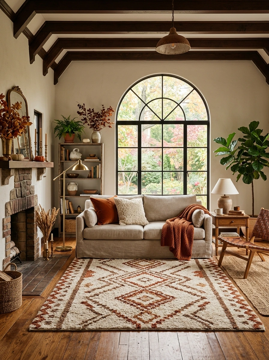
Relying on a single fabric type across all the pillows can flatten the layered look this palette depends on. Pairing a velvet pillow in rust or chocolate with a boucle one in cream adds real textural contrast, since the two materials catch light very differently even within the same color family.
Pair one velvet pillow with one boucle or bouclé-textured pillow.
Keep both within the same color family for cohesion.
Using only one fabric texture across every pillow on the sofa.
Mixing textures in colors that clash rather than complement one another.
Boucle in particular photographs beautifully under warm lamp light, since its looped texture catches shadow and highlight in a way flat velvet cannot replicate.
8. Style a Console Table With Dried Branches in a Cream Vase
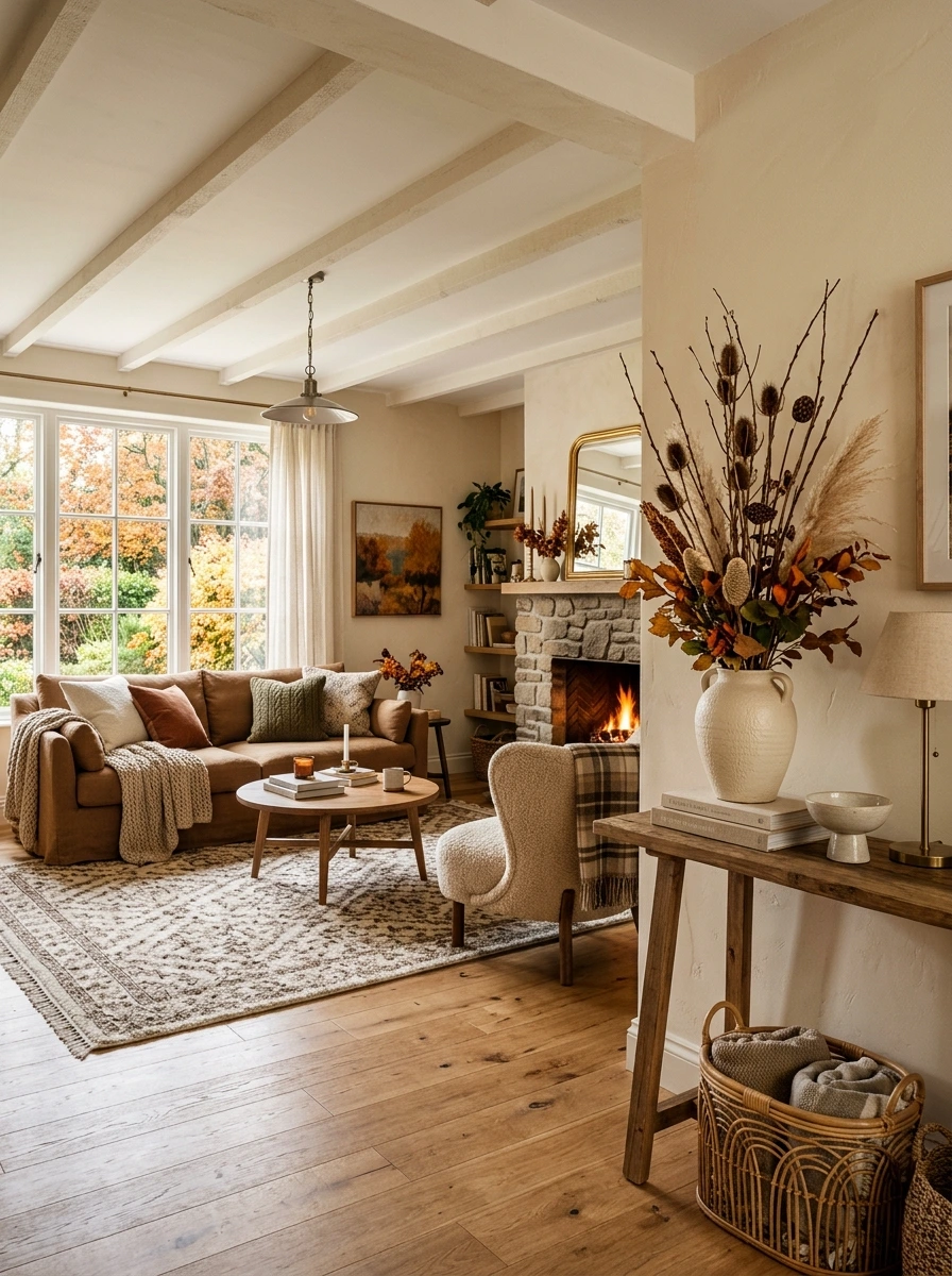
A console table with only a lamp can feel a little sparse next to a fully layered sofa area nearby. Dried branches in a textured cream ceramic vase add height and a soft, organic touch, and the muted tone keeps the arrangement from clashing with anything else on the table.
📌 Good To Know
Keep the arrangement under 24 inches tall if the console sits behind a low-back sofa, since anything taller can start to feel visually top-heavy from across the room.
A vase with a matte, slightly textured finish suits dried stems better than a glossy one, which can look a bit too polished next to the natural, imperfect branches.
9. Add a Framed Fall Landscape Painting Above the Sofa
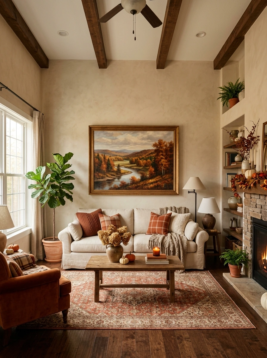
A large blank wall above the sofa is one of the easiest gaps to overlook, even in an otherwise fully styled room. A framed fall landscape painting, ideally one with warm rust and gold tones in the trees, gives the wall a focal point that ties directly into the room’s overall color palette below it.
A blank wall above the sofa with nothing tying it to the room’s color story below.
A warm-toned fall landscape painting pulls the color palette up onto the wall.
Center the frame’s bottom edge about 8 to 10 inches above the sofa back, since hanging it too high visually disconnects the art from the furniture beneath it.
10. Compare Cream vs Brown as the Room’s Dominant Base Tone
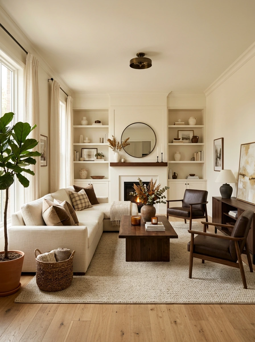
Choosing which of the two tones takes the larger role, cream or brown, changes the entire feel of the room, and both approaches work well depending on the space’s natural light and size.
| Cream as Dominant Tone | Brown as Dominant Tone |
|---|---|
| Keeps the room feeling bright and open, especially in smaller spaces. | Creates a cozier, more enveloping feel, better suited to larger rooms. |
| Best with brown used as accent furniture and pillows. | Best with cream used for lighter textiles and trim details. |
A room with limited natural light generally benefits from cream as the dominant base, since an all-brown room can start to feel dim without enough light sources to balance it.
11. Style the Mantel With a Leaf Garland and Candle Cluster
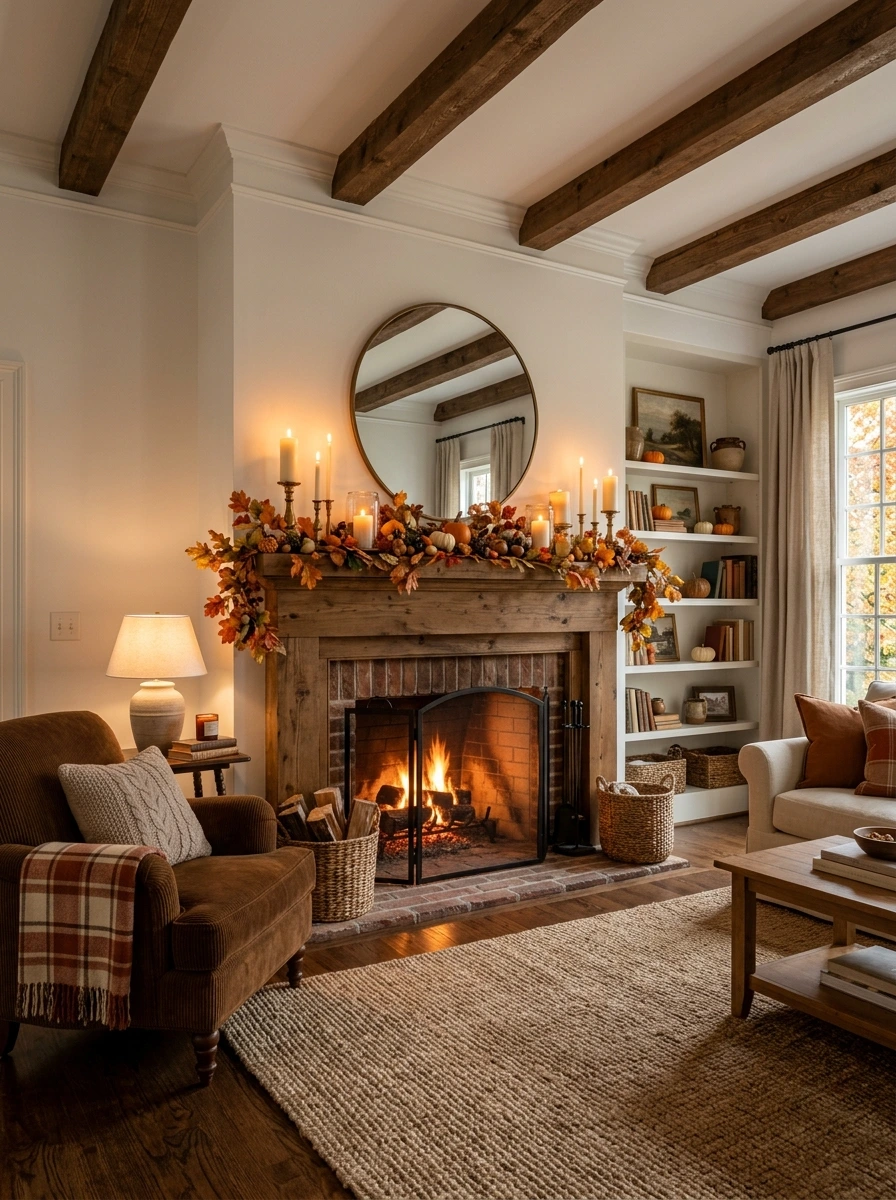
A bare mantel misses one of the easiest opportunities for seasonal styling in the whole room. A faux leaf garland draped along the edge, paired with a cluster of candles at varying heights, brings warmth and texture right to the room’s natural focal point.
A bare mantel that misses the room’s most natural focal point for seasonal styling.
A leaf garland and candle cluster bring warmth right to the room’s focal point.
Let the garland dip slightly in the center rather than pulling it perfectly straight, since a bit of natural sag reads as more relaxed and less staged.
12. Add a Woven Basket Filled With Extra Cream Throws
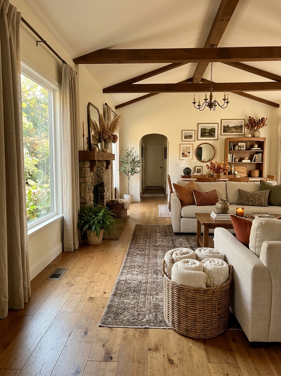
Extra blankets piled loose on a chair or shelf can undercut even a well-styled room. A woven basket contains the overflow while adding its own natural texture, and filling it specifically with cream throws keeps the whole grouping tonally consistent.
💡 Quick Tip
Roll the throws loosely rather than folding them flat, since the rolled texture fills the basket more fully and looks styled rather than simply stored.
Keep two or three throws max inside, since overstuffing the basket flattens its own woven texture along with the blankets stored inside it.
13. Layer a Patterned Vintage Rug Over a Plain Base
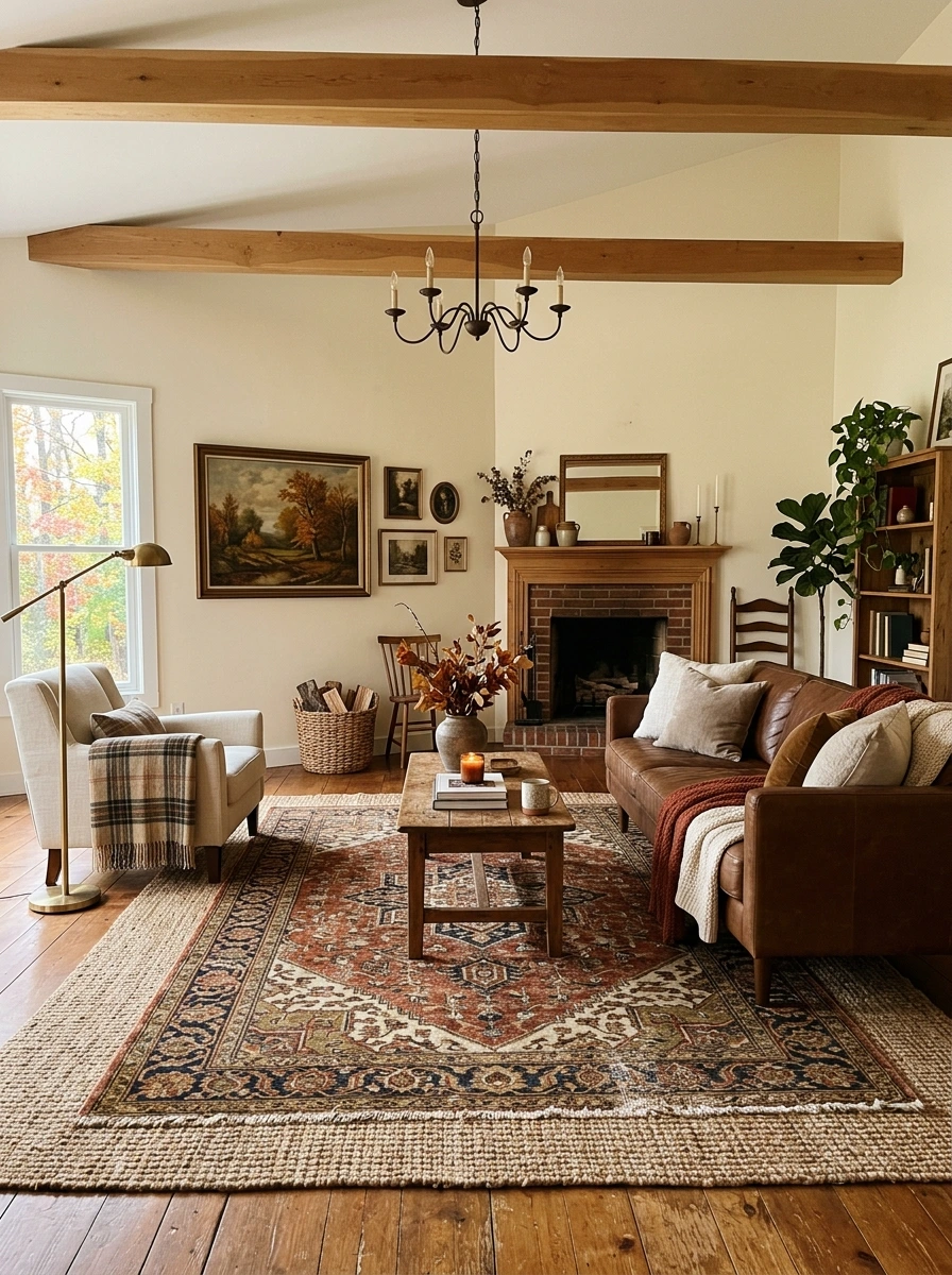
A single flat jute or wool rug can look a little one-dimensional once the rest of the room has so much layered texture. A smaller patterned vintage-style rug on top adds depth and pattern right at floor level, echoing the same layered approach used on the sofa pillows above it.
- ▸Use a jute or plain woven rug as the base layer covering most of the floor.
- ▸Add a smaller patterned vintage rug on top, centered near the seating area.
- ▸Keep the top rug’s colors within the same rust, brown, and cream palette.
Center the top rug slightly off from the base rug’s exact middle, since a perfectly centered layer can read as accidental rather than intentionally styled.
14. Style a Bowl of Decorative Balls in Warm Neutral Tones
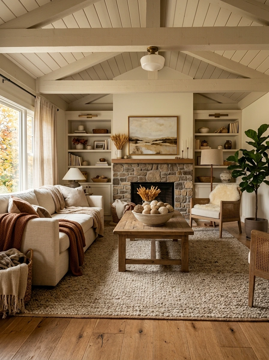
A coffee table centerpiece does not need to rely solely on pumpkins or florals to feel seasonal. A wide, shallow bowl filled with decorative wood or woven balls in warm neutral tones adds texture and visual weight without competing with anything else on the table.
- ▸Choose a wide, shallow bowl rather than a deep one that hides the balls inside.
- ▸Fill it with a mix of wood, rattan, and textured fabric balls for variety.
- ▸Keep all the balls within the same warm neutral color family.
This detail works especially well beside a taller candle cluster on the same table, since the low, rounded shapes balance out the vertical height of the candles.
15. Add a Brass Candlestick Cluster on the Coffee Table
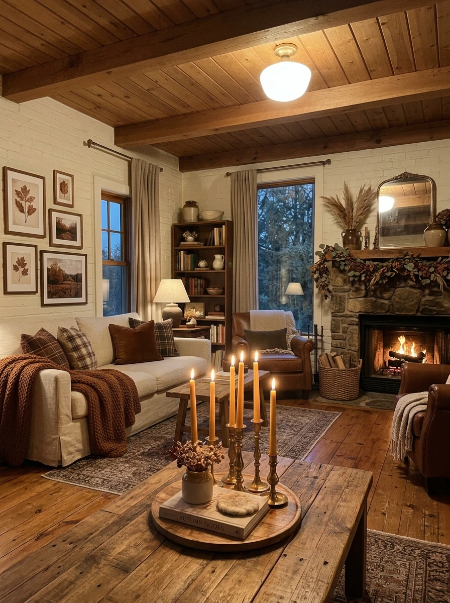
Candles at a single height barely register once the room’s lights dim in the evening, but a cluster of brass candlesticks at varying heights builds the layered, warm glow this palette is meant to create. The metallic finish also picks up and reflects the candlelight itself.
Group three to five brass candlesticks in mixed heights rather than a single matching pair, since the varied heights create the layered glow this look depends on.
Ivory or cream taper candles suit the brass finish better than stark white ones, keeping the whole grouping consistent with the room’s warmer overall tone.
16. Choose Warm White Bulbs to Keep Brown Tones From Reading Dark
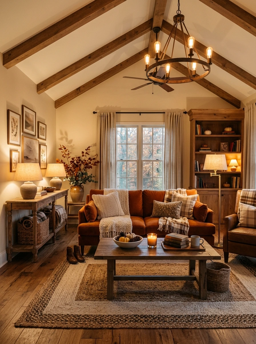
A room built heavily around brown furniture and dark wood can start to feel dim under the wrong bulb temperature, even with plenty of natural light during the day. Choosing warm white bulbs, rather than cool or daylight ones, keeps the deeper tones reading rich and warm instead of murky once evening sets in.
Buy every bulb in the room from the same brand and batch, since even slightly mismatched warm tones side by side create a subtle but noticeable inconsistency across different lamps.
17. Add a Real or Faux Olive Branch in a Ceramic Vase
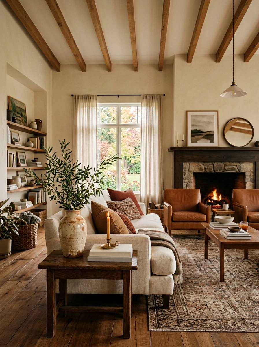
Traditional fall foliage, like maple leaves or wheat stems, is not the only option that fits a rich brown and cream palette. Olive branches, with their soft silvery green leaves, add a quieter, more elevated take on greenery that suits this more muted, sophisticated color direction.
A bright orange or yellow floral arrangement that clashes with the room’s muted palette.
A soft olive branch in a ceramic vase adds a quiet, sophisticated touch of greenery.
A textured stoneware or matte ceramic vase suits the olive branch’s soft, muted coloring better than a smooth glass vase would.
18. Style Bookshelves With Neutral Spines and Brass Objects
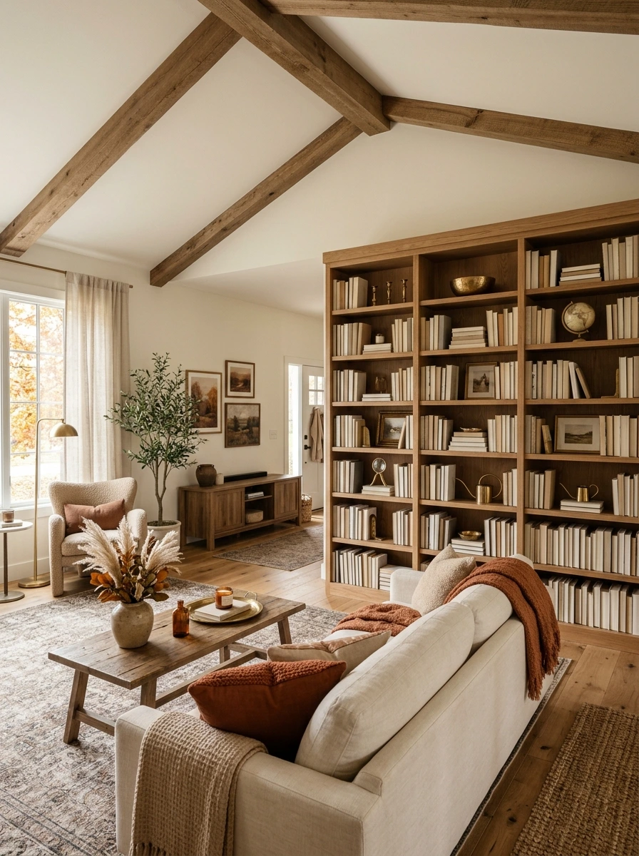
A bookshelf full of brightly colored spines can pull focus away from the room’s overall warm, muted palette. Turning books to show their neutral or cream-toned pages, or grouping neutral spines together, alongside a few small brass objects keeps the shelf visually consistent with the rest of the room.
Group books by neutral spine color rather than by author or genre.
Turn any brightly colored spines inward so only the pages show.
Add one or two small brass bookends or objects between stacks.
Leave some open, empty shelf space rather than filling every inch, since negative space is what keeps a styled shelf from tipping into visual clutter.
19. Add a Chunky Knit Pouf in Cream as Extra Floor Seating
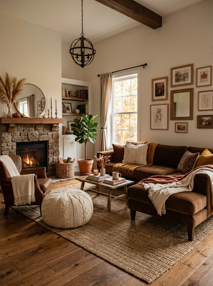
Floor space beside the sofa often sits unused, even though it is a natural spot for a low, casual seat. A chunky knit pouf in cream fills that gap with soft texture, and its neutral tone means it blends with the room rather than competing with any of the pillow colors nearby.
A pouf in this exact cream tone also doubles nicely as a footrest, giving the seating area added function alongside its visual softness.
20. Choose Dark Wood Furniture to Ground a Cream-Heavy Room
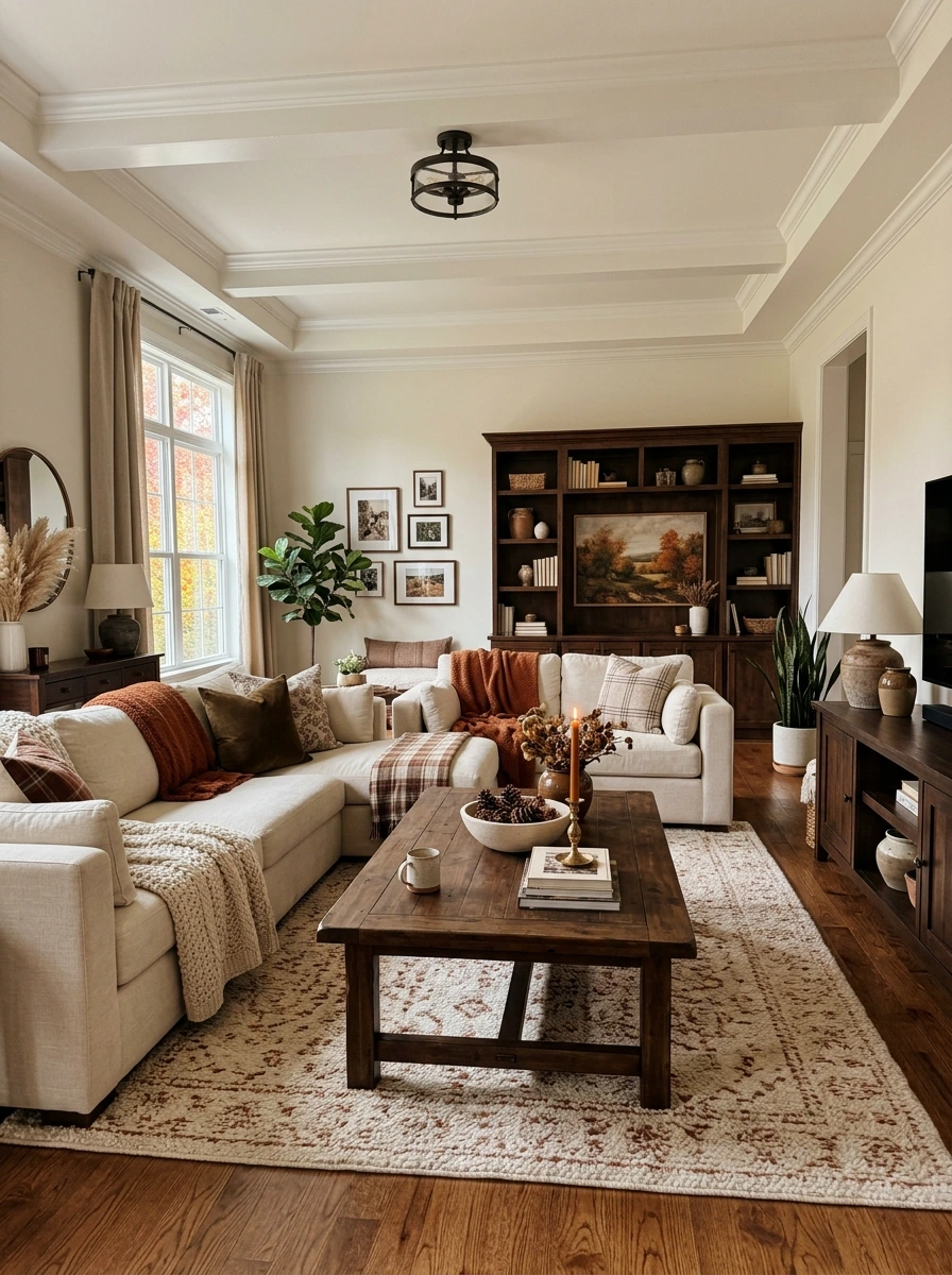
A room with mostly cream and light-toned furniture can start to feel a little flat and low-contrast without something darker to anchor it. Dark wood pieces, a coffee table, console, or bookshelf, ground the space and give the eye a place to rest amid all the lighter surrounding tones.
💡 Quick Tip
Choose at least one large dark wood piece, like a coffee table, so the contrast reads clearly rather than getting lost among several smaller dark accents scattered around the room.
A dark walnut or espresso finish pairs especially well with brass hardware and lamp bases, since both materials share the same warm, deep undertone.
21. Add a Woven Wall Hanging Above a Console or Bed
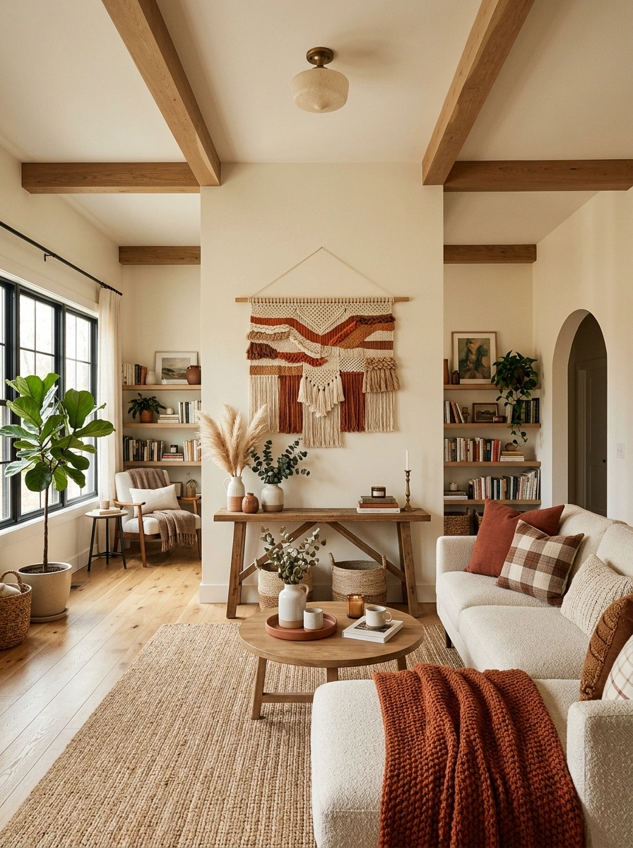
A bare wall above a console or headboard misses an easy opportunity for texture that does not rely on framed art. A woven wall hanging in cream and rust tones adds dimension and a handmade quality, filling the space with the same warm, natural material palette found throughout the rest of the room.
Choose a wall hanging sized to about two-thirds the width of the furniture below it.
Keep the color palette within the room’s existing rust and cream tones.
A wall hanging that is too small, which reads as an afterthought on a large wall.
Choosing bright, unrelated colors that clash with the room’s overall palette.
A wall hanging with fringe or tassel detailing echoes the same texture found in throw blankets and rugs elsewhere in the room, tying the whole space together visually.
22. Style a Nightstand With a Small Pumpkin and Warm Candle
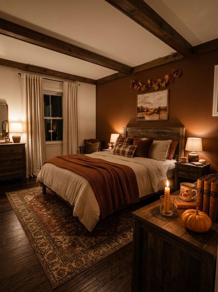
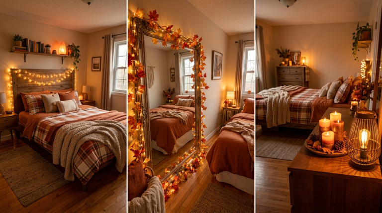
A nightstand with just a lamp and a book can feel a little sparse once the rest of the bedroom is fully styled. A single small pumpkin beside a lit candle adds height and warmth right at the bedside, without cluttering the limited surface space a nightstand usually has.
Choose a flameless candle for the nightstand if it will stay lit unattended before bed, since it gives the same warm glow without the fire risk near pillows and blankets.
23. Drop In a Boucle Accent Chair in a Warm Neutral Tone
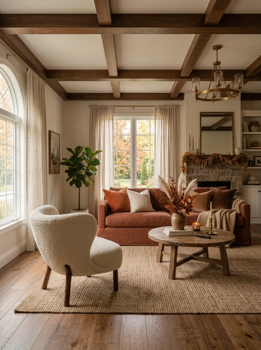
A room built entirely around a single sofa can benefit from a second seating piece with its own distinct texture. A boucle accent chair in cream or oatmeal adds a soft, looped texture that contrasts nicely with the sofa’s smoother upholstery, while staying firmly within the room’s warm neutral palette.
Choose a chair with dark wood legs to keep the piece visually connected to the room’s other dark wood furniture, rather than letting it float as an isolated soft shape.
24. Add a Cream Linen Curtain to Soften Natural Light
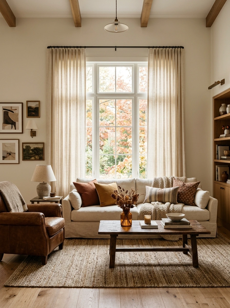
Harsh, bright daylight streaming through bare windows can wash out the warmer, muted tones this palette depends on. Cream linen curtains filter that light softly, keeping the room’s brown and rust tones reading rich rather than flattened by too much direct sun.
💡 Quick Tip
Hang the curtain rod a few inches above the actual window frame and slightly wider than it, so the linen pools slightly at the floor and appears taller than the window itself.
Linen with a slight texture and imperfect drape suits this palette better than a smooth, crisp cotton, since the natural fiber echoes the room’s other organic materials.
25. Finish the Coffee Table With a Low, Wide Floral Arrangement
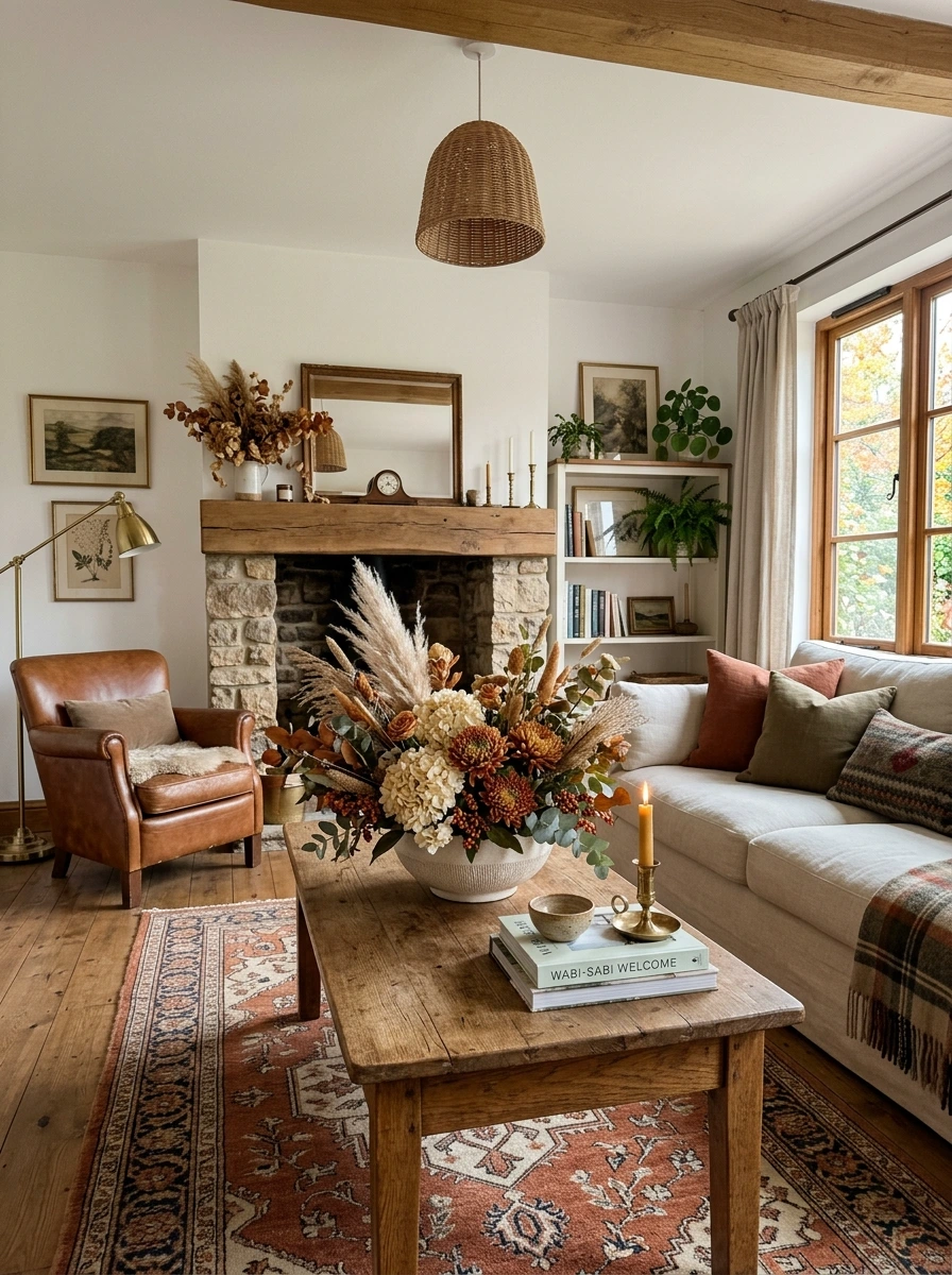
A tall, narrow floral arrangement can look dramatic, but it blocks sightlines across the room and can feel out of scale on a lower coffee table. A low, wide arrangement in rust and cream tones spreads across more of the table’s surface while staying visually grounded and easy to see over.
Keep the arrangement under 10 to 12 inches tall on a standard coffee table, so it never blocks the view across the room from the sofa or an accent chair.
Use a shallow, wide dish or trough vase rather than a tall standard one, since the wider base naturally forces the arrangement to spread outward rather than up.
26. Style a Bench at the Foot of the Bed With Layered Throws
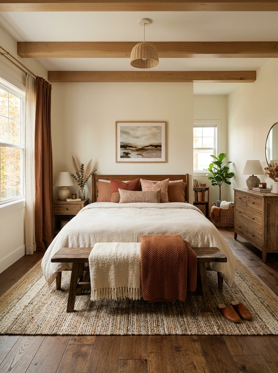
A bench at the foot of the bed can look a little bare with nothing on it, even when the rest of the bedroom is fully styled. Layering two throws in different textures, a solid cream one and a chunky rust knit, adds warmth and visual depth right at the base of the bed.
- ▸Lay a solid cream throw flat across the bench first as the base layer.
- ▸Fold a chunky rust knit throw and place it at an angle over one end.
- ▸Let the layers overlap unevenly rather than stacking them in a perfectly neat pile.
Choosing two tones within the same warm family, rather than an identical matching pair, reads as more collected and layered than a set purchased together.
27. Add Wall Sconces in Aged Brass for Layered Lighting
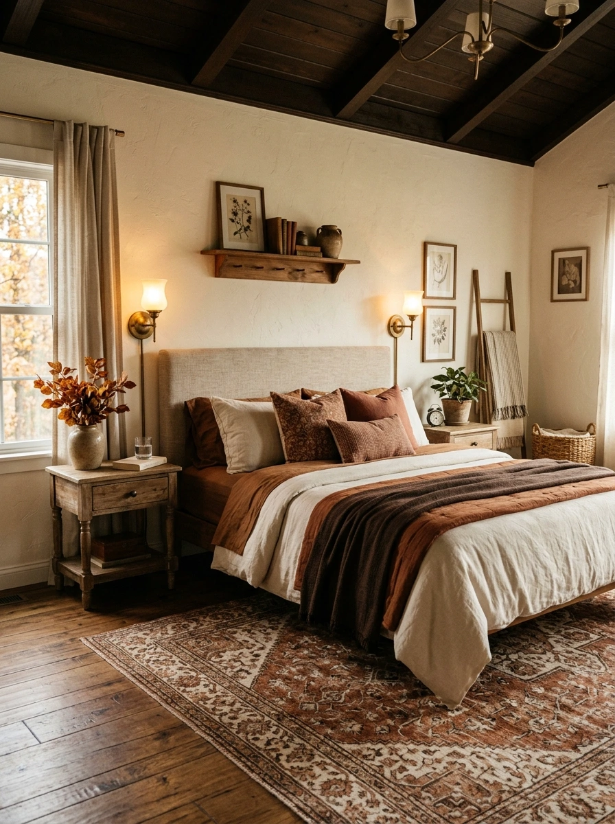
Overhead lighting alone rarely creates the warm, layered glow this palette depends on, especially once evenings get darker earlier in the season. Wall sconces in aged brass add a second light source at eye level, and the metal finish continues the same warm material palette found in lamps and candlesticks elsewhere in the room.
A plug-in sconce with a cord cover skips the need for any electrical work, making it an easy option even for renters who cannot hardwire fixtures.
28. Choose a Leather Accent Chair in a Rich Chocolate Tone
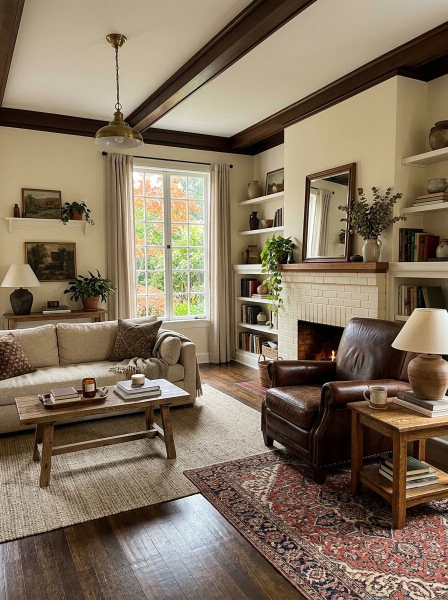
Fabric chairs in rust and cream cover the softer end of the palette, but a leather accent chair in a deep chocolate tone adds a completely different material into the mix. The sheen and structure of leather contrasts nicely against all the room’s knit and boucle textures, without introducing a new color.
Every seating piece in the room made of soft fabric, missing any material contrast.
A chocolate leather chair adds material contrast without introducing a new color.
A slightly worn or distressed leather finish suits this warm, collected palette better than a glossy, brand-new looking leather, which can feel a bit too formal in a cozy fall room.
29. Style Open Shelving With Neutral Ceramics and Dried Stems
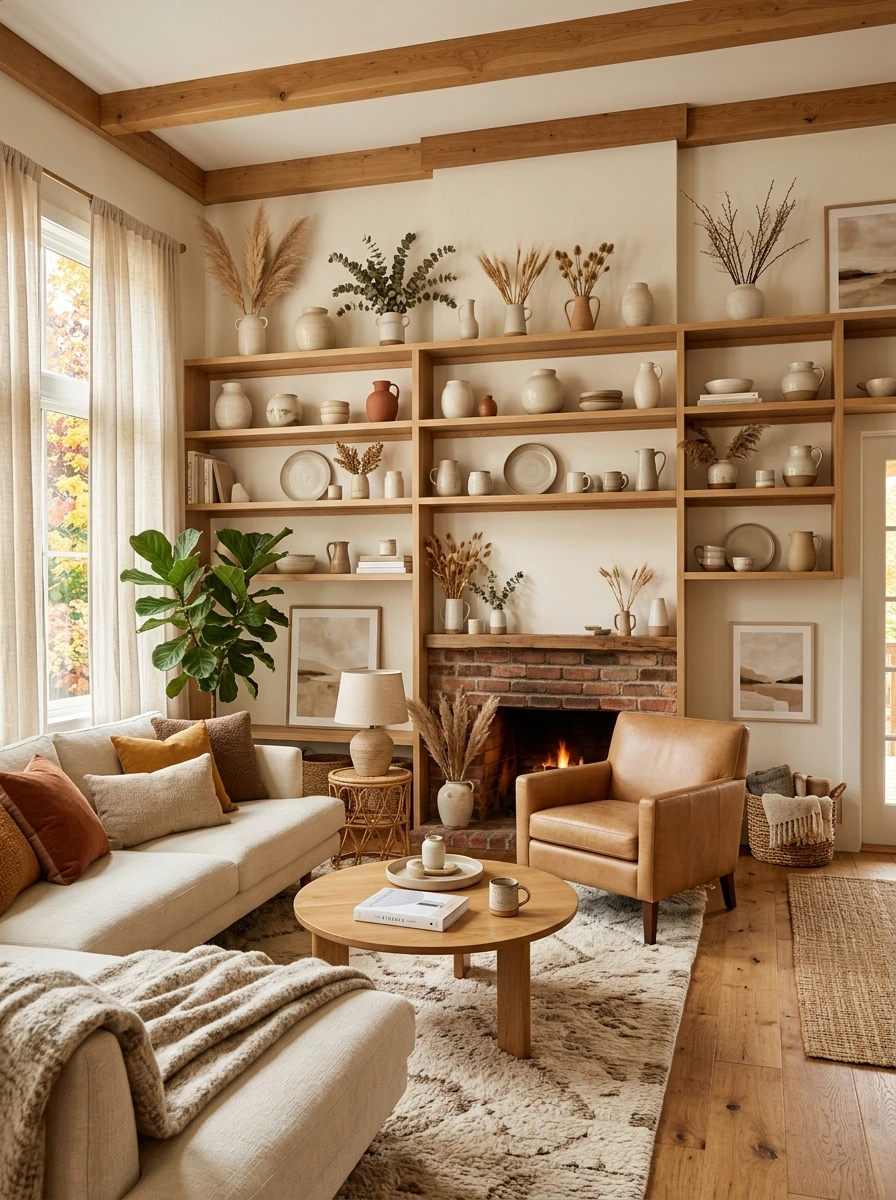
Open shelving filled with a mix of colorful objects can pull focus away from the room’s overall muted palette. Styling it with neutral ceramics in cream and taupe tones, alongside a few dried stems, keeps the shelf visually consistent with the rest of the room while still feeling curated.
Choose ceramics in cream, taupe, or matte white for the majority of the shelf.
Add one or two dried stems in a small vase for organic texture.
Group items in varied heights rather than lining them all up flat.
Vary the ceramic textures, matte, glazed, ribbed, rather than choosing all identical finishes, since the subtle variation reads as more collected over time.
30. Finish With a Cluster of Pumpkins in White, Grey, and Orange
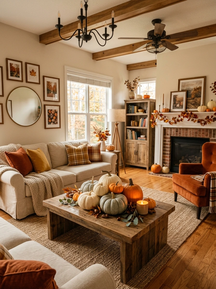
A coffee table or entryway console can feel unfinished without a clear seasonal touch, but an all-orange pumpkin display can look a bit predictable in a more elevated room. A cluster mixing white, grey, and just one or two orange pumpkins keeps the seasonal nod while staying consistent with the room’s muted, sophisticated palette.
💡 Quick Tip
Group the pumpkins in odd numbers, five or seven, with the orange ones tucked toward the center rather than placed at the edges of the cluster.
Faux pumpkins with a matte, slightly textured finish photograph closer to the real thing than the glossy plastic versions most stores carry, and they hold their look for the entire season.
31. Add a Fireplace Mantel Styled With Layered Candle Heights
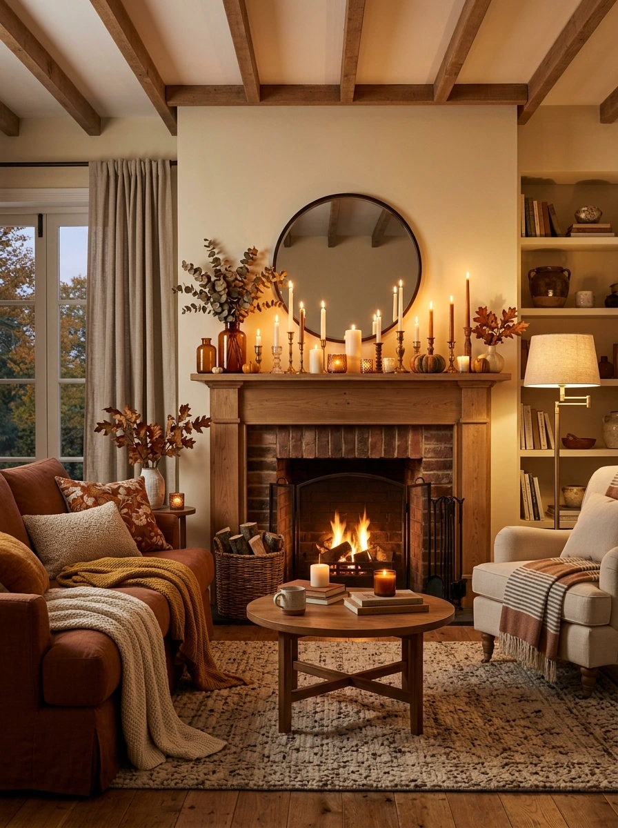
A working or decorative fireplace gives the room a natural focal point, but a bare mantel misses the chance to build on that. Layering candles at varying heights across the mantel, tapers beside pillars beside votives, creates the kind of warm, flickering glow that makes the whole area feel like the heart of the room.
A bare mantel with no candlelight to draw the eye toward the fireplace as a focal point.
Layered candle heights build a warm, flickering glow that anchors the whole room.
Group the candles toward one end of the mantel rather than spacing them evenly across the whole length, since asymmetry reads as more natural and collected.
32. Choose a Herringbone or Textured Weave Throw Blanket
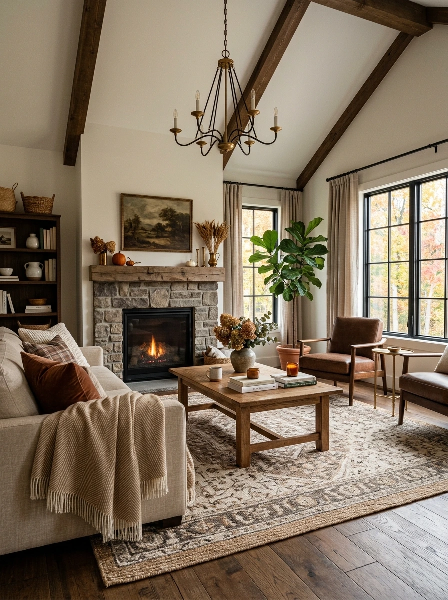
A plain, flat-woven throw does the functional job, but a herringbone or other textured weave adds visual interest even before anyone touches it. The subtle pattern created by the weave itself, rather than a printed design, keeps the throw feeling elevated and understated.
A herringbone weave in wool or a wool blend photographs with more visible texture under warm lamp light than a smooth cotton throw would.
33. Style a Console Behind the Sofa With Framed Family Photos
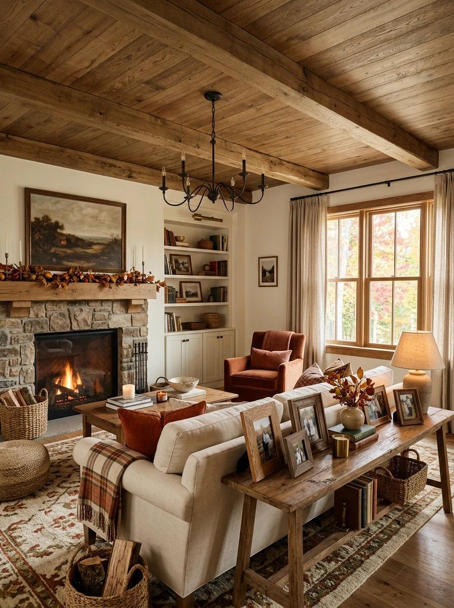
A console behind the sofa often ends up holding only a lamp and a candle, missing an easy chance for a bit of personal warmth. Framing a few family photos in wood or brass frames, grouped alongside the room’s other styled objects, adds a lived-in quality that pure decor alone cannot replicate.
- ▸Choose two or three photos in a consistent frame material, wood or brass.
- ▸Group them together on one side of the console rather than spreading them out.
- ▸Balance the grouping with a lamp or vase on the opposite side.
Black and white or sepia-toned photos tend to blend into this warm, muted palette more seamlessly than full-color prints, which can introduce colors that clash with the room.
34. Add a Woven Basket of Firewood Beside the Fireplace
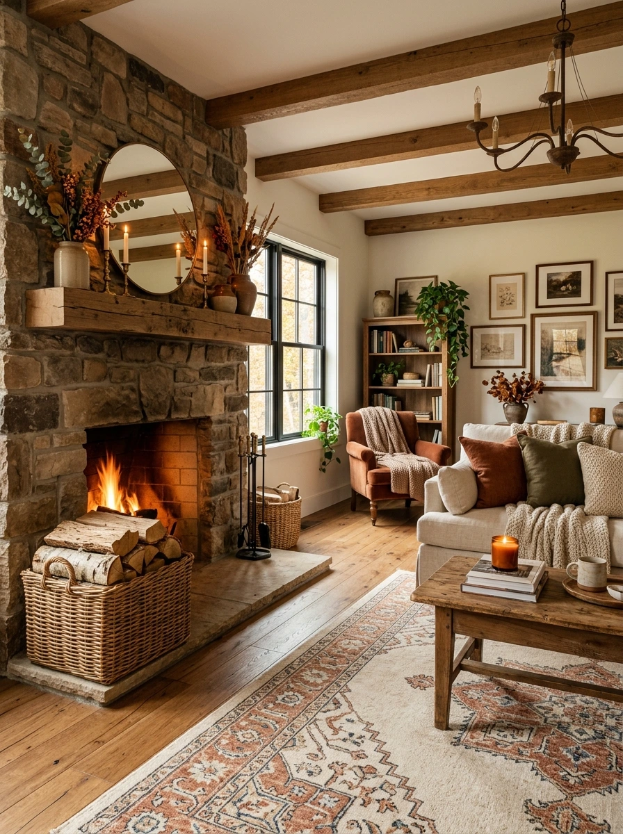
A stack of loose firewood beside the fireplace can look messy no matter how neatly it is piled. A large woven basket contains the same firewood in a single defined shape, adding texture right at the hearth while keeping the whole area looking tidy.
📌 Good To Know
Choose a basket with sturdy handles and a wide, low profile, since tall narrow baskets tip over easily once loaded with heavier logs.
Stack the logs bark-side facing out for the most visually appealing arrangement, since exposed cut ends tend to look less finished from the front.
35. Layer a Sheepskin or Faux Fur Throw Over an Accent Chair
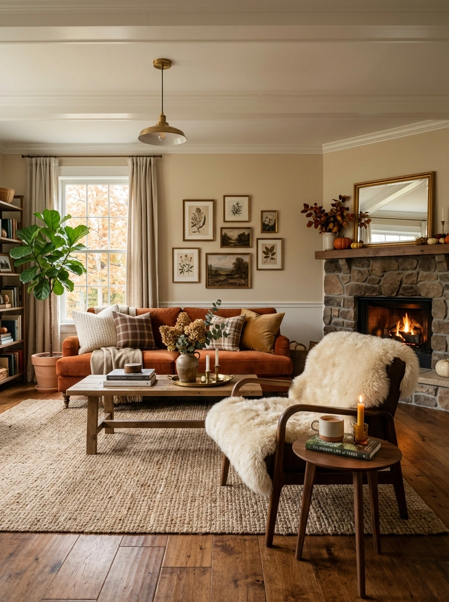
A single texture repeated throughout the room, even a nice one like knit or velvet, starts to feel one-note after a while. A sheepskin or faux fur throw draped over an accent chair introduces a completely different texture, and its cream tone photographs beautifully against darker leather or wood furniture nearby.
Shake the throw out and re-drape it every so often, since faux fur tends to flatten in one spot if left arranged the exact same way for weeks.
36. Add a Small Brass Bowl for Loose Change or Keys by the Door
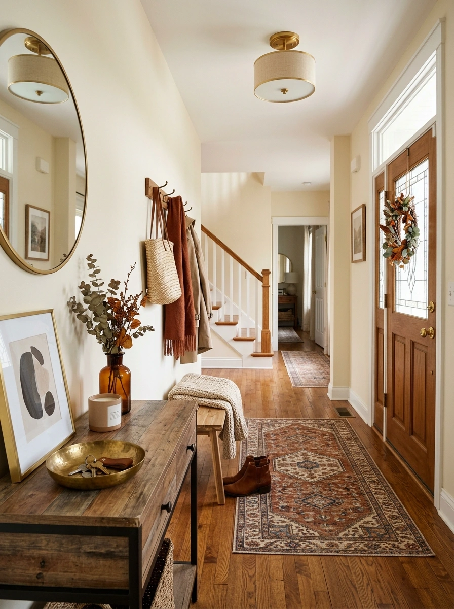
A small entryway detail is easy to overlook, but a brass catchall bowl by the door serves a real daily function while adding one more warm metallic touch to the room’s overall palette. It gives keys and loose change a defined spot instead of scattering across whatever surface is closest.
A slightly hammered or textured brass finish hides fingerprints and small scratches better than a perfectly smooth polished one, keeping it looking good with daily use.
37. Style a Reading Corner With a Floor Lamp and Knit Throw
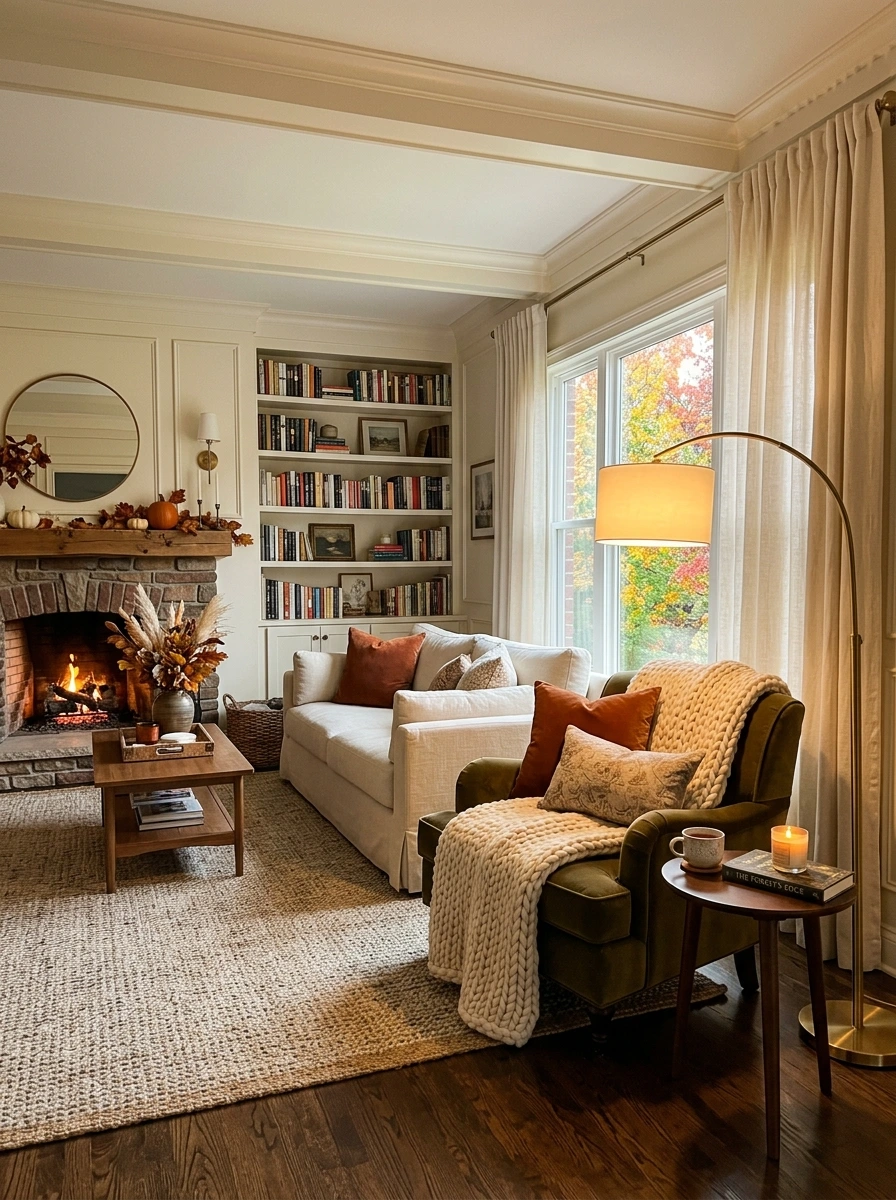
A room can feel purely social, built entirely around the main seating area, without a smaller, quieter corner for reading or winding down alone. A floor lamp beside a single accent chair, with a knit throw draped over the arm, creates that second, more intimate zone within the same room.
Position the floor lamp so its light falls directly over the shoulder when seated, since a lamp placed purely for looks often ends up poorly angled for actual reading.
A brass floor lamp with an adjustable arm gives you the flexibility to direct the light exactly where needed, without sacrificing the room’s overall warm metallic theme.
38. Choose Monogram or Initial Wall Decor for a Personal Touch
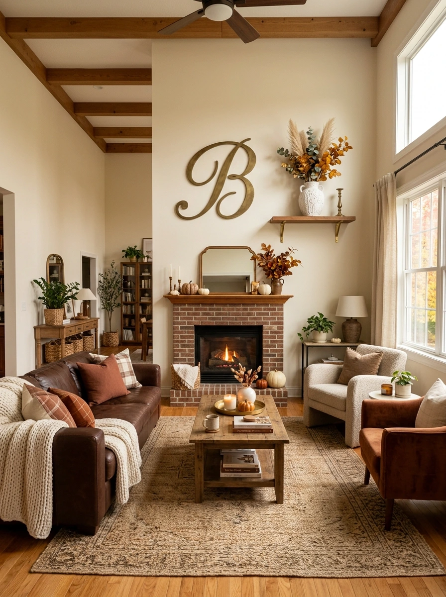
A room full of beautifully styled but entirely generic decor can still feel a little impersonal without something that reflects the people who actually live there. A monogram letter or family initial in brass or dark wood adds a personal touch that fits naturally alongside the room’s other metallic and wood accents.
- ▸Choose one initial letter in brass or aged metal, matching existing hardware finishes.
- ▸Group it with a small decorative object rather than hanging it alone on a bare wall.
- ▸Keep the size proportional to the wall space, since an oversized letter can feel out of scale.
A single letter reads as more intentional and design-forward than a full name or multiple initials, which can start to look more like a nursery decal than adult decor.
39. Add a Low Wood Bench as an Alternative Coffee Table Base
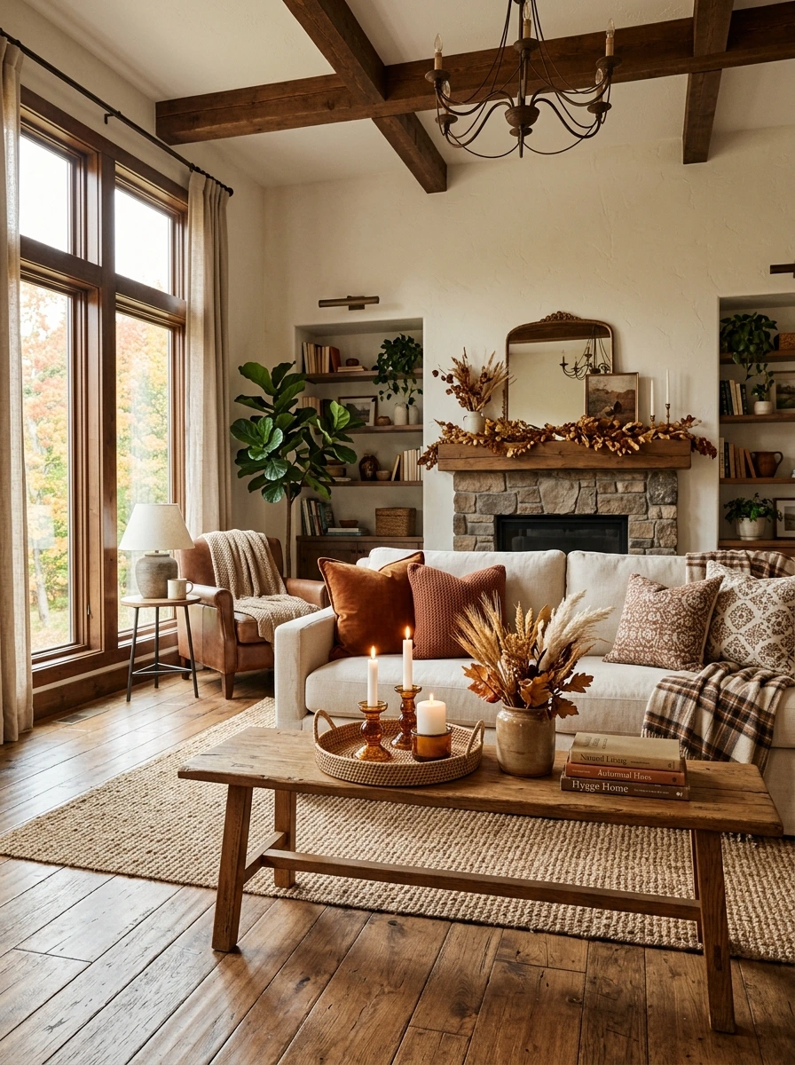
A traditional coffee table works fine, but a low wood bench brings a slightly more casual, collected feel that pairs naturally with the room’s other vintage-leaning wood pieces. It also offers a flatter, more versatile surface for trays, books, and centerpiece styling.
Choose a bench low enough to comfortably clear knees when seated on the sofa.
Style it with a tray, a candle cluster, and one or two books.
Choose a wood tone that complements, rather than exactly matches, the room’s other furniture.
A bench with a slightly worn or distressed wood finish fits this palette’s collected, layered feel better than a smooth, brand-new looking piece.
40. Finish With a Fall Scented Candle in an Amber Glass Jar
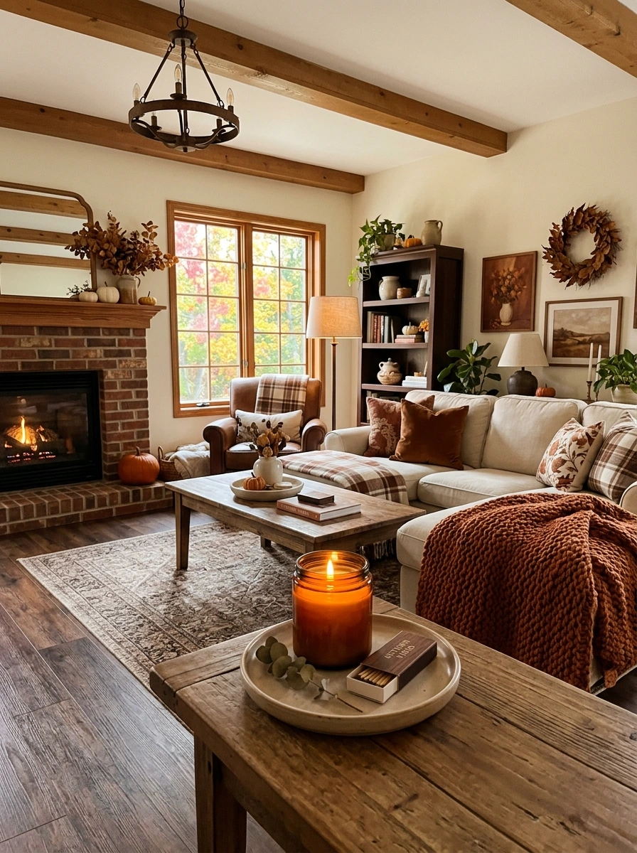
A room can have every visual layer perfectly styled and still be missing the scent that makes fall actually feel present in the space. A candle in an amber glass jar, both a design object and a fragrance source, ties the room together with cedarwood, spiced pumpkin, or amber and clove notes that read as fall without feeling like an air freshener.
💡 Quick Tip
Choose one scented candle per main room rather than several competing fragrances, and set it on a small tray or coaster to protect wood surfaces from wax drips.
An amber glass jar also catches candlelight beautifully once lit, adding a warm glow to the container itself even before the scent fills the room.
Conclusion
A rich brown and cream fall room does not need bright orange or literal pumpkins on every surface to feel warm. Layered textures, a boucle chair, a chunky knit throw, brass candlesticks, do more for the mood than color contrast ever could. Start with whichever piece solves your room’s biggest gap, whether that is a bare mantel or a single-texture sofa.
You do not need all forty ideas to see a shift. A cream throw, a cluster of brass candlesticks, and a mix of neutral pumpkins can transform a room within an afternoon. Add in the layered rugs, the wall sconces, the reading corner, over time, and let the space grow richer as you find pieces you genuinely love.
The most elevated fall rooms are not the most decorated ones. They are the ones built on depth and texture rather than color alone.