20 Living Room Color Scheme Ideas That Interior Designers Love

Introduction
Color is the fastest way to change how a room feels — and the easiest way to get wrong. The difference between a living room that feels pulled together and one that feels off is almost always color. Not the furniture. Not the layout. The color choices and how they relate to each other.
These twenty schemes are the ones interior designers return to again and again — not because they are trendy, but because they work. Each one is built on a logic you can understand and apply to your own space, regardless of your budget or your starting point.
1. Warm White With Warm Wood and Brass
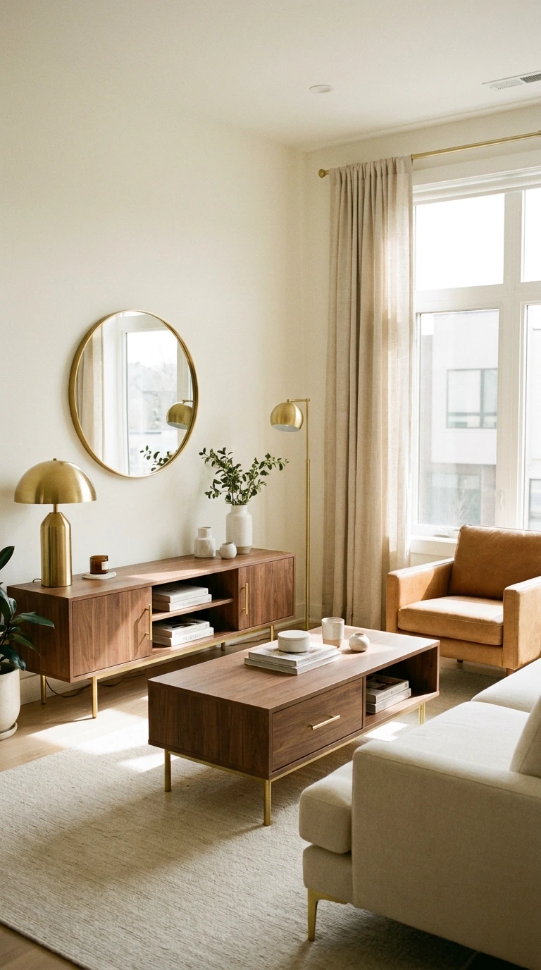
Warm white walls paired with natural wood furniture and brass accents is the scheme that appears in more professionally styled living rooms than almost any other. It works because the warmth flows consistently through every element — nothing feels cold, nothing feels out of place. The result is a room that looks effortless but is actually very deliberate.
The secret is keeping everything within the warm spectrum. Cool white walls with warm wood creates an unresolved tension most people can feel but cannot identify. Swap to a white with yellow or red undertones — Benjamin Moore White Dove, Farrow and Ball All White, or any equivalent — and the whole room settles.
Why This Scheme Works
- Warm white reflects light without the clinical feel of cool white
- Natural wood introduces organic texture that softens the palette
- Brass adds warmth and polish without the heaviness of darker metals
- The combination photographs beautifully in both natural and artificial light
2. Sage Green With Cream and Natural Linen
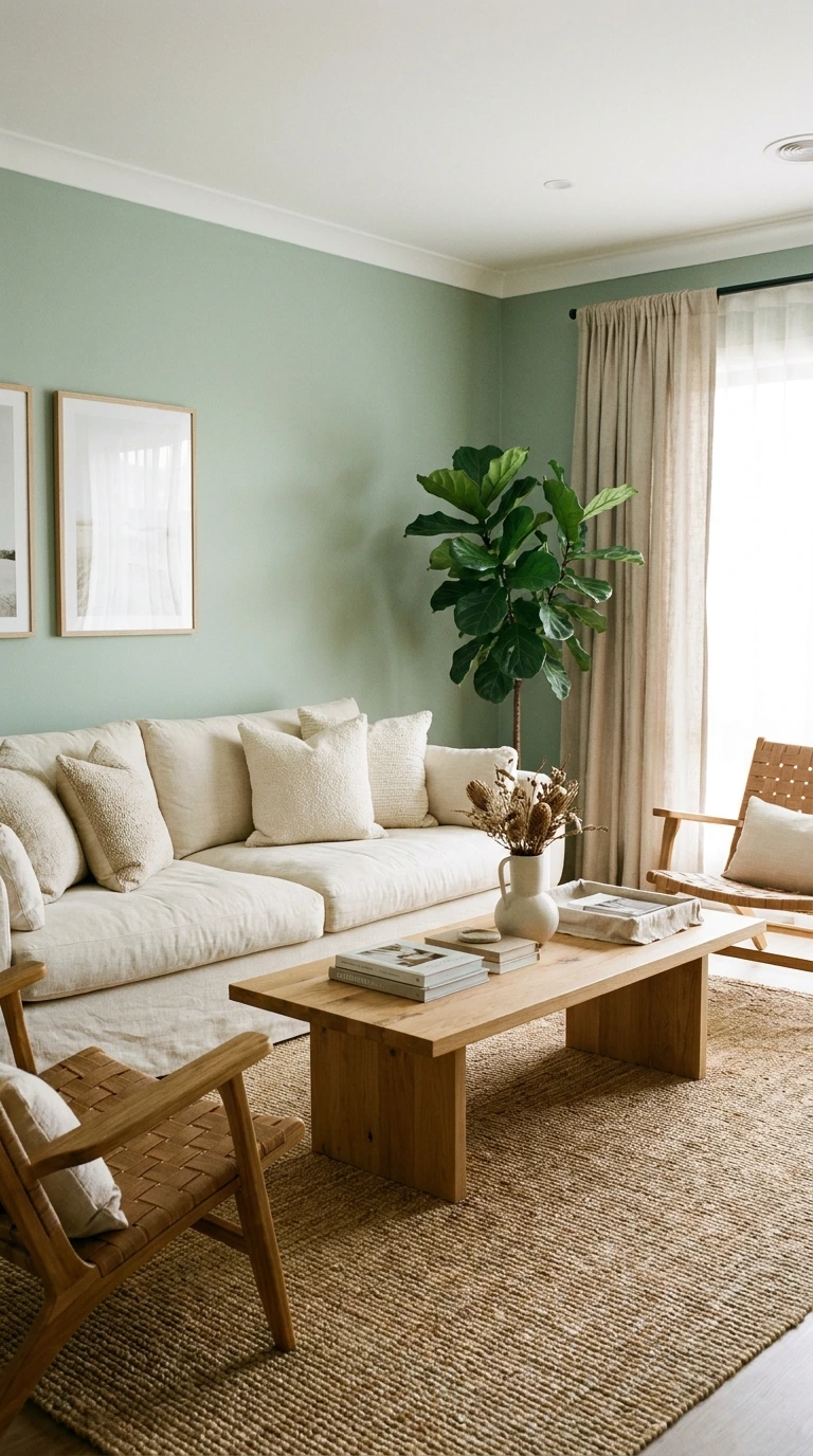
Sage green has become one of the most requested living room colors of the last five years — and for good reason. It is calm without being cold, organic without being earthy, and it pairs with cream and natural linen in a way that feels effortlessly put together. This scheme suits almost every architectural style.
Keep the sage on the walls and bring the cream and linen in through the sofa, curtains, and cushions. Add a natural wood coffee table and a jute rug to complete the palette. Avoid adding too many colors — the restraint is what makes this scheme feel so resolved.
Pro Tip: Test your sage green paint in the corner of the room where the least natural light falls. Sage reads very differently in shadow than in bright light — what looks soft and muted in the paint store can look almost gray in a north-facing room.
3. Navy Blue With White and Natural Wood
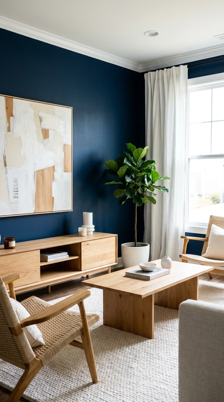
Navy blue is one of the most confident color choices available for a living room — and one of the most consistently successful when handled correctly. It creates depth, drama, and a sense of enclosure that makes a living room feel genuinely cozy rather than just warm. Pair it with white trim and natural wood to keep it from feeling heavy.
Use navy on a single wall or on all four, depending on the room size and the amount of natural light available. Smaller rooms benefit from a single navy accent wall; larger rooms can handle navy on all four walls if the trim, ceiling, and furnishings stay light. Natural wood floors or furniture break the depth and add organic warmth.
4. Terracotta With Warm Cream and Bronze
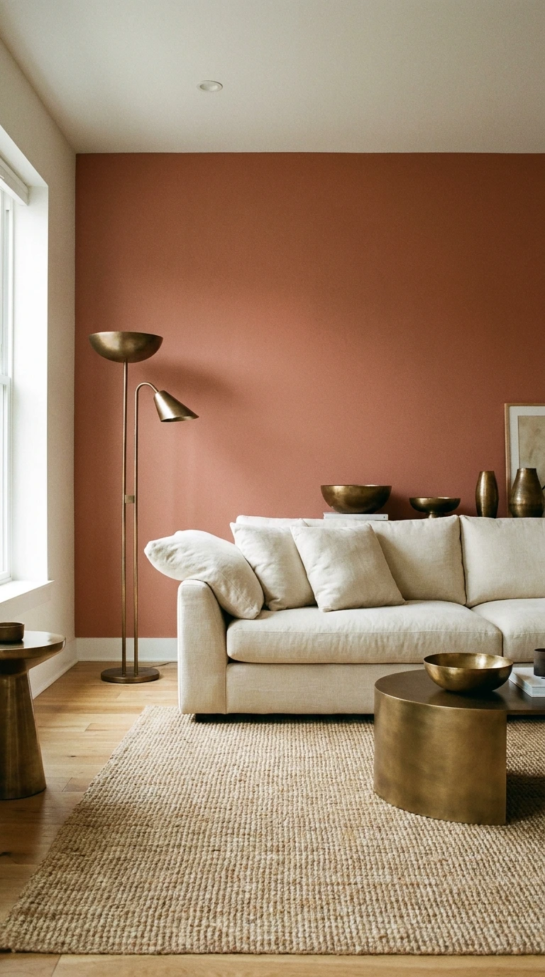
Terracotta is having a sustained moment in interior design — not as a trend, but as a genuine rediscovery of a color that has been used in homes for centuries. It brings warmth, character, and a connection to natural materials that few other colors can match. Pair it with warm cream and bronze accents for a scheme that feels collected and timeless.
Use terracotta on a single feature wall rather than all four in a typical-sized living room. Bring in cream through a large sofa or armchair and let the bronze appear through small accents — a lamp base, a candle holder, a picture frame. A jute or wool rug in a complementary warm tone ties the whole palette together.
Terracotta Shades That Work in Living Rooms
- Dusty, muted terracotta for a sophisticated, grown-up feel
- Deeper burnt sienna for drama and depth
- Soft clay tones for a lighter, more versatile approach
- Warm brick tones for a rustic or Mediterranean-inspired scheme
5. Soft Gray With Blush and Aged Brass
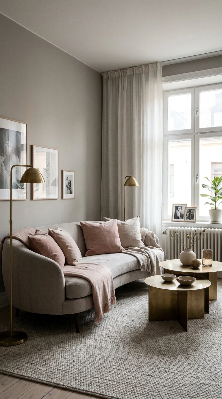
Soft gray and blush is a combination that has staying power precisely because neither color dominates — they coexist in a way that feels balanced and calm. Aged brass accents add warmth and a slightly vintage quality that elevates the combination beyond its surface simplicity. This is a scheme that looks expensive without requiring expensive furniture.
Choose a gray with warm undertones rather than cool ones — a gray that reads as slightly purple or blue in certain lights will conflict with the warmth of blush. Warm gray, greige, or a gray with a hint of taupe all work. Keep the blush soft and dusty rather than bright or saturated.
6. Chocolate Brown With Ivory and Gold
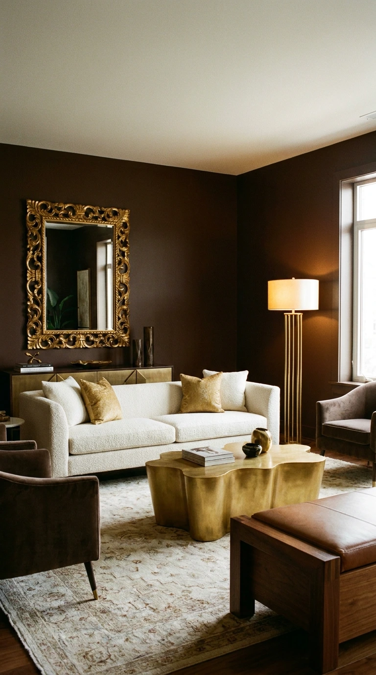
Deep chocolate brown — on walls, in a large sofa, or both — creates a living room with genuine depth and luxury that lighter palettes cannot achieve. This is the scheme that makes a room feel like a place you want to stay in for hours. Pair it with ivory and gold to keep the palette warm rather than heavy.
Brown walls with ivory trim read as architectural and considered rather than dark and oppressive, provided the ceiling stays light. A large ivory sofa against a brown wall creates a high-contrast focal point that anchors the room. Gold accents — a mirror, a lamp, cushion trims — add the warmth that keeps chocolate brown from feeling cold.
| Color Scheme | Mood | Best Room Size | Key Accent |
|---|---|---|---|
| Warm White and Wood | Calm, timeless | Any | ✨ Brass |
| Sage Green and Linen | Organic, restful | Any | 🪵 Natural wood |
| Navy and White | Bold, classic | Medium to large | ✨ Gold |
| Terracotta and Cream | Warm, earthy | Any | 🟤 Bronze |
| Gray and Blush | Soft, elegant | Any | ✨ Aged brass |
7. All White With Texture and Natural Materials
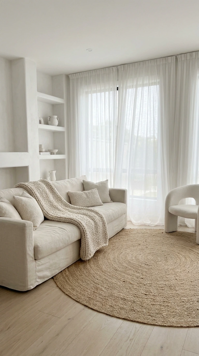
An all-white living room that relies entirely on texture and natural materials for interest is one of the hardest schemes to execute and one of the most striking when done well. The point is not sterility — it is restraint. Every element stays within the white and near-white spectrum, but each brings a different surface quality that creates depth without color.
Think a cream linen sofa, a chunky wool throw in off-white, a jute rug, a white plaster lamp, bleached wood shelving, and sheer cotton curtains. The interest comes entirely from how light hits different surfaces differently throughout the day. This scheme requires discipline — one wrong piece in the wrong material breaks the effect entirely.
8. Forest Green With Warm White and Walnut
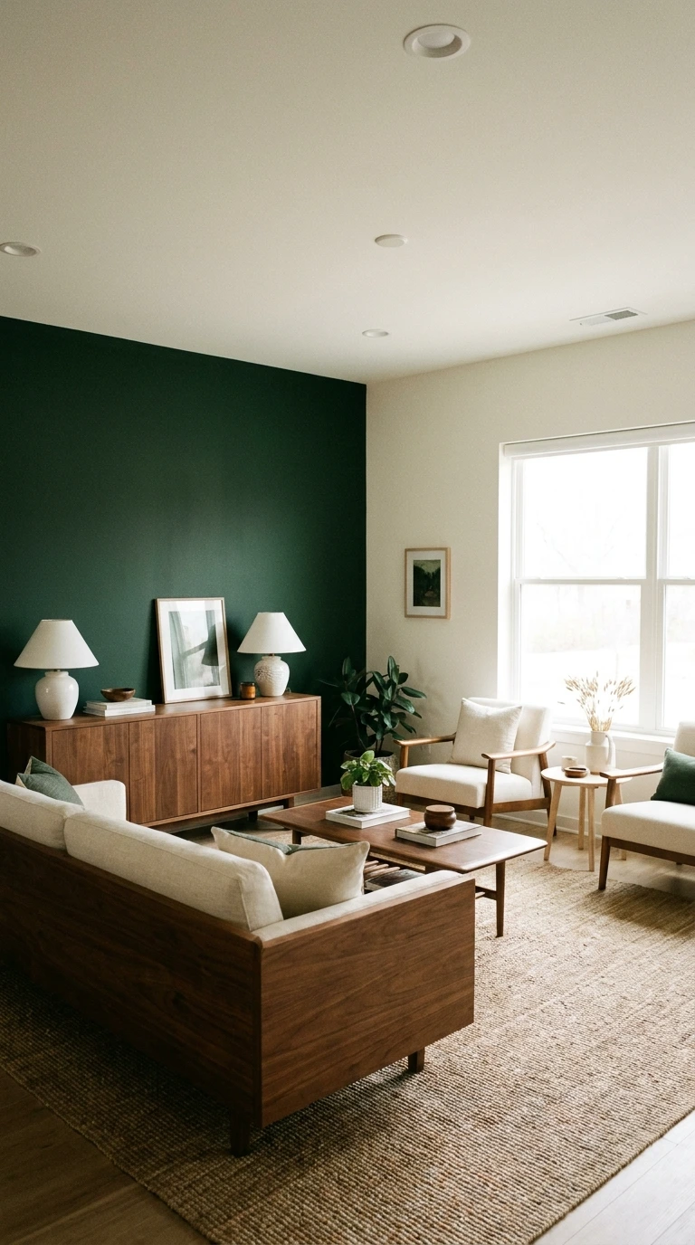
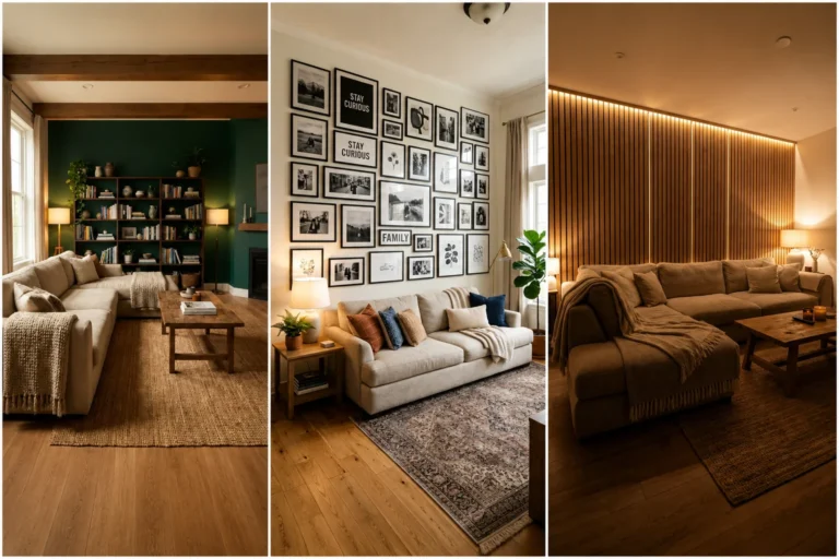
Deep forest green paired with warm white walls and walnut furniture is an interior designer’s shortcut to a living room that feels considered, masculine without being cold, and timeless without being boring. The green brings the outside in without feeling rustic or casual. Walnut adds warmth and grain that lighter woods cannot deliver in quite the same way.
This scheme works particularly well in rooms with high ceilings or large windows, where the forest green can breathe rather than dominate. Use it on a single wall as a starting point. Style with warm-toned textiles — terracotta cushions, a warm amber throw — to add contrast without introducing a fourth color.
Warning: Forest green reads very differently on north-facing versus south-facing walls. On a north-facing wall with limited natural light, deep green can read as almost black by late afternoon. Always test a large sample in the actual room before committing to the full wall.
9. Dusty Blue With Sand and Rattan
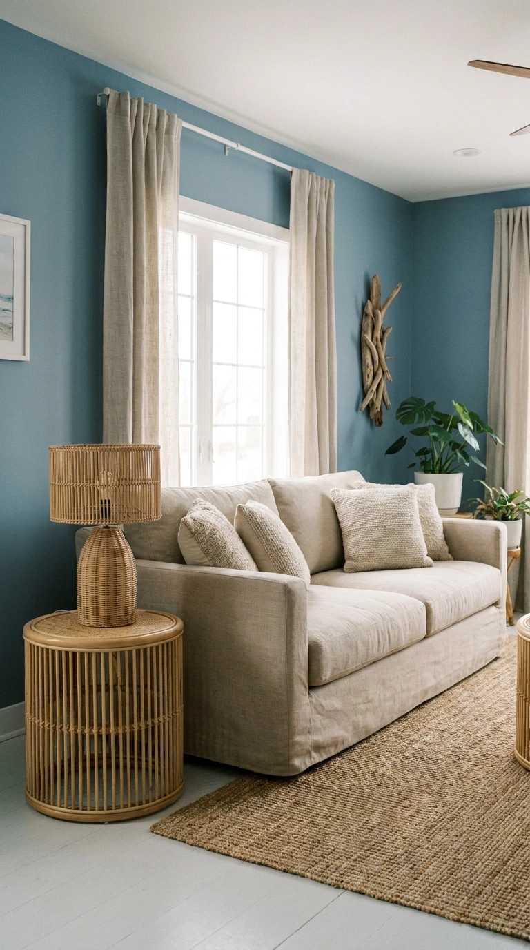
Dusty blue walls with sand-toned textiles and rattan furniture create a living room that feels coastal without being literal about it — no anchors, no nautical stripes, no obvious seaside references. Just a palette that feels light, airy, and genuinely calming. This scheme suits casual, relaxed living styles better than formal ones.
Keep the blue muted and dusty rather than bright or navy — the softness is what distinguishes this scheme from something more conventional. Introduce sand through a large area rug, a linen sofa, or curtains in a warm oatmeal tone. Rattan accents — a side table, a lamp base, a chair — complete the organic, relaxed quality.
10. Black and White With a Single Bold Accent Color
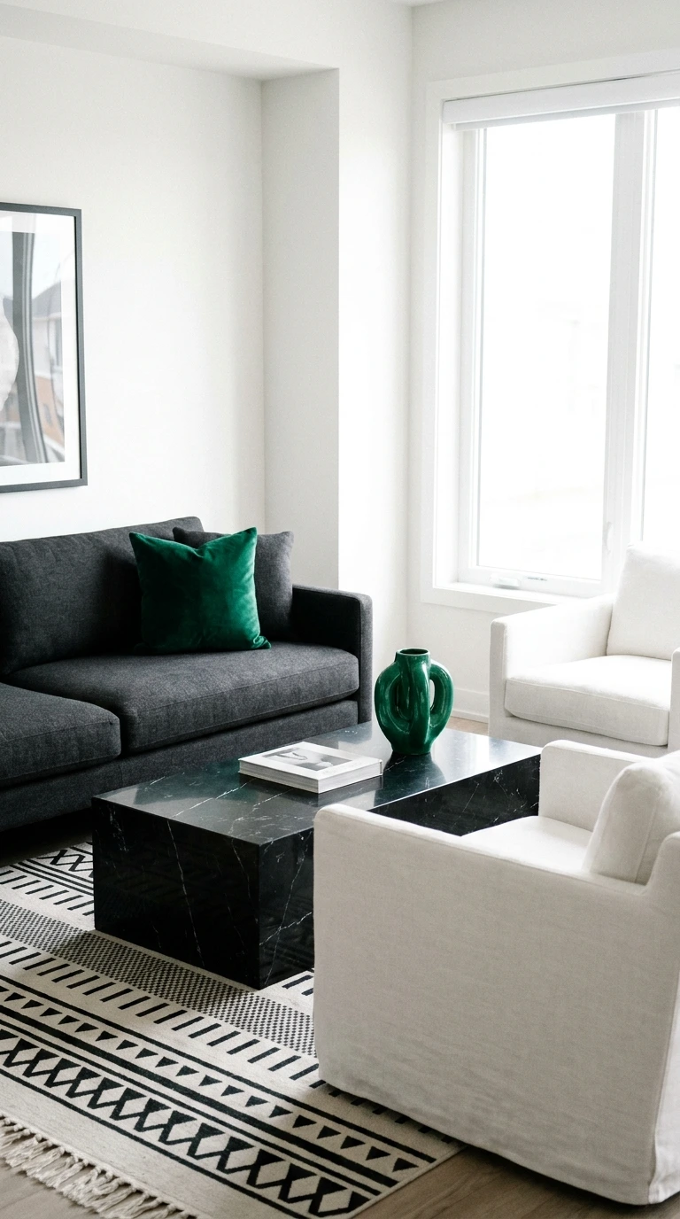
A black and white living room with one deliberately chosen accent color — emerald green, burnt orange, cobalt blue — is a scheme that reads as extremely confident and intentional. The monochrome base is the canvas; the accent color is the statement. This approach works because the rules are clear: everything is either black, white, or the accent. Nothing else.
Choose the accent color based on how you want the room to feel. Emerald creates drama and luxury. Burnt orange creates warmth and energy. Cobalt blue creates crispness and vibrancy. The accent should appear at least three times in the room — in a cushion, a piece of art, a plant pot — to feel intentional rather than accidental.
How to Introduce the Accent Color
- In the largest soft furnishing — a sofa or large rug
- As a recurring small object — cushions, a vase, a lamp shade
- In a piece of artwork that ties the whole palette together
- Through plants — a dark green adds life without disrupting the monochrome
11. Warm Caramel With Off-White and Copper
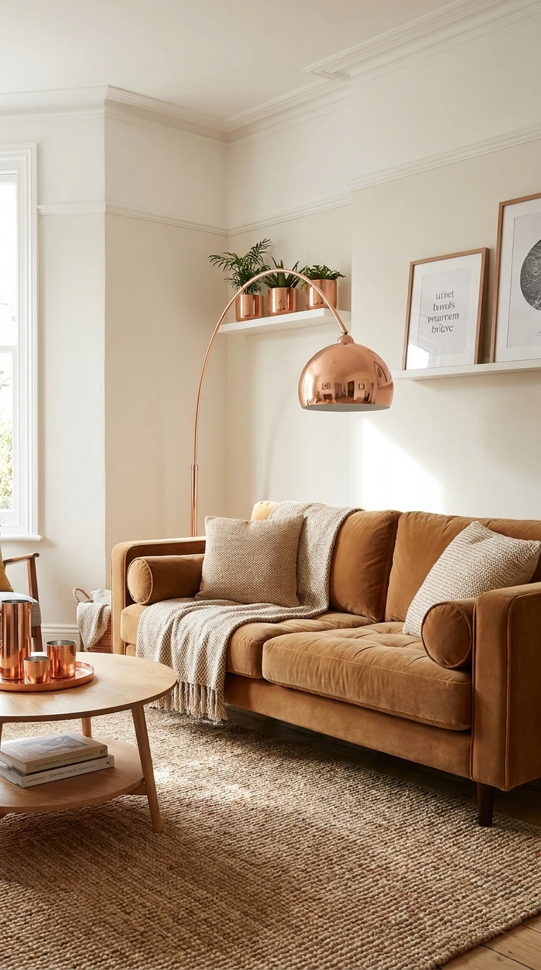
Caramel tones — in a sofa, in wall color, or both — create a living room that feels immediately warm and welcoming without the heaviness of darker brown or chocolate tones. Pair caramel with off-white walls and copper accents for a scheme that has genuine warmth at every layer. This is a palette that feels good to live in day to day, not just to look at in photographs.
The key with caramel is keeping everything warm — cool whites or silver accents will conflict with the yellow-red base of caramel tones. Off-white, ivory, or warm linen all work as neutrals. Copper appears best through smaller accents rather than large fixtures, where its saturation can become overwhelming.
12. Dusty Lavender With White and Silver
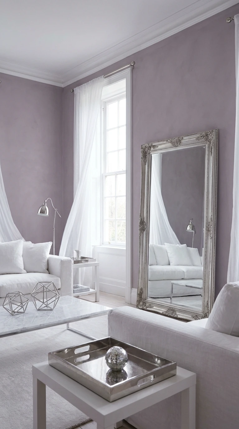
Dusty lavender in a living room is a choice that most people do not have the confidence to make — and consistently feel grateful for when they do. It is soft without being juvenile, cool without being cold, and genuinely distinctive in a landscape where most living rooms default to beige or gray. Pair it with white and silver for a palette that feels light and slightly ethereal.
Choose a lavender with enough gray in it to avoid reading as purple or lilac — the dustiness is what gives this scheme its sophistication. White trim and silver accents keep the scheme from feeling heavy. Add a large mirror with a silver or chrome frame to maximize the light-reflecting quality of the whole palette.
Important: Lavender and dusty purple tones shift dramatically under different light sources. Under warm incandescent light, lavender walls can read as pink. Under cool LED light, they read as gray. Test your chosen shade under the actual light sources in your living room before committing.
13. Warm Greige With Chocolate Accents
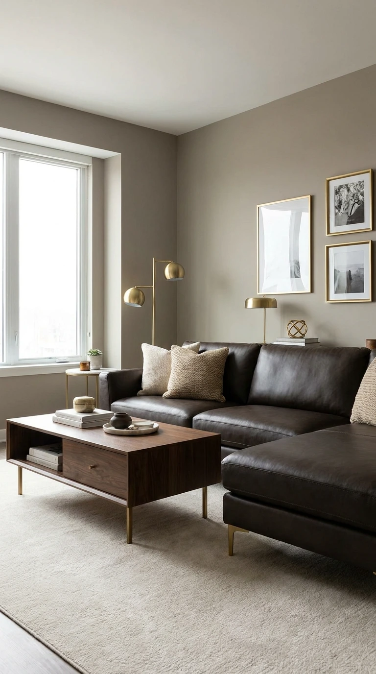
Greige — a true halfway point between gray and beige — is the neutral that works in more spaces than any other single color. It is versatile enough to feel contemporary or traditional depending on what you put with it, warm enough to avoid the clinical feel of cool gray, and grounded enough to avoid the sweetness of pure beige. Pair it with chocolate brown accents for a scheme that feels sophisticated and resolved.
The chocolate accents should appear through furnishings rather than walls — a deep brown leather sofa, a dark wood coffee table, warm-toned cushions. Keep the accessories in gold or warm brass tones to add light to what could otherwise be a palette that leans a little dark.
14. Blush Pink With Charcoal and Gold
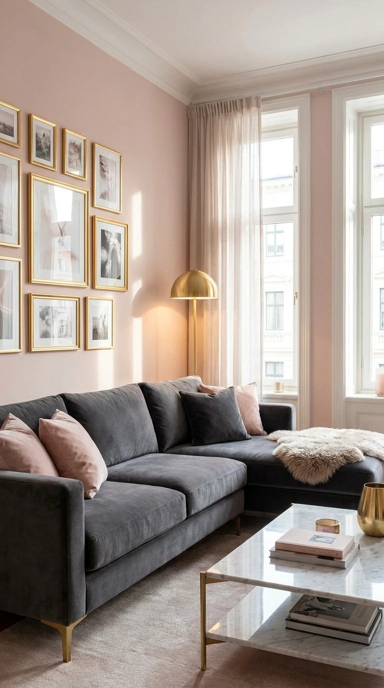
Blush pink and charcoal is one of the most sophisticated color combinations available — and one that works precisely because the two colors have no obvious natural relationship. The warmth of blush and the cool depth of charcoal create a tension that keeps the eye moving around the room. Gold resolves the tension, providing warmth that sits comfortably alongside both.
Use charcoal on a single wall behind the sofa or in a large, dark sofa against blush-toned walls. Avoid using both as wall colors in the same room — the contrast is most effective when one is structural and one is decorative. Gold appears through accessories — picture frames, light fixtures, cushion piping.
Making Blush and Charcoal Work Together
- Keep blush soft and dusty, never bright or candy-like
- Use charcoal as a grounding element, not a dominant one
- Introduce gold in at least three separate places for cohesion
- Add a large rug in a neutral warm tone to connect the two colors at floor level
- Choose soft furnishings in natural linen or velvet for the right texture alongside both colors
15. Warm Ochre With Deep Teal and Natural Wood
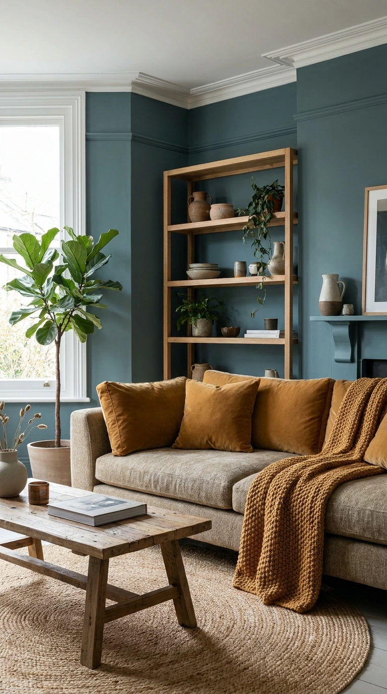
Ochre and teal is a combination that requires confidence — and rewards it. These are complementary colors that create visual energy without discord when both are kept in their muted, earthy versions. Natural wood grounds the palette and prevents it from feeling graphic or aggressive. This scheme brings genuine color into a living room without sacrificing sophistication.
Use ochre sparingly — in cushions, a throw, a piece of art, or a single accent wall — rather than as the dominant wall color. Let teal carry more of the weight, either as a wall color or in a large sofa. Natural wood in furniture and flooring creates the neutral foundation that stops the two colors from competing.
- Choose your largest piece of furniture first and build the color scheme around it
- Repeat every color at least three times throughout the room
- Test paint colors in the room at different times of day before committing
- Keep metals consistent — mixing brass, chrome, and copper is almost always a mistake
- Add one unexpected accent that is slightly darker or deeper than the rest of the palette
16. Burnt Orange With Cream and Dark Walnut
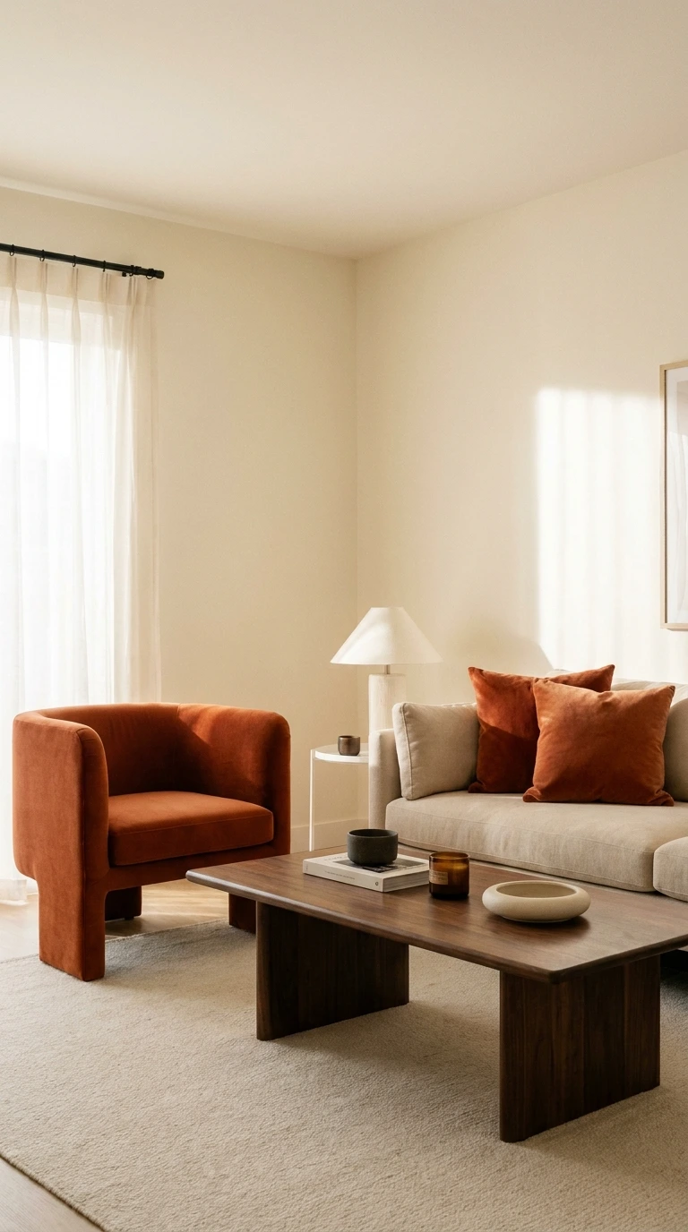
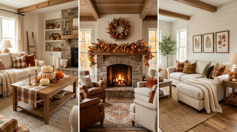
Burnt orange is not a color most people think of for a living room — and that is exactly why it works so well when chosen with intention. It brings warmth, energy, and a connection to natural materials that more common color choices simply do not deliver. Paired with cream and dark walnut, it creates a scheme that feels both bold and deeply grounded.
Use burnt orange as an accent rather than a dominant wall color unless the room has excellent natural light and generous proportions. Bring it in through cushions, a statement chair, a ceramic lamp, or a piece of art. Let cream carry the walls and large furniture, and let dark walnut ground everything at floor level.
17. Deep Plum With Warm Gold and Ivory
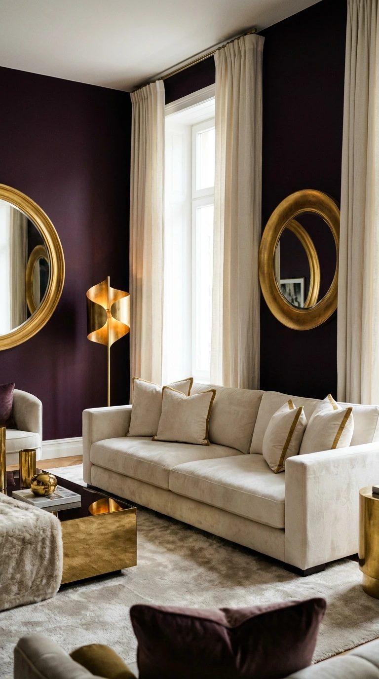
Deep plum in a living room is a dramatic, confident choice that creates an atmosphere of genuine luxury when handled correctly. It works best in rooms where the goal is enclosure and intimacy rather than openness and airiness. Pair it with warm gold and ivory to keep the scheme warm and avoid the coldness that purple tones can sometimes carry.
Use plum on two walls maximum — the wall behind the sofa and perhaps one adjacent wall. Keep the ceiling and remaining walls in ivory or warm white. Gold appears through light fixtures, cushion accents, and a large mirror frame. Ivory in the sofa and curtains provides the breathing room the scheme needs to feel rich rather than oppressive.
18. Classic Blue and White With Natural Accents
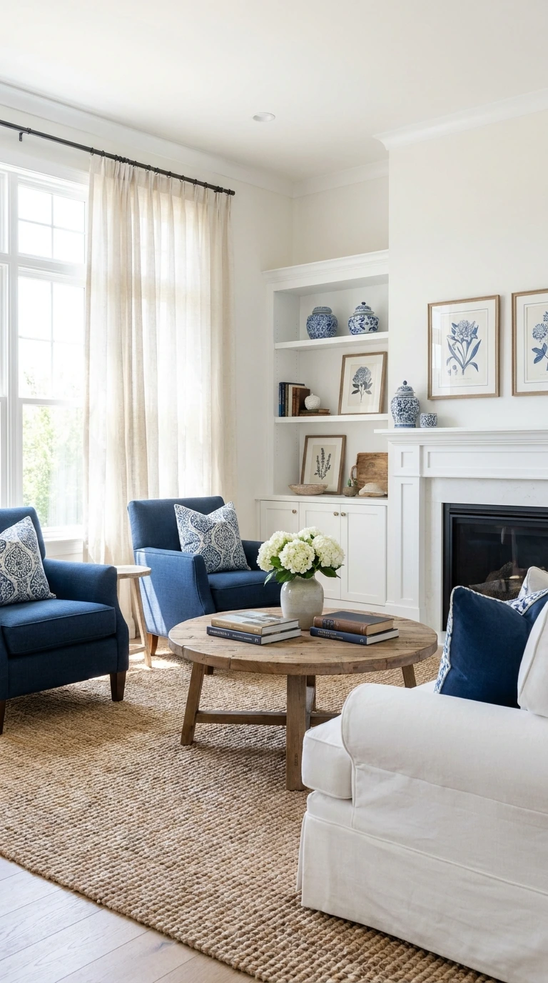
Blue and white is one of the oldest color combinations in interior design and one of the most enduring precisely because it never resolves into a trend — it simply is. The classic pairing feels fresh every decade because the proportions and the specific shades change while the fundamental logic stays the same. Natural accents — wood, linen, jute — update it for a contemporary context.
The key decision is which blue. Cornflower blue feels informal and cheerful. Indigo feels dramatic and considered. Sky blue feels light and airy. Navy feels structured and confident. Each brings a completely different atmosphere to the white-and-blue base. Choose the one that matches the mood you want the room to carry.
Pro Tip: In a blue and white living room, introduce the natural accents through the largest possible pieces — a jute rug, a linen curtain, a wooden coffee table. Small natural accents in an otherwise graphic palette look like afterthoughts rather than intentional additions.
19. Moody Charcoal With Warm Amber and Aged Brass
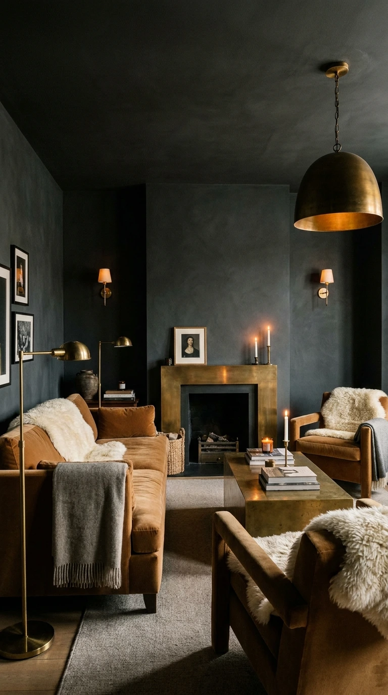
A fully charcoal living room — walls, and potentially ceiling — creates an enveloping atmosphere that no lighter palette can replicate. The key to making it work rather than oppressive is the warmth of the accents. Amber-toned lighting, aged brass fixtures, warm wood furniture, and textiles in caramel and cream all work against the dark ground to create a room that feels deeply cozy.
This scheme requires commitment. Half-measures — one charcoal wall among three lighter ones — rarely achieve the atmospheric quality that makes this approach worth choosing. If you are going to go dark, go all the way, and trust that the warm accents will do the work of keeping the room livable.
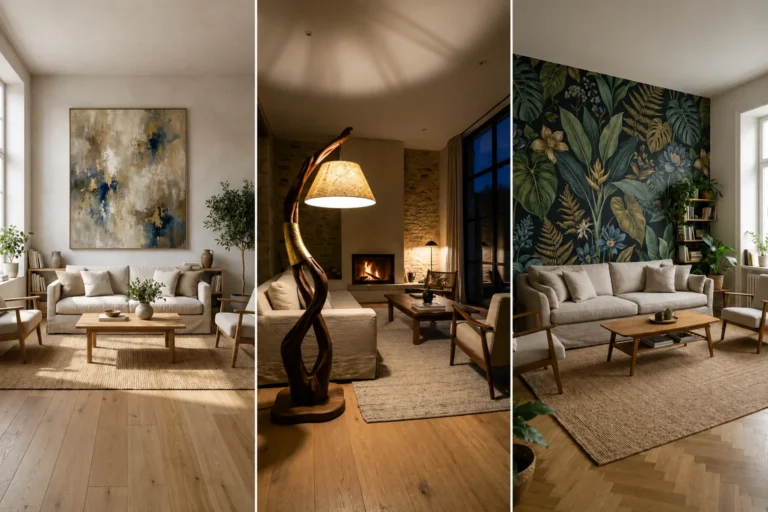
20. Earthy Neutrals — Sand, Stone, Bone, and Linen
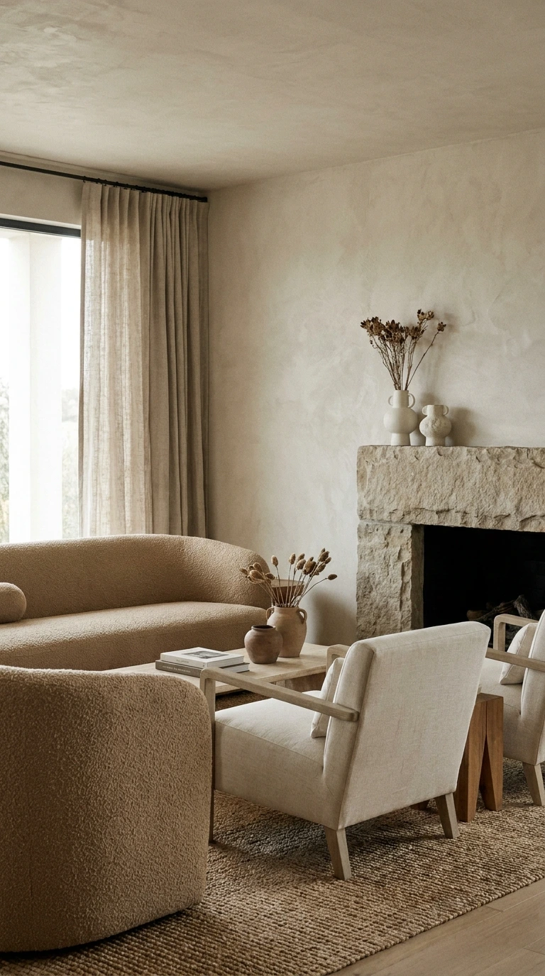
A scheme built entirely from earthy neutrals — sand, stone, bone, warm gray, pale terracotta, and linen — creates a living room of quiet, layered sophistication. There is no single focal point, no accent color, no statement piece. The interest comes entirely from the relationship between adjacent tones and the variety of textures that carry them.
This is one of the most difficult schemes to execute well precisely because there is nowhere to hide — every material choice matters, every texture needs to earn its place. But when it works, it creates a living room that feels genuinely timeless and deeply calm in a way that color-driven schemes rarely achieve.
How to Build an Earthy Neutral Scheme
- Start with the lightest tone — a warm white or pale stone — on the walls
- Layer in mid-tones through the largest pieces of furniture
- Add the darkest neutral through accessories, a rug, or a single accent piece
- Vary the textures aggressively — wool, linen, wood, stone, jute, ceramic
- Avoid any color that is too cool, too saturated, or too obviously from outside the neutral family
Frequently Asked Questions
How do I choose a living room color scheme?
Start with the largest piece of furniture you already own or plan to buy, since it will be the dominant color in the room. Build the rest of the palette around it, choosing a wall color that complements rather than competes. Most successful living room schemes use three colors — a dominant, a secondary, and an accent.
What color makes a living room look bigger?
Light, warm neutrals — warm white, cream, pale sage, and dusty blue — all make a living room feel larger by reflecting light and reducing the sense of visual boundaries. Cool colors can also expand a space but need to be used carefully to avoid a clinical feel.
How many colors should be in a living room?
Three is the number most interior designers work with — a dominant color, a secondary color, and an accent. More than four distinct colors in a living room almost always creates a feeling of visual confusion. The rule is simple: choose fewer colors and repeat each one more times.
Can I use dark colors in a small living room?
Yes, with care. A single dark accent wall in a small living room can create depth and drama that makes the room feel more intentional. Using dark color on all four walls in a small room requires very good lighting and deliberate warm accents to avoid feeling oppressive.
What is the most timeless living room color?
Warm white with warm wood and brass is the combination that appears most consistently across decades of interior design, regardless of what is trending at any given moment. It works in almost every architectural style and adapts easily as other elements of the room change.
How do I use color as an accent without it looking accidental?
Repeat the accent color at least three times in the room — in a cushion, a piece of art, and a small object. One instance of an accent color looks like a mistake. Three instances look intentional. Five or more instances make it a secondary color rather than an accent.
Should my living room color scheme match the rest of the house?
Not necessarily match, but transition. Adjacent rooms should share at least one color so the move from room to room feels coherent rather than jarring. The living room can have its own distinct palette as long as it shares a tonal family with the spaces that connect to it.
Conclusion
The right color scheme does not just make a living room look better — it changes how the room feels to be in. That is the standard worth holding every color decision to. Not whether it is fashionable. Not whether it photographs well. Whether it creates the atmosphere you actually want to live in every day.
Start with one scheme from this list that resonates most with the feeling you want and work from there. Test the colors in your actual room under your actual light. Adjust until the palette feels resolved. Then stop adding and start living in it.