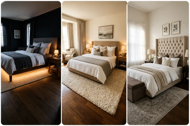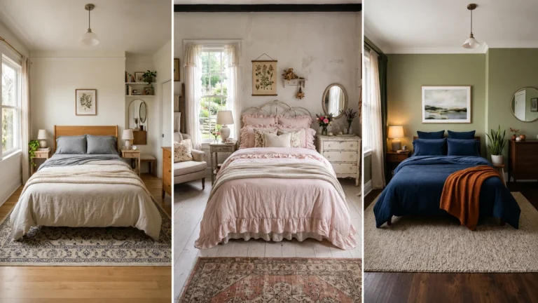
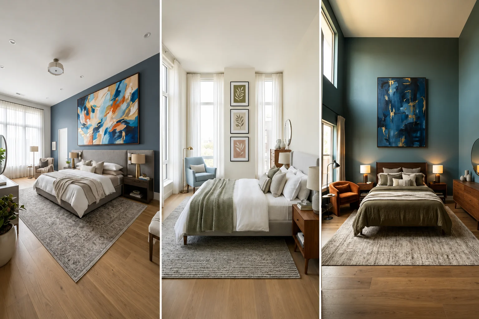
How to Hang Bedroom Wall Decor Like an Interior Designer

Introduction
Few small details affect a bedroom’s overall polish as much as how its wall decor is hung. Even beautiful, expensive art can look oddly out of place if it’s positioned too high, too low, or out of proportion with the furniture beneath it, while a modest print hung with genuine intention can transform a plain wall into the room’s clear focal point.
The good news is that professional-looking wall decor placement comes down to a handful of repeatable, measurable rules rather than any innate design talent. Below are 40 designer-approved principles covering height, scale, spacing, and styling, so you can hang your bedroom’s art and decor with the same confidence and precision a professional would.
Pro Tip: Before hammering a single nail, trace your frames onto kraft paper, cut them out, and tape the paper cutouts to the wall. Live with the mockup for a day or two to confirm the proportions genuinely feel right before committing to permanent holes.
1. Use the 57 to 60 Inch Rule for Open Wall Space
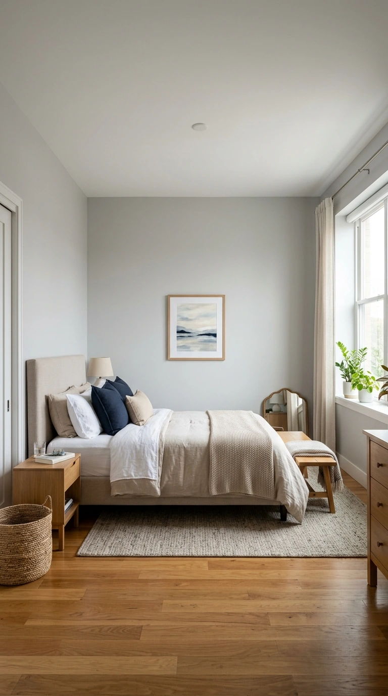
For any art hung on a blank wall without furniture directly beneath it, center the piece so its middle point sits between 57 and 60 inches from the floor. This standard is based on average human eye level and is the same measurement used by museums and professional galleries to create a consistent, balanced visual line throughout a home.
Rather than relying on your own personal eye level, which varies significantly depending on your height, this fixed measurement ensures the art feels correctly placed regardless of who’s viewing it. Mark this height directly on the wall with a pencil before hanging anything, then align the center of your frame with that specific mark.
2. Don’t Rely on Your Own Eye Level as a Guide
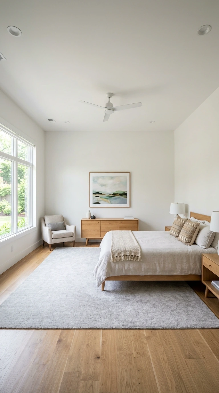
A common piece of advice tells people to hang art “at eye level,” but this instruction is far more subjective than it sounds. Taller individuals or those with high ceilings tend to hang everything too high when guessing based on their own perspective, while shorter people often end up placing art too low.
Using the fixed 57 to 60 inch measurement instead of your own eye level removes this guesswork entirely. This single adjustment is one of the most common fixes interior designers make when correcting a client’s existing wall art placement.
3. Leave 6 to 8 Inches Above Furniture
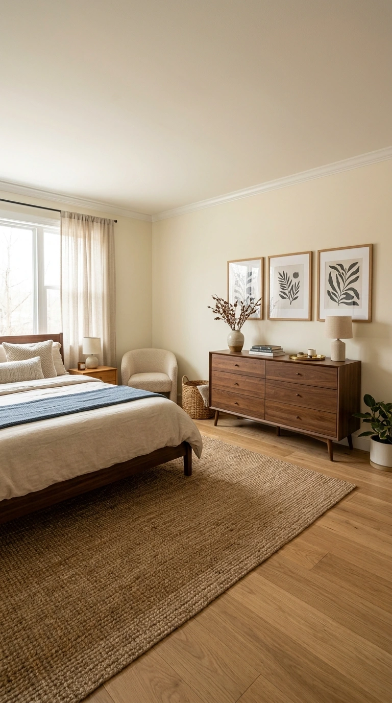
When art hangs directly above a piece of furniture, like a dresser or console, leave roughly 6 to 8 inches of space between the top of the furniture and the bottom of the frame. This gap keeps the art feeling visually connected to the furniture beneath it rather than floating disconnected higher up the wall.
Too much space between the two elements makes the composition feel disjointed, while too little can make the arrangement feel cramped. This 6 to 8 inch range consistently strikes the right balance across most standard furniture heights.
4. Hang Art 6 to 10 Inches Above a Headboard
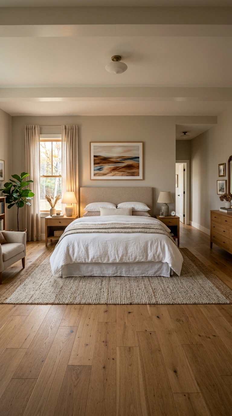
Art positioned above a bed’s headboard should sit with its bottom edge roughly 6 to 10 inches above the top of the headboard. This spacing keeps the piece feeling connected to the bed as a cohesive composition, rather than appearing to float toward the ceiling.
This is one of the single most common mistakes in bedroom design: hanging art too high above an already tall headboard. Since the headboard itself already occupies significant vertical space, keeping this gap on the tighter end of the range typically produces the most balanced result.
Warning: Hanging art with the bottom edge more than 10 to 12 inches above the headboard is one of the most frequent bedroom design mistakes, making the piece look disconnected and randomly placed rather than intentional. When in doubt, err toward the tighter end of the 6 to 10 inch range.
5. Follow the Two-Thirds Width Rule Above the Bed
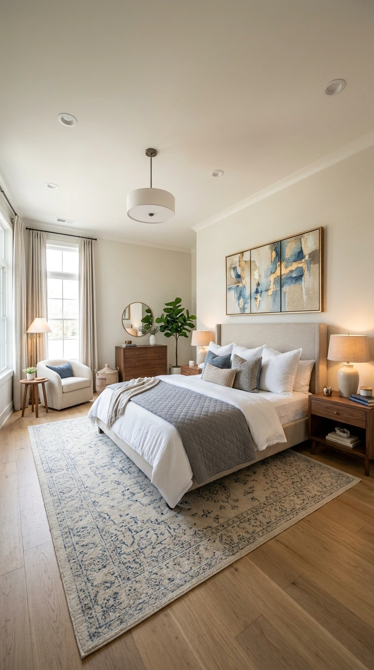
Your artwork’s total width should equal roughly two-thirds of your headboard’s width, sometimes expressed as a range between 60 and 80 percent. This proportion consistently reads as intentional and balanced to the eye, which is why interior designers rely on it so heavily.
For a queen bed, this typically translates to artwork around 36 to 48 inches wide, while king beds can accommodate pieces between 48 and 60 inches wide. Art that’s noticeably smaller than this range tends to look disconnected and lost above the larger bed beneath it.
6. Never Let Art Exceed the Furniture’s Width
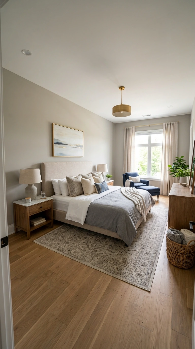
Just as art shouldn’t be too narrow for the bed or dresser beneath it, it also shouldn’t extend wider than the furniture itself. Art that spills beyond the edges of a headboard or dresser makes that furniture piece look comparatively small and undersized.
Measuring your furniture’s exact width before shopping for art prevents this common miscalculation. Staying within the two-thirds to three-quarters range keeps the composition feeling proportional in both directions.
7. Adjust Higher for Rooms with Tall Ceilings
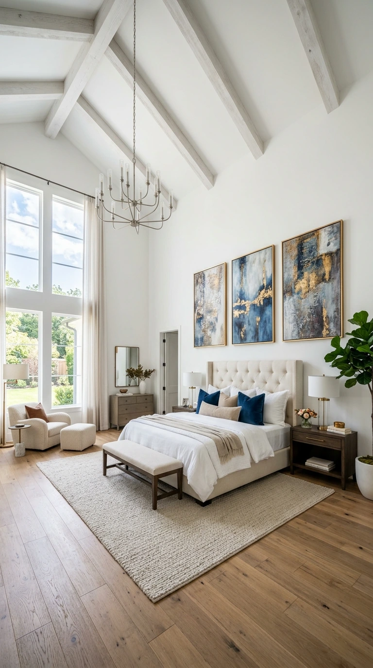
If your bedroom has notably high ceilings, sticking rigidly to 57 inches can make art feel too low relative to the room’s overall vertical scale. In these cases, shift the center point up slightly to around 60 to 62 inches from the floor.
This adjustment ensures the art feels proportional to the wall’s height without losing its connection to human eye level entirely. The key is a subtle shift, not dramatically raising the piece simply because there’s more empty wall space above it.
8. Test Placement with Painter’s Tape First
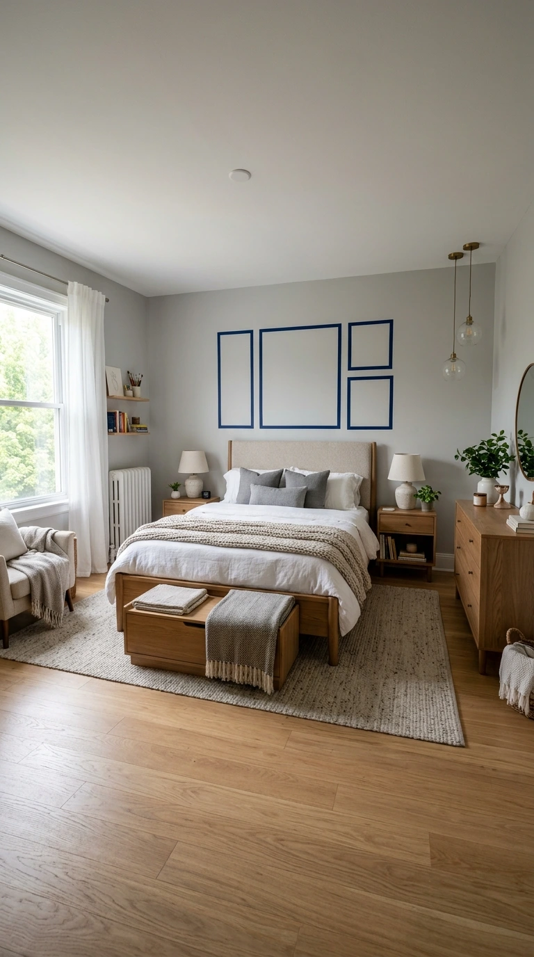
Before drilling or hammering a single hole, outline your intended art placement directly on the wall using painter’s tape. This simple, reversible step lets you evaluate proportions and positioning in the room’s actual light and layout before making any permanent commitment.
Living with the taped outline for a day or two, rather than deciding immediately, often reveals adjustments that weren’t obvious at first glance. This step costs nothing beyond a roll of tape and a bit of patience.
9. Measure to the Center Point, Not the Top of the Frame
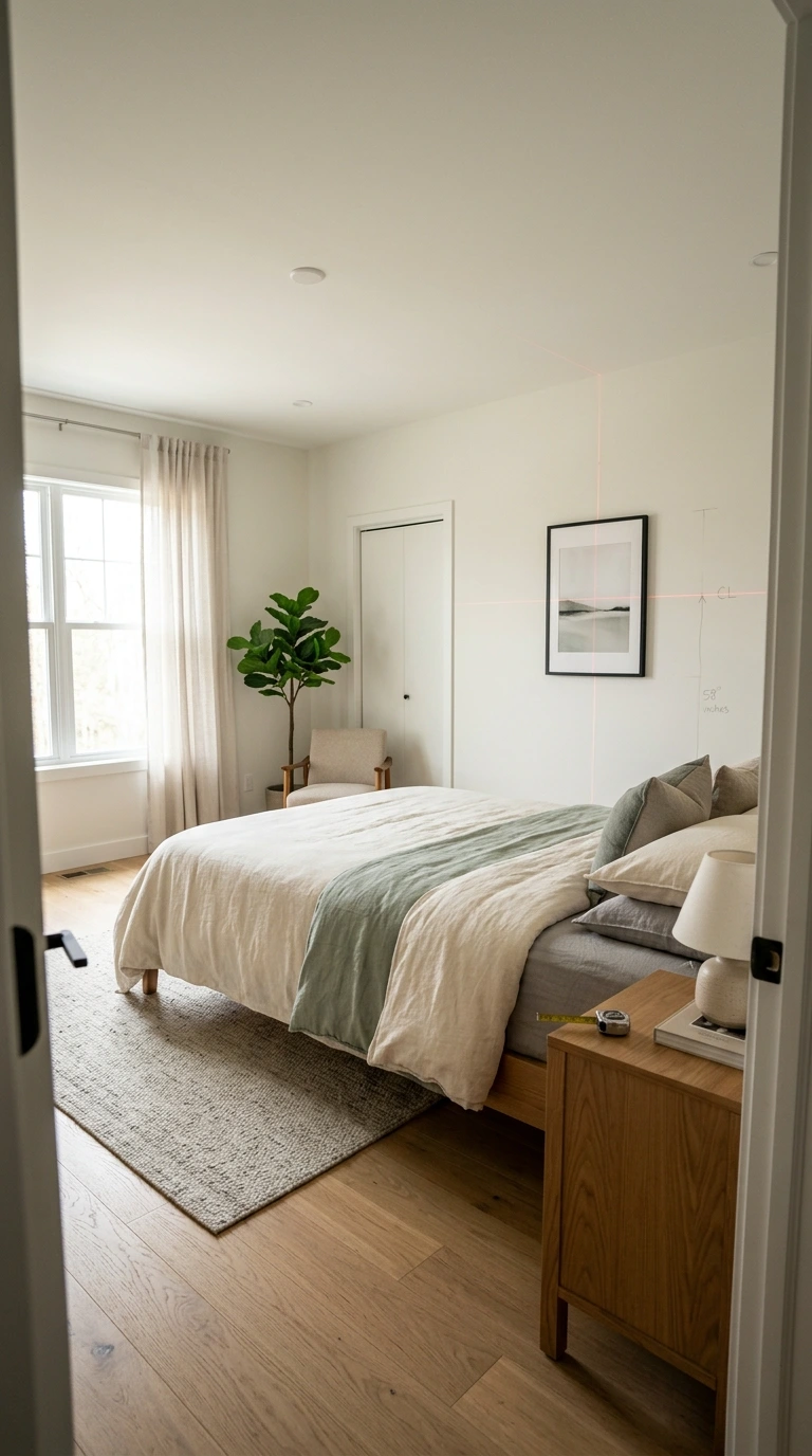
When calculating your target height, always measure to where the center of the artwork will land, not the top edge of the frame. This distinction matters because frame heights vary considerably between pieces, while the center point remains the consistent, comparable reference across your entire home.
To find the correct top-of-frame position, divide your art’s height by two, then add that number to your target center height, generally 57 inches. This calculation ensures accuracy regardless of how tall or short the specific piece happens to be.
Important: Confusing center height with top-of-frame height is one of the most common measurement errors when hanging art. Always double-check which point you’re measuring to before marking your wall, since this mistake can throw off placement by several inches.
10. Choose Horizontal Orientation Above the Bed
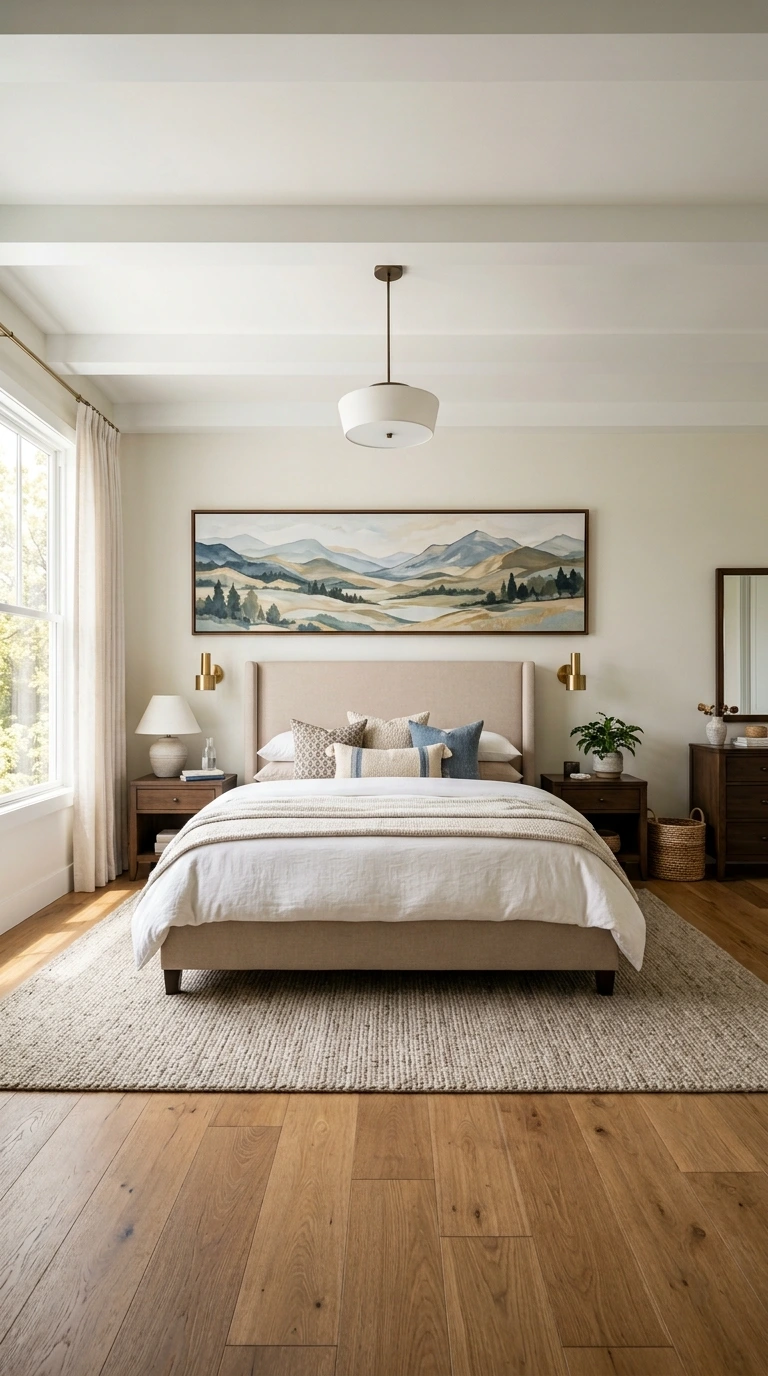
Horizontal artwork tends to work best above a bed, since its wider, shorter shape naturally mirrors the horizontal line of the bed and headboard beneath it. This orientation reinforces the sense of visual connection between art and furniture.
If you’re drawn to a vertical piece instead, consider using it on a side wall rather than directly above the headboard, where its shape may feel visually at odds with the bed’s own proportions. Matching orientation to the furniture below remains one of the simplest ways to achieve a cohesive composition.
11. Consider a Diptych or Triptych for Wider Beds
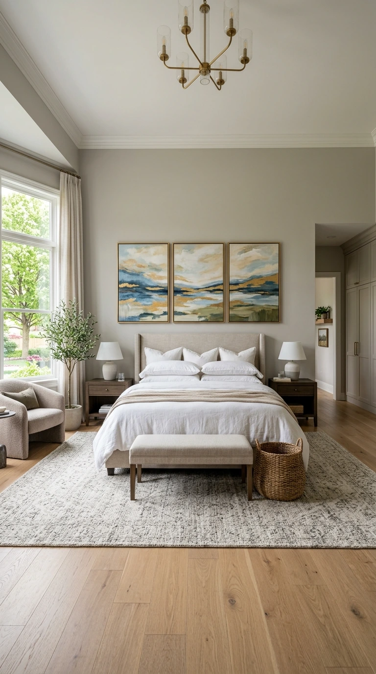
Rather than searching for a single oversized piece, a two-panel diptych or three-panel triptych arrangement can achieve the same overall visual impact while working particularly well above larger king or queen beds. This approach also opens up more art options, since suitably large single pieces can be difficult to find.
Choosing panels from the same cohesive set, rather than mismatched individual pieces, ensures the grouping reads as one unified composition rather than several unrelated works. This technique remains a favorite among designers specifically for wider walls needing a substantial visual anchor.
12. Keep Spacing Between Grouped Pieces Tight
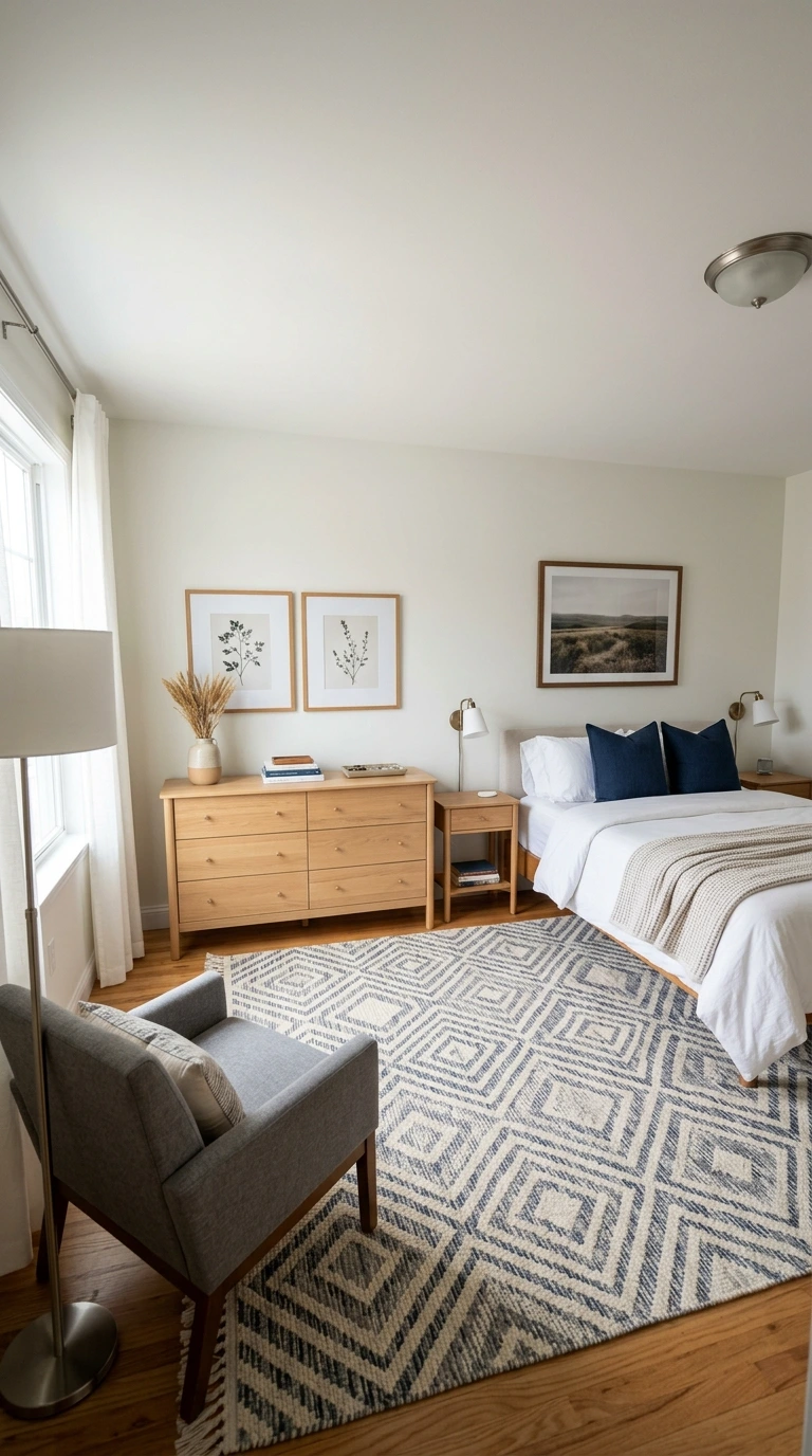
When hanging multiple frames side by side, keep the gap between them relatively tight, generally 2 to 4 inches. Spacing that’s too wide makes a grouping look scattered and unrelated, while tighter spacing reads as one cohesive collection.
This principle applies whether you’re hanging a matching pair, a diptych, or several pieces within a larger gallery arrangement. Consistency in this spacing matters more than the exact number chosen, so pick a measurement and apply it uniformly throughout the grouping.
13. Center the Entire Grouping as One Unit
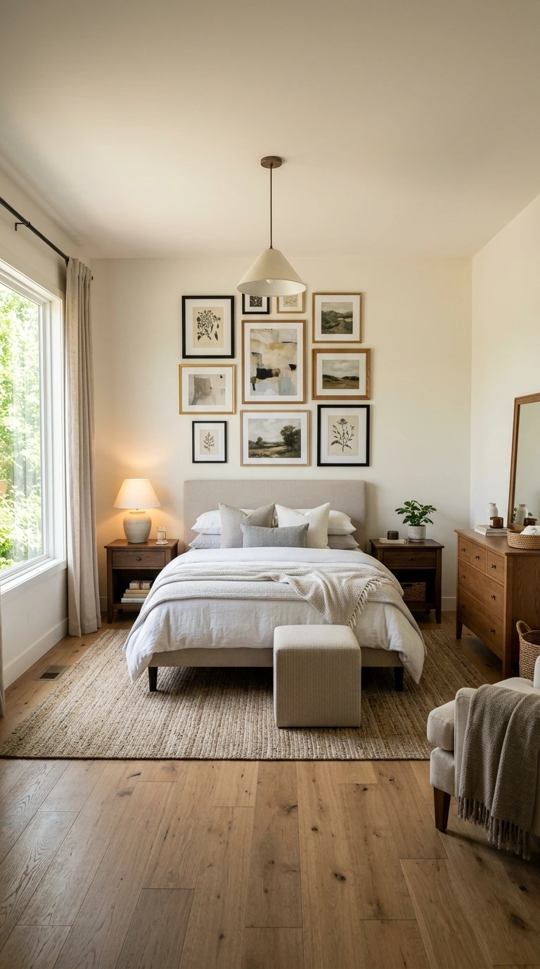
When hanging a gallery wall or multi-piece arrangement, treat the whole grouping as a single visual unit rather than centering each individual frame separately. Find the center point of the entire collection and align that point with your target height, generally 57 inches.
This approach ensures the overall composition feels balanced, even though individual pieces within it may vary in size. Failing to apply this rule is a common reason multi-piece arrangements end up looking disjointed rather than cohesive.
14. Use Paper Templates for Complex Gallery Walls
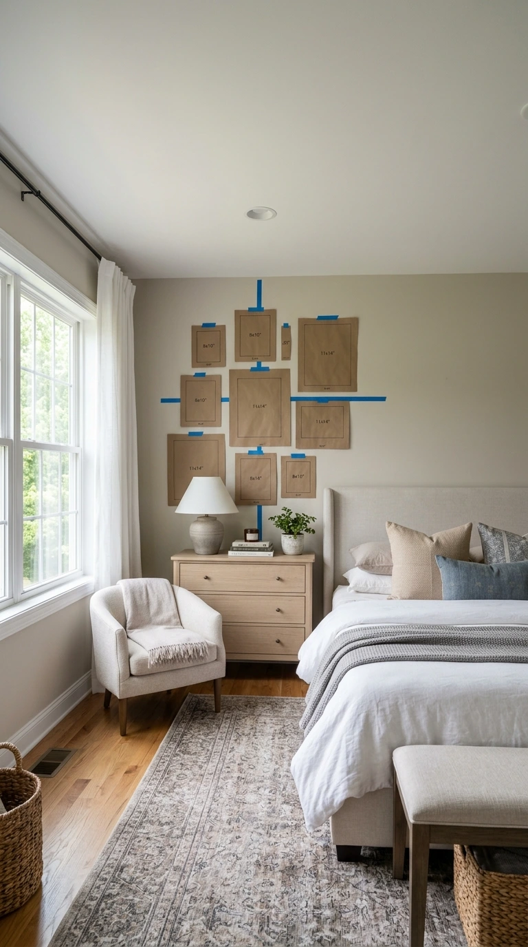
For gallery walls involving several different frame sizes, cutting paper templates to match each piece’s exact dimensions and taping them to the wall first prevents costly measuring mistakes. This method lets you rearrange the layout freely before committing to any nail holes.
Once the arrangement looks correct on paper, you can hammer nails directly through the template itself for precise placement. This technique is one of the most reliable ways to plan a complex, multi-piece wall composition with confidence.
15. Create Symmetry with Matching Pairs
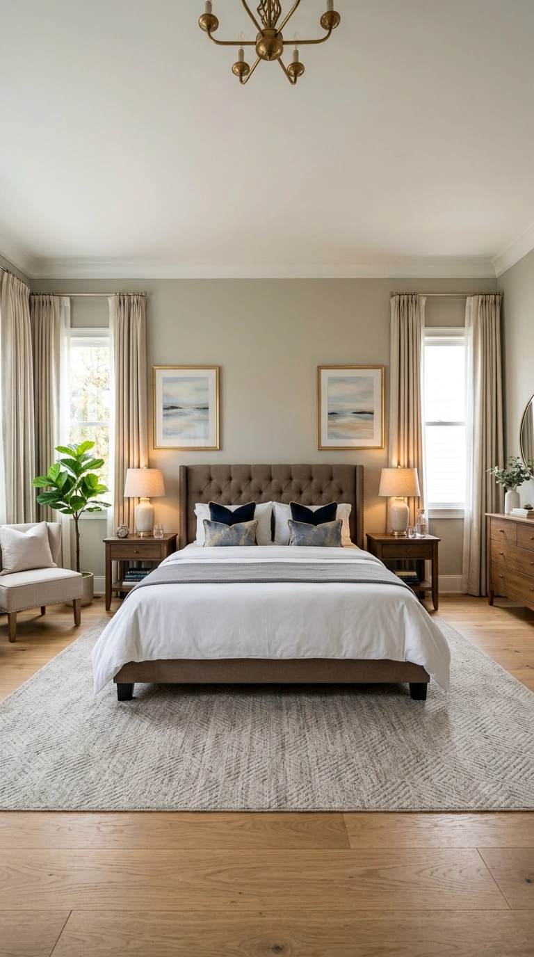
Two identical or closely matching pieces hung symmetrically on either side of a headboard, or flanking a window, create an immediately polished, intentional look. Symmetry reads as calm and orderly, which suits a bedroom’s restful function particularly well.
Choosing pieces in matching sizes and keeping their spacing perfectly even reinforces this sense of intentional balance. A well-executed symmetrical pair almost always looks more considered than two random, mismatched frames placed in a similar arrangement.
- ✅ Center open-wall art between 57 and 60 inches from the floor
- ✅ Leave 6 to 10 inches between the top of a headboard and the bottom of art above it
- ✅ Keep art width between two-thirds and three-quarters of the furniture beneath it
- ✅ Adjust to 60-62 inches center height for rooms with notably high ceilings
- ✅ Test every placement with painter’s tape before drilling any holes
16. Choose Art Colors That Echo Your Existing Palette
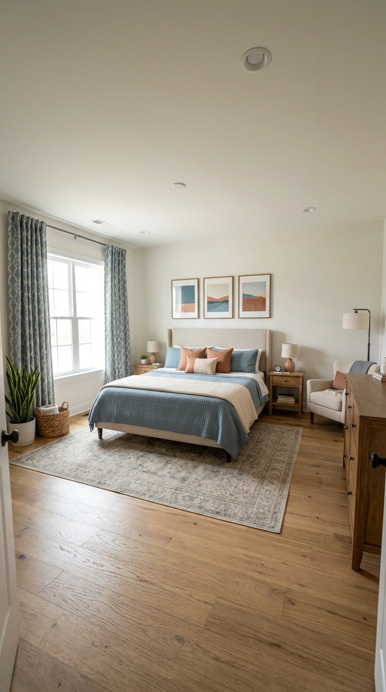
Bedroom wall art doesn’t need to match your bedding or wall color exactly, but it should genuinely harmonize with your room’s existing color scheme. Look for pieces that pick up at least one or two colors already present in your bedding, curtains, or other accessories.
This approach ties the art into the room’s broader design story rather than letting it feel like an unrelated addition. Choosing art with a mix of your existing palette plus one fresh accent color adds visual interest while still feeling cohesive overall.
17. Add One Accent Color for Visual Interest
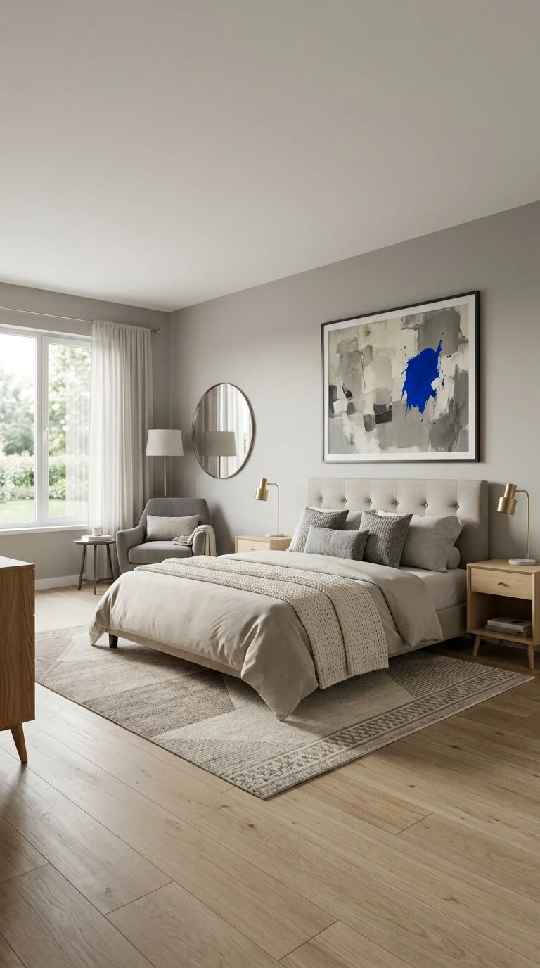
While harmony matters, introducing a single accent color through your art that isn’t otherwise present in the room adds a layer of depth and interest beyond a purely matched palette. This small departure keeps the space from feeling flat or overly predictable.
Choosing this accent thoughtfully, rather than at random, ensures it still feels intentional within the room’s overall color story. A single unexpected pop of color through wall art often becomes a genuinely memorable design detail.
18. Position Art Away from Ceiling Fan Rotation
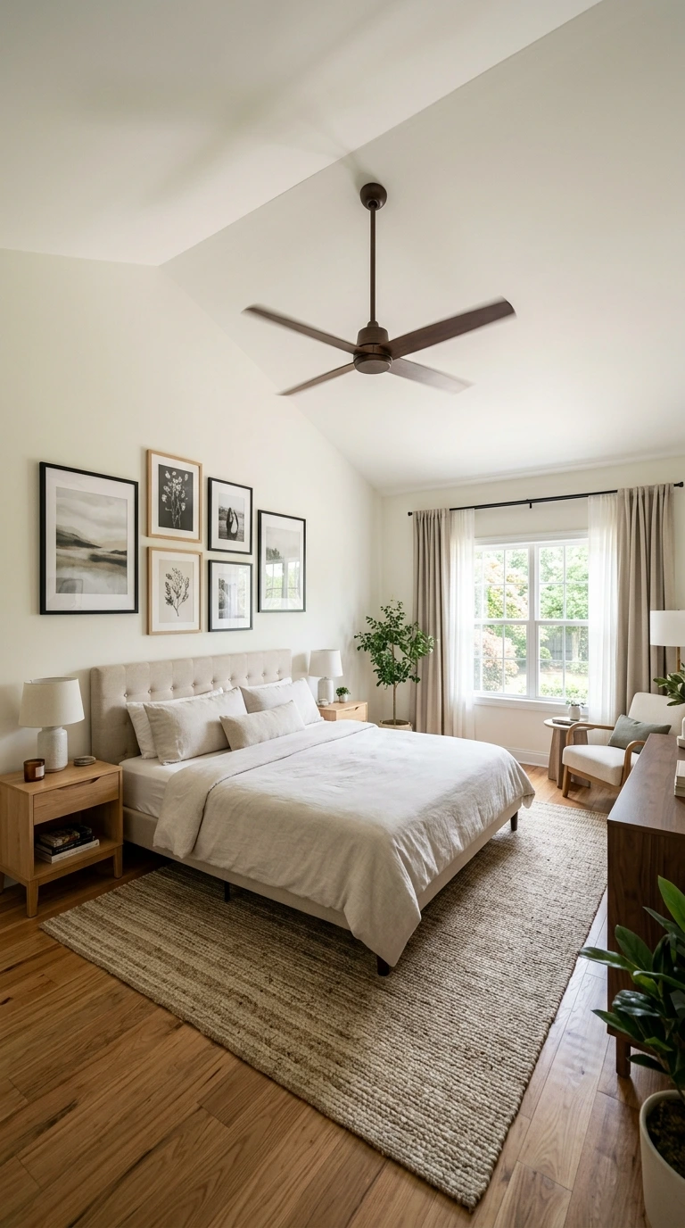
If your bedroom includes a ceiling fan, ensure any wall art or shelving is positioned far enough away from the fan’s rotation and airflow path. Vibration from a nearby fan can gradually loosen hanging hardware over time, creating a genuine safety concern.
This consideration matters especially for heavier pieces or those hung directly above the bed, where any potential fall poses greater risk. A few extra inches of clearance from the fan’s blade radius provides meaningful peace of mind.
19. Follow a Sloped Ceiling’s Angle Rather Than Fighting It
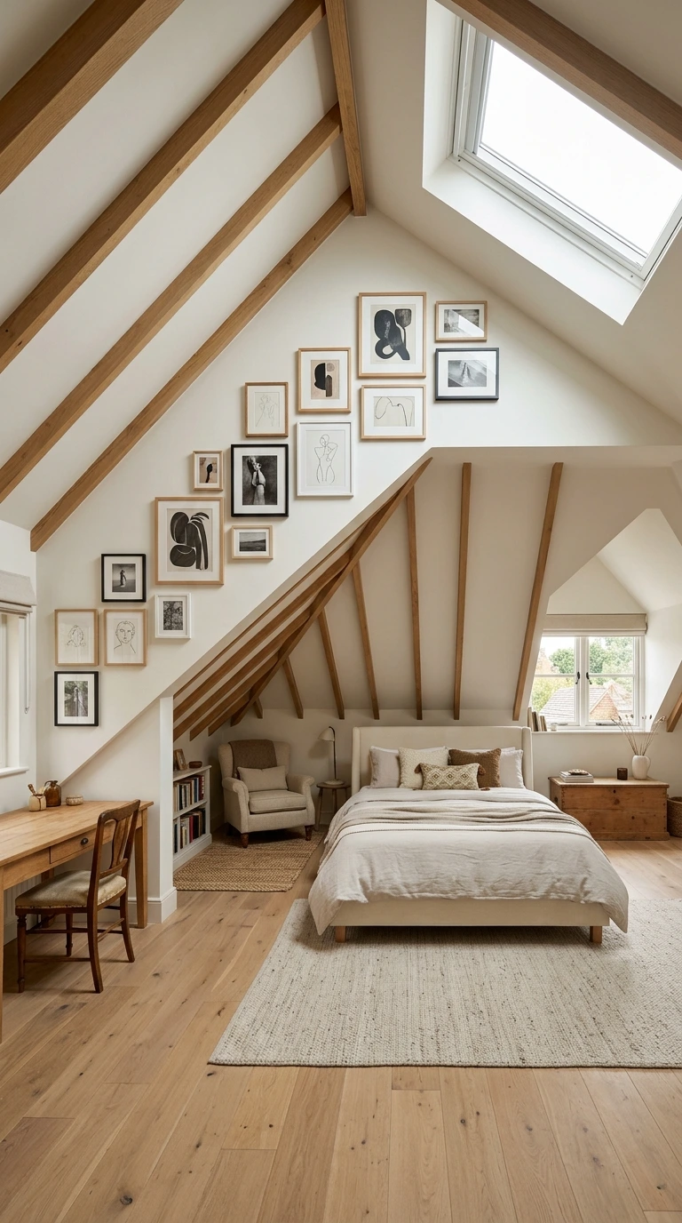
In bedrooms with an angled or sloped ceiling, work with that architectural feature rather than trying to force standard height rules onto an irregular wall. Center the art visually within the available wall space, adjusting height as needed to feel proportional to that unique shape.
The same core proportion principles, like the two-thirds width rule, still apply; they simply need to be adapted to your specific architecture. Fighting a sloped ceiling’s natural lines typically looks more awkward than embracing and working within them.
20. Consider Leaning Art Instead of Hanging It
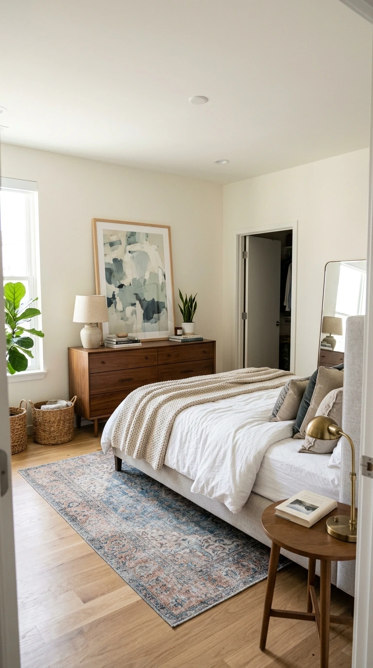
Leaning a piece against the wall atop a dresser, shelf, or even the floor for larger pieces creates a relaxed, collected look that differs intentionally from a fully mounted gallery wall. This casual styling choice has become a popular, low-commitment alternative to permanent hanging.
This approach also allows you to swap pieces easily without creating new nail holes each time your taste evolves. Leaning works particularly well on a deep headboard shelf or a wide dresser top where the piece has adequate surface support.
Important: Leaned art should genuinely fill the available space rather than leaving the wall looking sparse or unfinished. If a single leaned piece looks lost, consider layering a second smaller piece behind or beside it to create more visual depth.
21. Use Picture Lights or Lamps to Illuminate Art
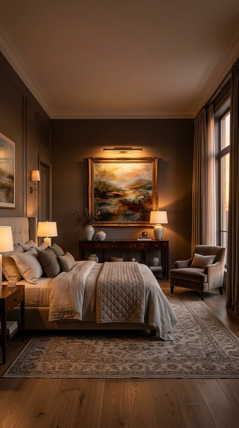
Art that isn’t properly lit can make an entire wall feel flat and underwhelming, regardless of how well it’s placed. A dedicated picture light, a nearby lamp, or simply positioning the piece to avoid glare from a window all meaningfully elevate how the art reads within the room.
You don’t need an elaborate gallery track lighting system to achieve this effect; even a well-placed table lamp beside the wall can make a noticeable difference. Considering lighting as part of your overall placement plan, rather than an afterthought, results in a more polished final look.
22. Avoid Glare from Nearby Windows
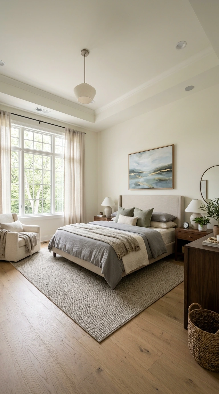
Positioning art directly across from or beside a bright window can create distracting glare that makes the piece difficult to actually view and appreciate at certain times of day. This consideration is especially relevant for framed pieces under glass.
Choosing canvas prints or matte, non-reflective glass helps minimize this issue if repositioning the art entirely isn’t practical. Observing how light moves through the room at different times of day before finalizing placement helps you avoid this common oversight.
23. Choose Non-Reflective Glass Near Light Sources
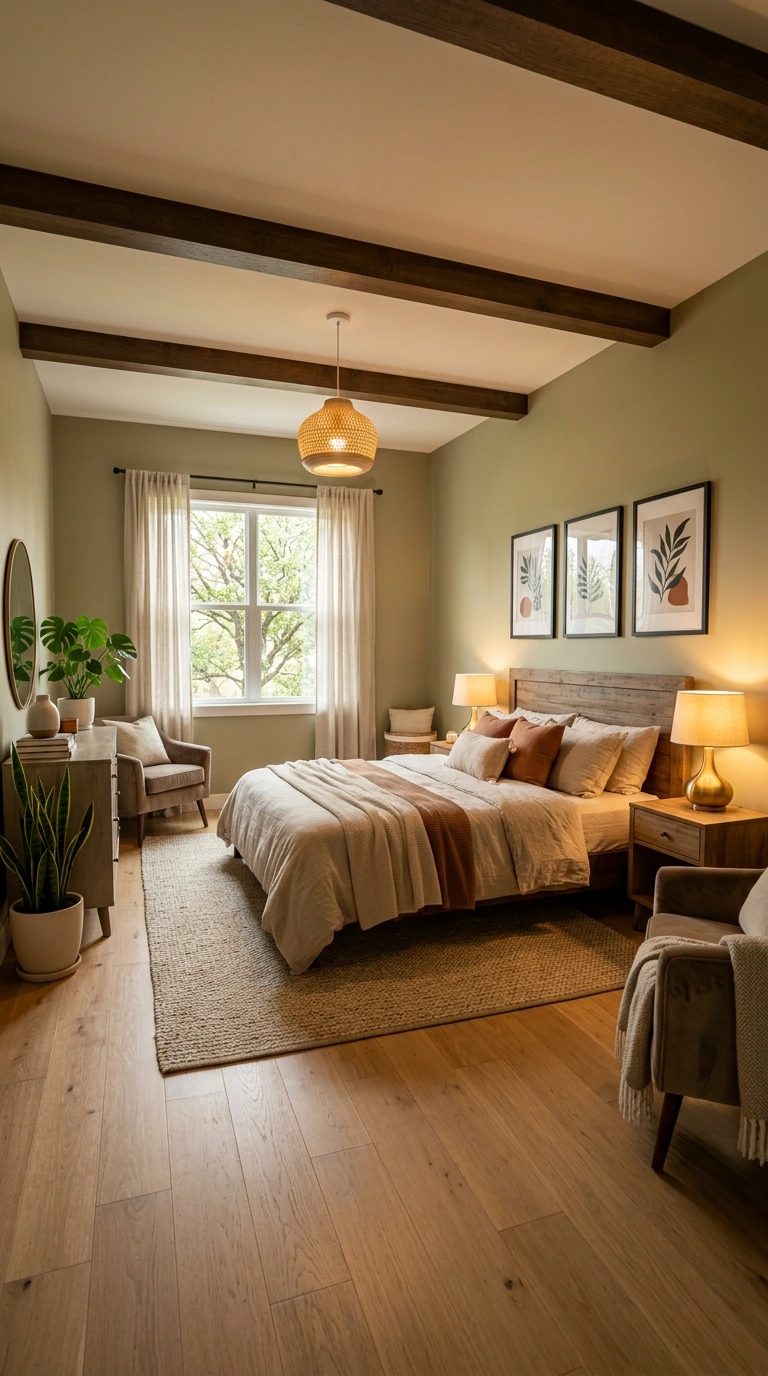
If a piece of art will hang near a bedside lamp or other direct light source, choosing non-reflective or matte glass in the frame prevents distracting glare from bouncing directly back at anyone viewing it. This small material choice meaningfully affects how enjoyable the piece is to actually look at day to day.
Standard glossy glass can create a mirror-like glare under the right lighting angle, undermining even a beautifully chosen piece of art. This detail is easy to overlook when shopping for frames but genuinely matters for pieces positioned near lamps.
Wall Art Arrangement Styles at a Glance
| Arrangement Style | Best Spacing | Best For | Center Height |
|---|---|---|---|
| Side by Side (2-4 pieces) | 2-4 inches apart | Above beds, sofas, consoles | 57-60 inches |
| Stacked Vertically | 3-5 inches apart | Narrow walls, between windows | 57 inches for whole group |
| Grid Layout (2×2) | 2-4 inches apart | Above beds, buffets, hallway features | 57 inches for whole group |
| Offset/Asymmetrical | 2-6 inches apart | Modern, relaxed interiors | 57-60 inches, staggered |
24. Secure Heavier Pieces Into Wall Studs
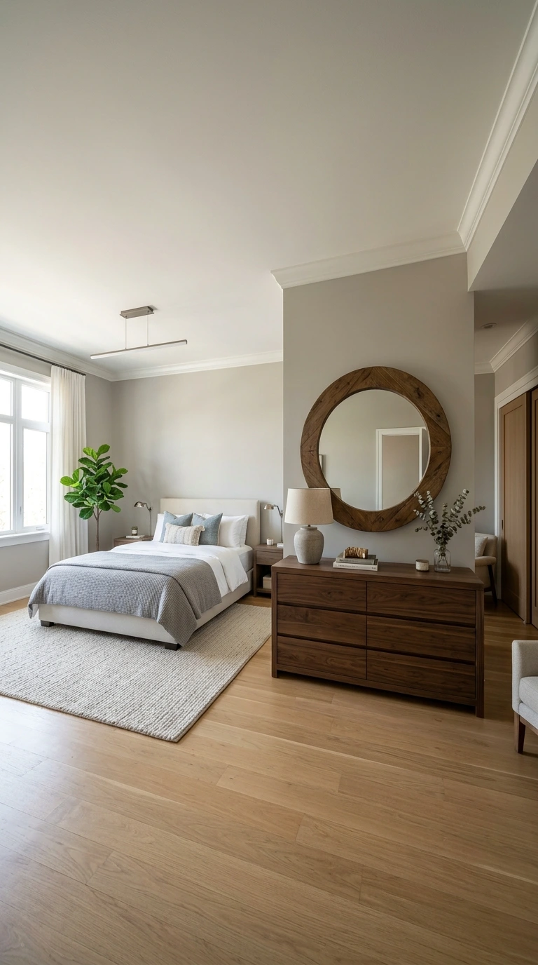
Any substantial piece of art or a heavy mirror, especially one positioned above the bed, should be anchored into a wall stud rather than relying purely on drywall anchors. This safety consideration matters even more directly above where someone sleeps each night.
Using a stud finder before marking your final placement ensures you can adjust slightly if needed to hit solid backing. This small extra step prevents a genuinely dangerous situation down the line if a heavy piece were to come loose.
25. Use a Grid Layout for a Clean, Structured Look
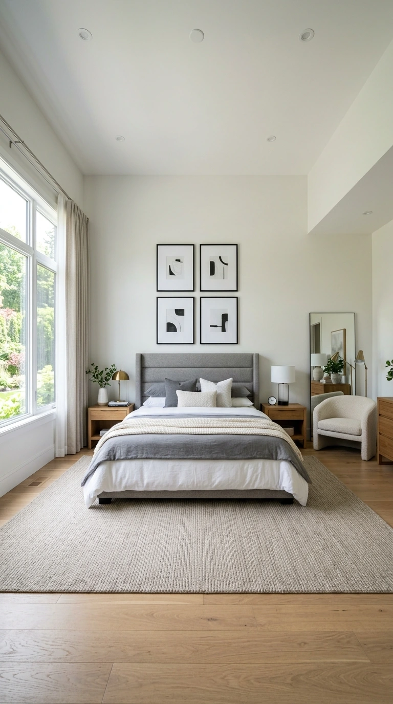
A 2×2 grid arrangement, with frames spaced 2 to 4 inches apart and the entire grid centered at 57 inches, creates a clean, contemporary display that works particularly well above a bed, buffet, or as a hallway feature. This structured format suits more modern or minimalist bedroom styles.
Choosing frames of consistent size and finish for a grid layout reinforces its clean, orderly quality. This arrangement style is one of the more forgiving options for beginners, since its rigid structure leaves less room for spacing errors.
26. Stack Frames Vertically for Narrow Walls
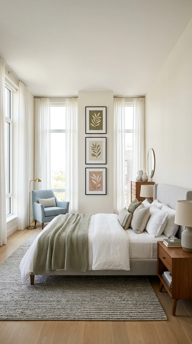
For narrow wall sections, like between two windows or in a tight hallway leading into the bedroom, stacking two or three frames vertically elongates the space and makes it feel more intentionally considered. Keep the center of the overall stacked arrangement at 57 inches, with 3 to 5 inches of space between each frame.
This vertical stacking technique is particularly effective in rooms where horizontal wall space is limited but vertical space is more generous. Choosing pieces with a shared color palette or theme helps the stacked grouping read as one cohesive unit rather than separate, unrelated pieces.
27. Try an Offset Arrangement for a Modern, Relaxed Look
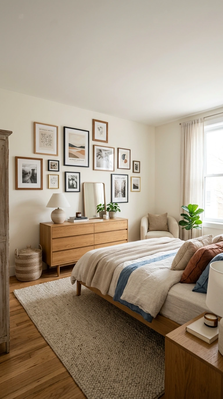
An intentionally asymmetrical, offset arrangement, hanging one piece slightly higher than another while keeping 2 to 6 inches of distance between them, adds movement and visual interest that a perfectly aligned grid doesn’t achieve. This style suits more modern or relaxed interior aesthetics particularly well.
This approach requires a bit more confidence than a rigid grid layout, since the “rules” here are looser and rely more on visual instinct. Testing the arrangement with painter’s tape first is especially valuable for this style, given its less formulaic nature.
Warning: An offset or asymmetrical arrangement can look unintentionally sloppy rather than intentionally relaxed if the pieces are too randomly placed. Maintain some consistent element, whether spacing, a shared color palette, or matching frame finishes, to keep the arrangement feeling like a deliberate design choice.
28. Match Frame Finishes for a Cohesive Gallery Wall
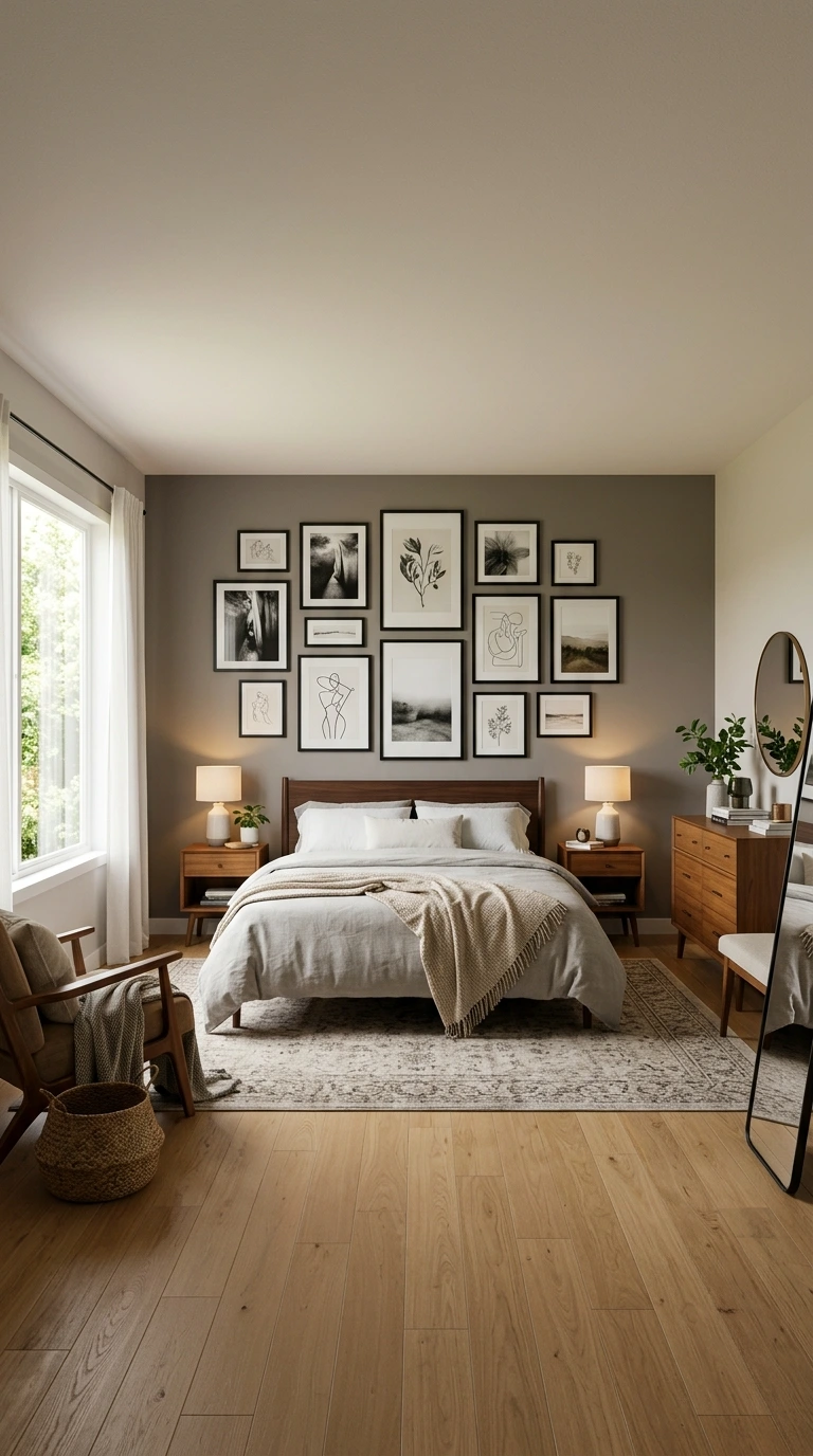
Choosing frames in a consistent metal or wood finish across a gallery wall arrangement, even if the artwork itself varies in style and subject, helps the overall collection read as one intentional display. This consistency is one of the easiest ways to unify a varied group of pieces.
If you prefer mixing frame finishes for a more eclectic feel, keeping at least the color palette or general tone consistent across the artwork itself helps maintain cohesion. Complete inconsistency across both frame and art tends to feel more random than intentionally eclectic.
29. Vary Frame Sizes Intentionally, Not Randomly
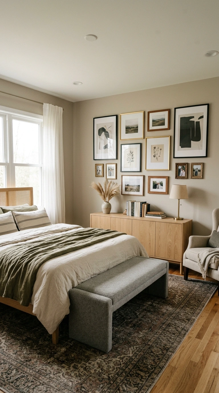
Within a gallery wall or grouped arrangement, deliberately varying frame sizes, rather than choosing an accidental, uneven mix, adds visual rhythm and interest. The key distinction is intention: sizes should feel like a deliberate design choice rather than simply whatever happened to be available.
Planning this size variation on paper or with taped templates beforehand helps ensure the final arrangement looks curated rather than haphazard. A thoughtfully varied composition consistently reads as more sophisticated than one where every frame happens to be identical.
30. Choose Calming Subject Matter for the Bedroom
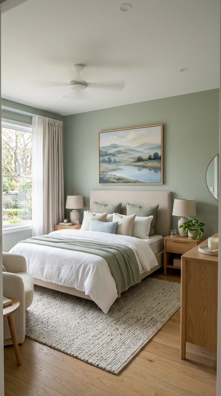
Since a bedroom’s function centers on rest and relaxation, art depicting serene landscapes, soft abstracts, or gentle, meaningful photography tends to suit the space better than bold, high-energy imagery more appropriate for a living room or home office. Letting the room’s intended mood guide your subject matter choices simplifies the selection process considerably.
This principle doesn’t mean bedroom art needs to be bland or overly muted; it simply means favoring pieces that feel calm and restful over anything visually jarring or overly stimulating. Art with a soft, low-contrast palette generally reinforces this calming atmosphere most effectively.
31. Balance Art Above a Dresser with the Dresser’s Scale
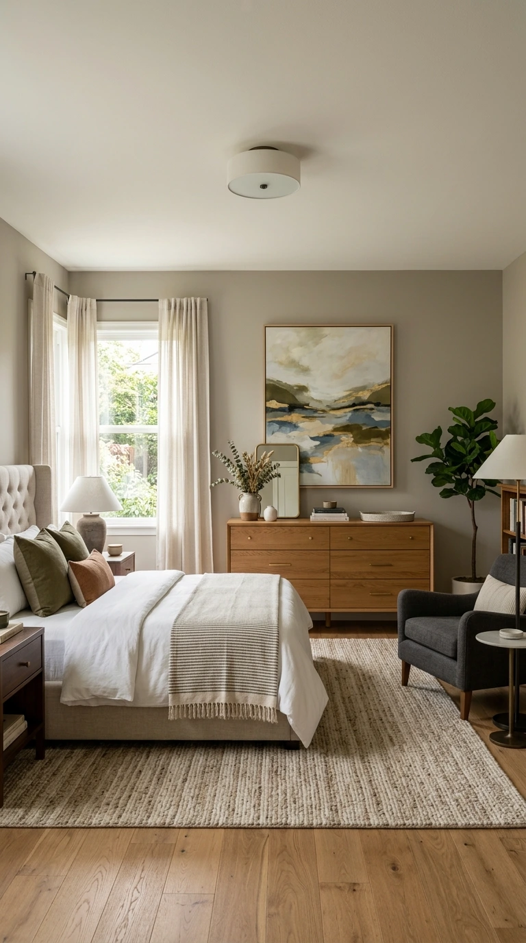
When hanging art above a dresser rather than a bed, apply the same core proportion principles: keep the art within roughly two-thirds to three-quarters of the dresser’s width, and leave 6 to 8 inches of space between the dresser top and the bottom of the frame. This creates the same cohesive, connected composition as art hung above a headboard.
If the dresser surface already displays several decorative objects, keep the wall art relatively simple to avoid an overly busy, cluttered overall look. Balancing what’s on the dresser with what’s on the wall above it prevents either element from competing for attention.
32. Hang Symmetrical Pairs Above Nightstands
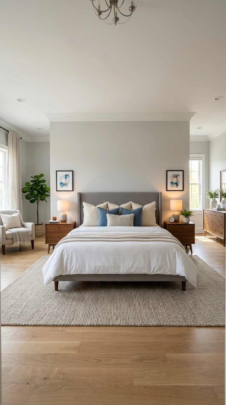
For a classic, polished look, hang two matching or closely coordinated pieces above each nightstand on either side of the bed, positioned at standard eye level when standing. Keep the spacing from the bed and the nightstand’s edges even on both sides.
This symmetrical detail reinforces the overall sense of order and calm a bedroom benefits from, echoing the broader symmetry principle discussed earlier for headboard art. Choosing simpler, smaller pieces for this location keeps the nightstand walls from competing with the room’s larger, primary focal point above the bed.
33. Position Art Thoughtfully Near a Window
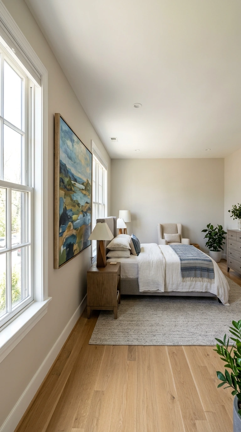
Hanging art beside a window creates an interesting juxtaposition between the interior decor and the natural view or light beyond it. This placement lets you enjoy the piece at different times of day as the changing natural light interacts with it.
Just be mindful of the glare considerations discussed earlier, since a bright window directly behind or across from a framed piece can create distracting reflections. Testing the placement at different times of day helps confirm the art remains genuinely visible and enjoyable throughout the day.
34. Keep the Relationship to Furniture, Not the Ceiling
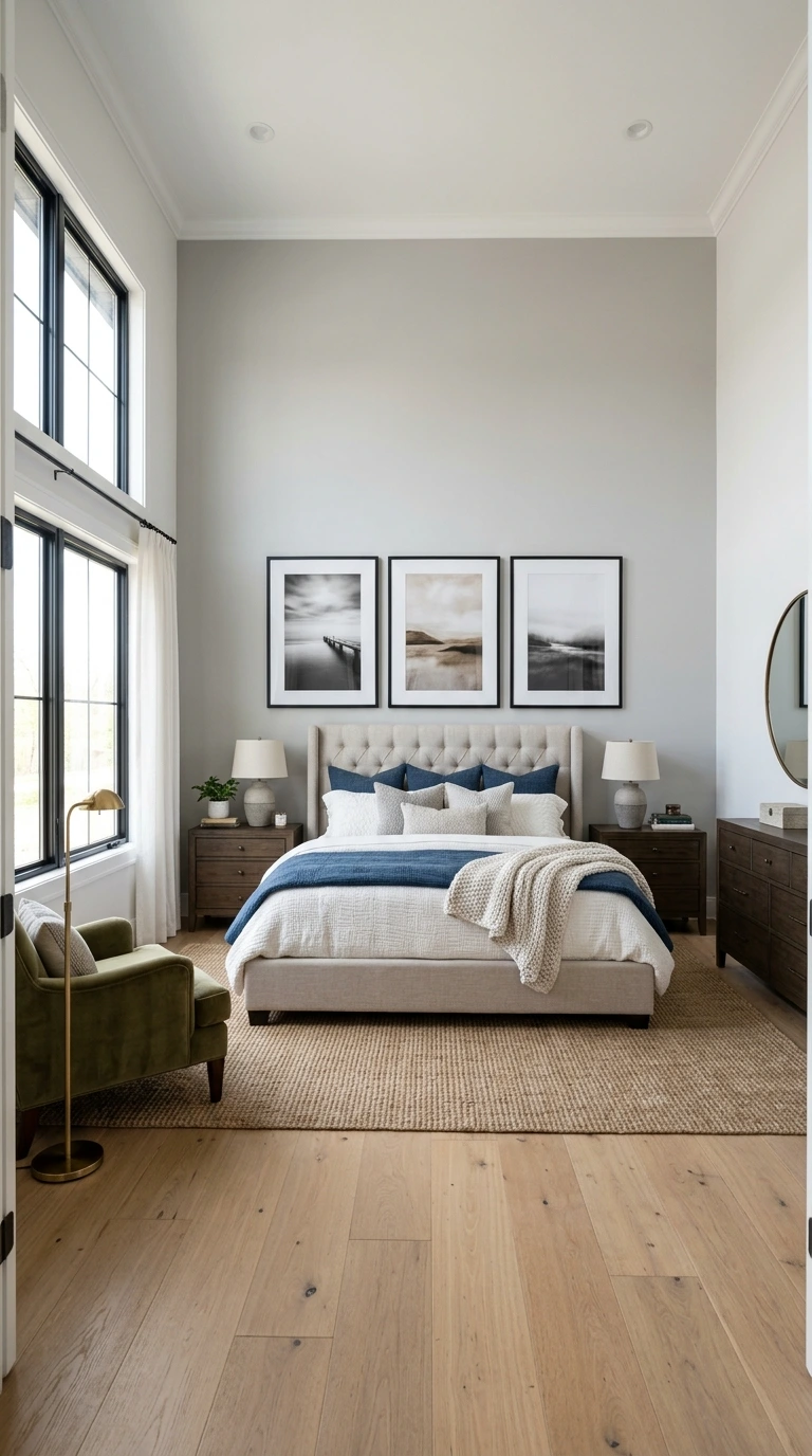
Even in a bedroom with very high ceilings, resist the temptation to hang art higher simply to visually “fill” the extra wall space above. The art’s relationship to the furniture beneath it should remain the primary guide, not the room’s overall ceiling height.
This principle can feel counterintuitive in a tall room, where a lot of blank space above the art may seem to call for a higher placement. Trusting the furniture-based proportion rules over the temptation to fill vertical space consistently produces a more balanced, intentional-looking result.
35. Consider the Whole Wall’s Scale, Not Just the Furniture
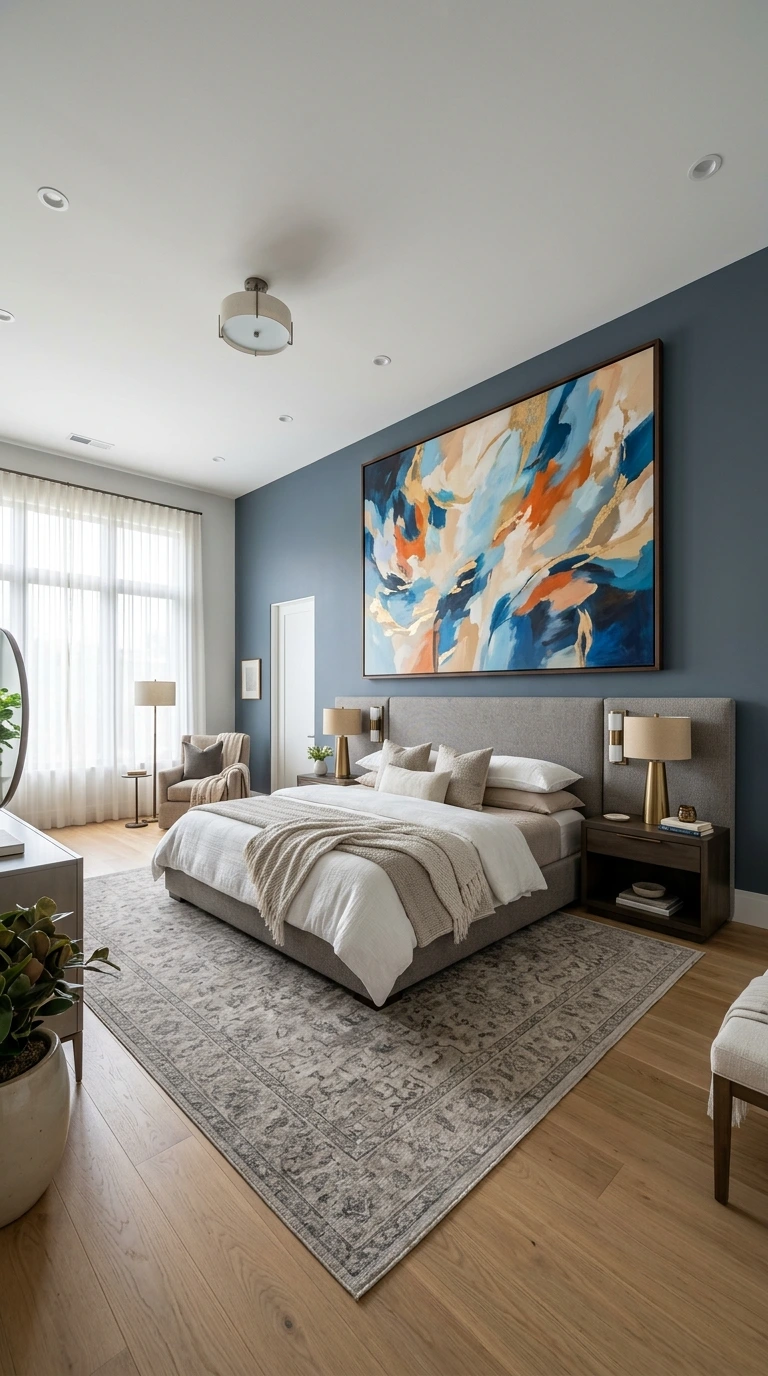
While furniture proportion matters enormously, it’s also worth stepping back periodically to assess how the art relates to the entire wall, not just the piece of furniture directly beneath it. A large, mostly empty wall may call for a bolder, larger piece than the furniture-based calculation alone would suggest.
This broader perspective helps prevent art that technically follows all the furniture-based rules from still looking undersized within an unusually large or prominent wall. Balancing both the furniture relationship and the wall’s overall scale produces the most consistently successful results.
- ✅ Choose calming, low-contrast subject matter suited to the bedroom’s restful function
- ✅ Match or intentionally vary frame finishes rather than mixing them randomly
- ✅ Position art to avoid glare from nearby windows or direct lamp light
- ✅ Secure heavier pieces into wall studs, especially above the bed
- ✅ Step back and view the arrangement from across the room before finalizing
36. Step Back and Assess from Across the Room
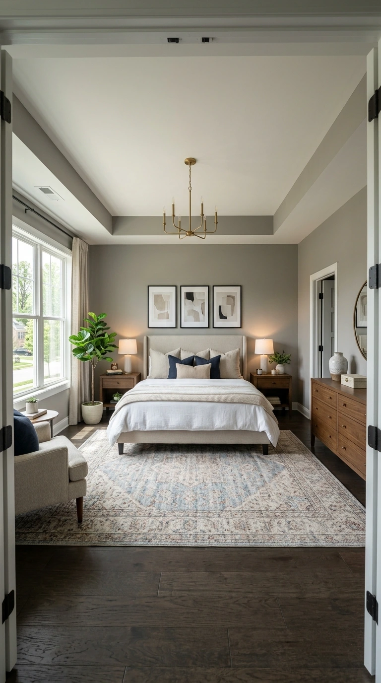
Before considering any arrangement finished, step back to the room’s main entry point or across the space entirely, and evaluate how the art reads from that distance. Details that seem perfectly proportioned up close can look different once viewed from where you’ll actually experience the room day to day.
This final check often reveals small adjustments worth making, whether shifting height slightly or reconsidering spacing between grouped pieces. Professional designers routinely step back throughout the placement process rather than relying solely on close-up measurements.
37. Avoid Hanging Every Wall with Equal Density
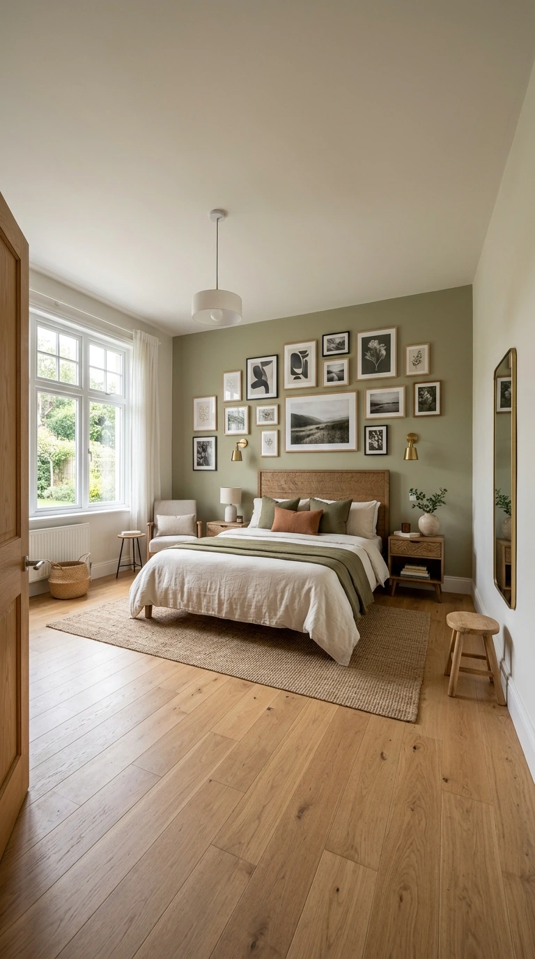
Not every wall in a bedroom needs the same amount of art or decor; some walls benefit from remaining intentionally simpler or even entirely bare. Filling every available surface with equal density can make a room feel busy and visually exhausting rather than calm and restful.
Identifying which wall deserves to be the room’s primary focal point, typically above the bed, and letting other walls stay comparatively quieter creates a clearer visual hierarchy. This restraint is often what separates a professionally styled room from one that simply has “a lot of stuff on the walls.”
38. Embrace Intentional Negative Space
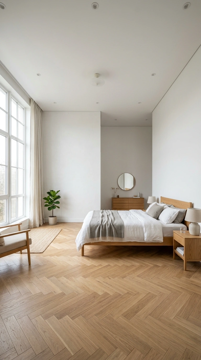
Leaving a section of wall genuinely bare, rather than feeling obligated to decorate every surface, can be a legitimate and sophisticated design choice, particularly in a bedroom prioritizing calm over visual stimulation. This principle takes some confidence but often produces a more serene, considered result.
If a wall already features strong architectural detail, like an interesting window or a textured paint treatment, leaving it otherwise undecorated lets that feature remain the clear focus. Negative space isn’t a failure to finish a room; it’s often a deliberate, restful design decision.
39. Break the Rules with Purpose When It Serves the Room
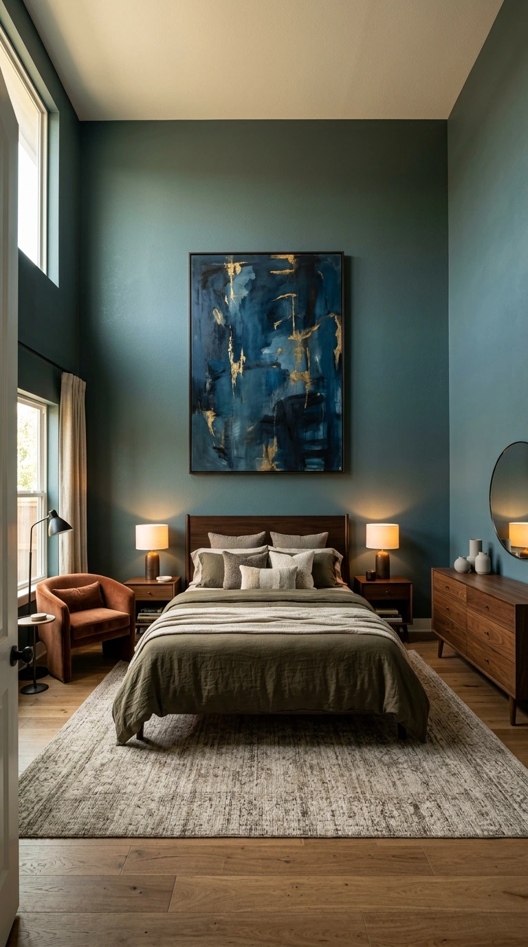
While the height, proportion, and spacing guidelines throughout this list provide a reliable foundation, professional designers occasionally deviate from them intentionally for dramatic effect. Placing art slightly higher or lower than the standard rule, when done with clear purpose, can bring genuine personality and distinctiveness to a space.
The key distinction between an intentional rule-break and a simple mistake lies in confidence and consistency: a deliberate deviation should feel purposeful throughout the room, not like an isolated error. Understanding the standard rules thoroughly first makes it much easier to recognize when and how to break them successfully.
40. Trust Your Overall Instinct Alongside the Rules
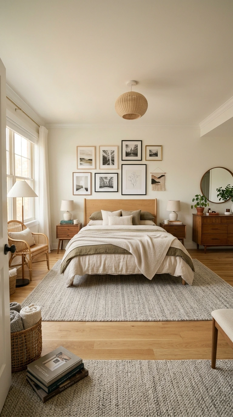
Ultimately, these 40 principles serve as a reliable starting framework, but the final judgment of whether a wall feels balanced and complete should always include your own genuine reaction to the space. If something technically follows every rule but still feels slightly off, trust that instinct and make an adjustment.
Design guidelines exist to remove guesswork and prevent common mistakes, not to replace your own eye entirely. The most successful bedroom wall displays combine these proven principles with a final layer of personal, instinctive refinement.
Frequently Asked Questions
1. How high should I hang art in my bedroom?
For open wall space without furniture beneath it, center the art between 57 and 60 inches from the floor. Above a headboard or dresser, position the bottom edge of the frame 6 to 10 inches above the furniture instead.
2. What size art should I choose for above my bed?
Aim for artwork or a grouping that spans roughly two-thirds to three-quarters of your headboard’s width. For a queen bed, this typically translates to pieces around 36 to 48 inches wide, while king beds can support art between 48 and 60 inches wide.
3. How much space should I leave between multiple frames?
For pieces hung side by side or in a grid, keep spacing between 2 and 4 inches. For vertically stacked arrangements, allow 3 to 5 inches between frames, centering the entire grouping at 57 inches.
4. Should bedroom art match my bedding exactly?
No, bedroom art doesn’t need to match your bedding or wall color precisely, but it should harmonize with your existing color scheme. Look for pieces that pick up at least one or two colors already present in your room, plus one fresh accent color for visual interest.
5. Is it okay to lean art instead of hanging it?
Yes, leaning art against the wall atop a dresser or shelf creates a relaxed, collected look and is an increasingly popular styling choice. This approach also makes it easy to swap pieces without creating new nail holes each time your taste changes.
6. What should I do if my ceilings are unusually high or my ceiling is sloped?
For high ceilings, shift your center height slightly up to around 60 to 62 inches rather than dramatically raising the art to fill empty space. For sloped ceilings, follow the angle of the ceiling itself and center the art visually within the available wall space rather than forcing standard measurements.
7. Do I really need to test placement with painter’s tape first?
While not strictly required, this step is one of the most reliable ways to catch proportion or spacing mistakes before committing to permanent nail holes. Living with a taped mockup for a day or two often reveals adjustments that aren’t obvious from measurements alone.
Conclusion
Hanging bedroom wall decor like an interior designer comes down to a set of measurable, repeatable principles rather than any innate artistic talent. From the reliable 57 to 60 inch height rule to proper spacing between grouped pieces and thoughtful color coordination, each of these 40 guidelines removes a layer of guesswork from the process.
Start with the foundational height and proportion rules, test your placement with painter’s tape before committing to anything permanent, and trust your own instinct alongside these principles for the final judgment call. A bedroom’s walls, thoughtfully and confidently styled, do as much to create a genuinely restful, polished space as any piece of furniture in the room.