60-30-10 Color Rule for Small Spaces: 45 Ideas to Get It Right

Introduction
The 60-30-10 rule is one of the simplest color formulas in all of interior design, yet it’s exactly what most small rooms are missing. It breaks a room’s color scheme into three clear proportions, 60 percent dominant color, 30 percent secondary color, and 10 percent accent color, giving you a structured framework instead of guessing your way through paint chips and fabric swatches.
This rule matters even more in a small space than a large one, since color imbalance shows up faster and more obviously when there’s less square footage to absorb it. Getting the proportions right is often the difference between a small room that feels calm and pulled together versus one that feels chaotic despite genuinely good individual pieces.
In this guide, you’ll find 45 specific ways to apply the 60-30-10 rule throughout a small room, covering walls, furniture, textiles, and small details. Whether you’re starting from scratch or adjusting a room that already feels a bit off, these ideas will help you use this rule with real confidence.
1. Understand What Each Percentage Actually Means

The 60 percent portion is your dominant color, typically covering walls, large furniture, and any big-ticket item that sets the room’s overall tone. The 30 percent is your secondary color, usually shown through medium-sized elements like curtains, an area rug, or an accent chair.
The remaining 10 percent is your accent color, reserved for small, high-impact details like throw pillows, art, or decorative objects. Understanding this breakdown before you buy anything prevents the common mistake of treating all three colors as equally weighted, which is what makes many rooms feel visually unbalanced.
2. Choose Your Dominant Color Based on Wall Space

In a small room, your walls typically make up the largest single visual surface, so they’re a natural home for your 60 percent dominant color. Light, neutral tones like soft white, warm gray, or pale beige work particularly well here, since they also help the room feel more spacious.
If you rent and can’t paint, your dominant color can instead come from large furniture pieces, like a sofa or bed frame, that occupy a similarly large visual footprint. Either approach works, as long as you’re consistent about which color is actually carrying that 60 percent weight throughout the space.
3. Let Your Secondary Color Come From Textiles

Curtains, an area rug, and a large accent chair are ideal spots for your 30 percent secondary color, since these items are substantial enough to register visually without overwhelming the room. This color should complement your dominant tone rather than compete with it.
Choosing a secondary color from the same general family as your dominant color, just a shade or two darker or richer, creates a cohesive look rather than a jarring contrast. This approach works especially well in small rooms, where too much contrast can visually chop up limited space.
4. Reserve Your Accent Color for True Small Details

Throw pillows, a vase, a piece of art, or a small lamp base are the ideal home for your 10 percent accent color, precisely because these items are small enough not to overwhelm a compact room. This is where you can genuinely be bold, since the small scale keeps even a saturated, dramatic color in check.
Resist the temptation to expand your accent color into a larger piece, since doing so effectively promotes it to secondary status and throws off the entire ratio. Keeping the accent truly small is what makes it feel like a deliberate pop rather than an overwhelming presence.
5. Test Your Colors With Physical Paint Swatches

Before committing to any paint color, test a physical swatch directly on your wall, viewed at different times of day, since lighting dramatically changes how a color actually reads in your specific space. A color that looks perfect in a store or online can shift considerably once it’s on your actual walls.
This step matters even more in a small room, since a slightly wrong dominant color choice affects a much larger percentage of your limited visual space than it would in a bigger room. Spending a few dollars on sample pots before buying gallons saves considerable frustration and repainting later.
6. Use a Monochromatic Approach for Maximum Calm

Choosing all three colors from within the same hue family, just at different shades and saturations, creates an especially calm, cohesive look that works beautifully in a small room. This approach is more forgiving for beginners, since you don’t need to worry about clashing undertones between different colors.
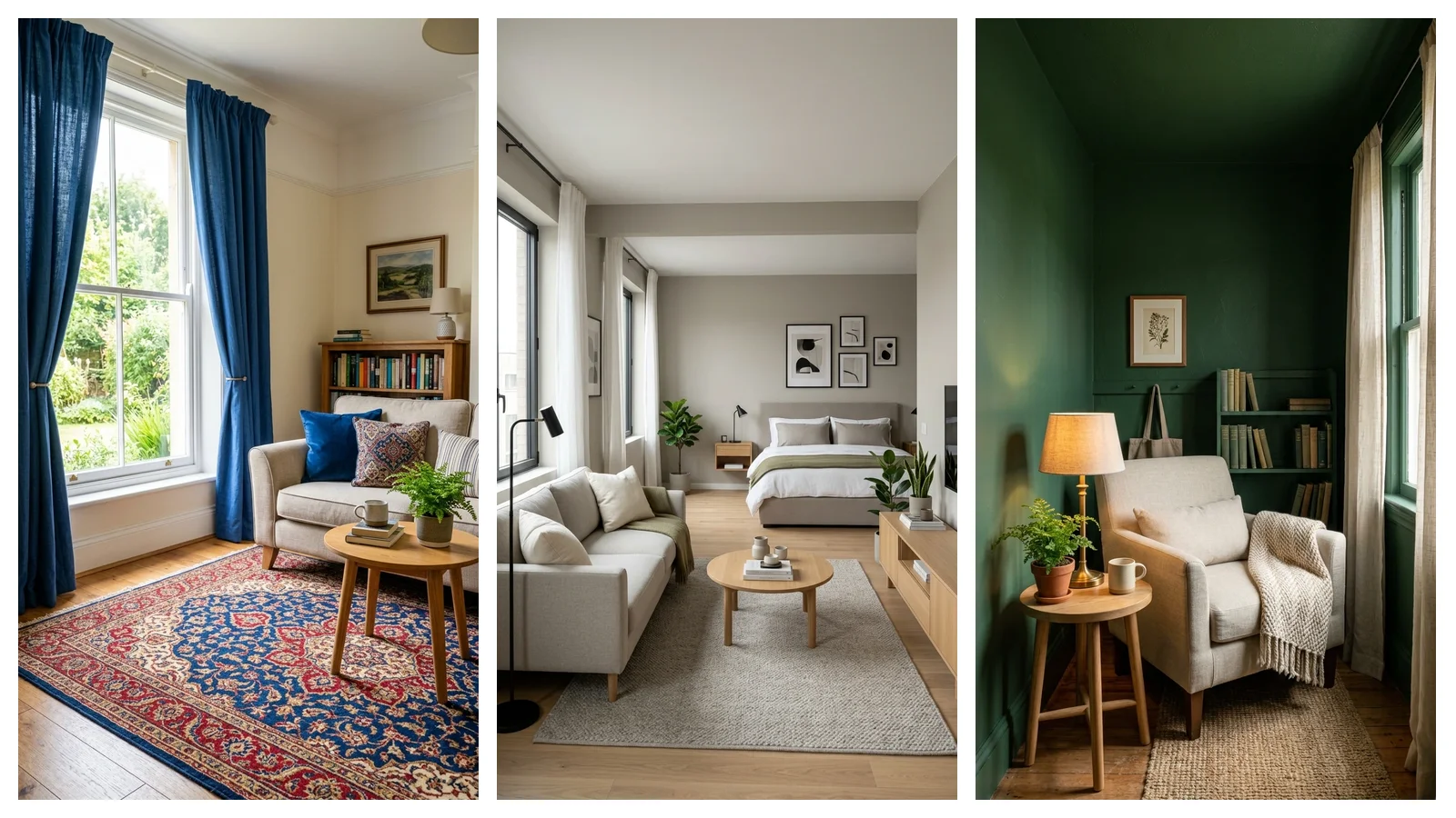
A room in varying shades of blue, for example, might use a pale blue-gray as the dominant wall color, a richer navy for the secondary rug or curtains, and a bright cobalt accent pillow for the pop of color. This layered, tonal approach reads as sophisticated while still technically following the 60-30-10 breakdown.
7. Try a Complementary Color Scheme for More Energy

If you want a livelier small room, choosing colors from opposite sides of the color wheel, like blue and orange, or red and green, adds energy while the 60-30-10 ratio keeps that contrast from feeling overwhelming. The large dominant color anchors the room, while the smaller accent portion carries the boldest, most contrasting tone.
This approach works particularly well for a small room that risks feeling too safe or boring with an all-neutral palette. Just make sure your dominant color remains the calmer, more muted of the two complementary tones, since a large expanse of a very bold color can feel overwhelming in tight quarters.
8. Apply the Rule to a Small Bedroom

In a small bedroom, your walls and bedding typically form the 60 percent dominant color, a rug or curtain set carries the 30 percent secondary tone, and throw pillows or a small piece of art deliver the 10 percent accent. This breakdown naturally follows the room’s largest to smallest elements.
Keeping your dominant color soft and calming matters especially in a bedroom, since this is a space meant for rest rather than high energy. Save your boldest color choice for the smallest, most flexible elements, like pillows, that can be swapped out easily if your taste changes.
9. Apply the Rule to a Small Living Room

A small living room’s dominant color often comes from the walls and the largest seating piece, like a sofa, while the secondary color shows up in a rug, curtains, or an accent chair. The accent color then lives in throw pillows, a vase, or a small piece of art on a shelf.
This room benefits particularly from the rule’s structure, since living rooms tend to accumulate more individual decor items than other rooms, making an unstructured color approach especially prone to feeling chaotic. Sticking to the ratio keeps a busy room feeling controlled even with several individual pieces in play.
10. Apply the Rule to a Small Kitchen

In a small kitchen, cabinets and wall color typically make up the 60 percent dominant tone, while a backsplash or window textiles carry the 30 percent secondary color. Small appliances, dish towels, or a few pieces of dishware then deliver the 10 percent accent.
Kitchens benefit from a lighter dominant color especially, since this room tends to already have a lot of visual busyness from appliances, cabinet hardware, and countertop items. Keeping the biggest color choices calm gives the smaller accent details more room to genuinely stand out.
- Choose your dominant color first, before any other decision
- Test physical paint swatches in your actual room lighting
- Keep secondary and dominant colors from the same tonal family for calm
- Reserve your boldest color choice for genuinely small accent items
- Recheck your ratios once decor is added, adjusting if one color creeps too large
11. Apply the Rule to a Small Bathroom

Tile and wall color usually serve as the dominant 60 percent in a small bathroom, with a shower curtain or bath mat providing the secondary 30 percent tone. Towels and small accessories, like a soap dispenser or a candle, then carry the 10 percent accent.
Since bathroom tile is often difficult or expensive to change, many people find it easiest to treat existing tile as their fixed dominant color and build the rest of the palette around it. This flexible approach to the rule works well when one element of a room simply can’t be altered.
12. Apply the Rule to a Home Office Nook

In a small home office corner, the desk and wall color behind it typically form the dominant 60 percent, while a chair or nearby storage piece carries the secondary 30 percent. Desk accessories, a small piece of art, or a lamp shade then deliver the 10 percent accent.
Keeping the dominant color calm and neutral in a workspace helps with focus, while the accent color gives you a small, energizing detail to look at during long work sessions. This breakdown works even in a nook that’s just a corner of a larger multi-purpose room.
| Room Type | Dominant Color Source | Secondary Color Source | Accent Color Source |
|---|---|---|---|
| Small Bedroom | Walls, bedding | Rug, curtains | Throw pillows, art |
| Small Living Room | Walls, sofa | Rug, accent chair | Pillows, small decor |
| Small Kitchen | Cabinets, walls | Backsplash, textiles | Small appliances, dishware |
| Small Bathroom | Tile, walls | Shower curtain, bath mat | Towels, small accessories |
| Home Office Nook | Desk, walls | Chair, storage | Desk accessories, art |
13. Use Wood Tones as Part of Your Color Calculation

Natural wood furniture and flooring count as part of your color scheme, even though they’re not paint colors in the traditional sense, and should be factored into your overall 60-30-10 balance. A room with substantial wood flooring or furniture already has a strong dominant tone before you even choose paint.
Building your color scheme around your existing wood tones, rather than ignoring them, prevents an unintentional clash between your chosen palette and the furniture you already own. This is a detail beginners often overlook, assuming the rule only applies to paint and textiles.
14. Layer Different Textures Within the Same Color

Within your 60 percent dominant color specifically, mixing different textures, a matte wall paint alongside a slightly glossy or textured furniture fabric, adds visual interest without introducing an additional color that would throw off your ratio. This technique is particularly valuable in a small, mostly monochromatic room.
A velvet sofa and a linen curtain in the same general tone, for example, read as considerably richer than identical fabrics in the same color would. This approach lets you achieve visual complexity while still technically respecting the simplicity the 60-30-10 rule provides.
15. Use the Rule to Simplify an Overwhelming Room

If your small room currently feels chaotic or overly busy, applying the 60-30-10 rule retroactively, by identifying which existing colors should be dominant, secondary, and accent, often reveals the actual problem. Frequently, a room feels overwhelming because too many colors are competing for the same 30 or 10 percent visual weight.
Removing or storing items that don’t clearly fit into one of the three designated color roles can dramatically calm down an already-decorated room without buying anything new. This diagnostic use of the rule is often more valuable for beginners than starting completely from scratch.
16. Choose a Neutral Dominant Color for Maximum Flexibility

A neutral dominant color, like white, cream, gray, or beige, gives you the most flexibility to update your secondary and accent colors over time without needing to repaint an entire small room. This is a particularly practical choice for anyone whose taste or preferred trends tend to shift more frequently than every few years.
Since the dominant color occupies the largest, most expensive-to-change surfaces, like walls, keeping it neutral protects your investment while still allowing genuine personality through the more easily swapped secondary and accent elements. This strategy works especially well for renters who may not be able to repaint at all.
17. Use a Bold Dominant Color With Confidence in a Small Room

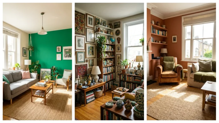
While neutral dominant colors are the safer, more common choice, a bold dominant color, like deep navy or forest green, can work beautifully in a small room specifically because the 60-30-10 structure keeps the boldness organized rather than chaotic. Small rooms painted in a single saturated color often feel enveloping and cozy rather than cramped.
This approach works best when your secondary and accent colors are chosen with restraint, since a bold dominant color paired with equally bold secondary and accent choices can quickly become overwhelming. Let the dominant color be the statement, and keep the other two percentages considerably quieter by comparison.
18. Apply the Rule to an Open-Concept Small Space

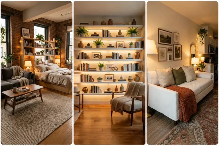
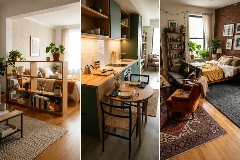
In an open-concept studio or small apartment where multiple functions share one room, maintaining a consistent 60-30-10 ratio across the entire visible space, rather than treating each zone separately, creates a cohesive look despite the lack of walls dividing different areas. This consistency is what makes an open floor plan feel like one considered room rather than several mismatched ones pushed together.
Repeating your dominant color across both the sleeping and living zones, for example, visually ties the space together even as the specific furniture serving each zone changes. This approach is one of the most important applications of the rule for anyone living in a studio apartment specifically.
19. Use the Rule When Choosing Art for a Small Wall

Art hung on your walls typically falls into either the secondary or accent category, depending on its size, and should be chosen with your existing ratio in mind rather than as a standalone decision. A large statement art piece might function as part of your secondary 30 percent, while a small framed print fits more naturally into the 10 percent accent.
Choosing art that pulls its color from your existing dominant or secondary tones, rather than introducing a completely new color, keeps your wall decor from accidentally becoming a fourth, unaccounted-for color category. This consideration is easy to overlook since art often gets chosen purely for subject matter rather than color contribution.
20. Apply the Rule to Kitchen Cabinet Hardware and Fixtures

Metal finishes, like cabinet hardware, faucets, and light fixtures, function as a kind of neutral accent within the 60-30-10 framework, and choosing a consistent metal tone throughout a small kitchen prevents this category from becoming a visual distraction. Brass, matte black, and brushed nickel are common choices that read as accent-level details.
Since these fixtures are often the most difficult and expensive to change later, deciding on this metal tone early, alongside your main color choices, helps you plan a kitchen’s overall palette more holistically. This detail is genuinely easy to overlook when focused purely on paint and cabinet color.
- Factor existing wood tones and flooring into your color plan from the start
- Choose art that echoes your existing dominant or secondary colors
- Decide on a consistent metal finish for hardware and fixtures early
- Use texture variation within your dominant color for added depth
- Reassess your color ratio periodically as you add new decor over time
21. Use the Rule to Choose a Duvet Cover

A duvet cover often functions as either your dominant or secondary color in a small bedroom, depending on whether it matches your wall color or introduces a complementary tone. Choosing this large textile with your overall ratio in mind prevents your bed, often the room’s largest single object, from accidentally throwing off your entire color balance.
A neutral duvet that matches your wall color effectively expands your dominant color’s footprint, while a patterned or colored duvet functions more as a secondary element. Either choice works, as long as you’re intentional about which role the duvet is actually playing in your overall scheme.
22. Apply the Rule to Curtain Choices

Curtains typically serve as your secondary 30 percent color, especially in a small room where window treatments cover a meaningful amount of visible wall space. Choosing curtains in a tone that complements rather than matches your walls exactly creates the layered depth the 60-30-10 rule is designed to achieve.
Sheer curtains in a very pale tone can also function almost as an extension of your dominant color if you want a more monochromatic, expansive look. This flexibility in how curtains contribute to your ratio makes them one of the more versatile secondary color choices available.
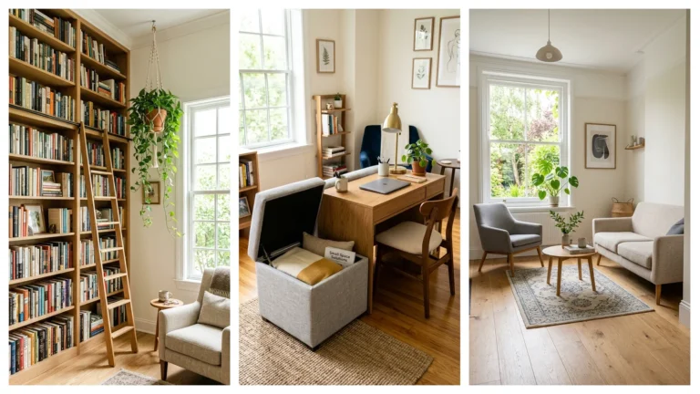
23. Use the Rule for a Small Reading Nook

A reading chair and any surrounding wall color typically form the dominant tone in a small reading nook, while a throw blanket or small area rug carries the secondary color. A single accent pillow or small lamp shade then delivers the accent percentage in this compact, functional space.
Keeping this small zone’s color scheme consistent with the rest of an open-concept room, rather than treating it as an entirely separate palette, helps the nook feel like a natural extension of the space rather than a visually disconnected corner. This consideration matters especially in smaller homes where every corner is visible from most vantage points.
24. Apply the Rule to a Small Dining Area

In a small dining nook, wall color and table finish typically make up the dominant 60 percent, while dining chairs or a table runner carry the secondary 30 percent. A centerpiece, place settings, or small art nearby then deliver the 10 percent accent.
Since dining areas are often visible from adjoining kitchen or living spaces in a small home, keeping this zone’s dominant color consistent with neighboring rooms helps maintain the overall sense of flow the 60-30-10 rule is meant to support. This is a detail that becomes especially important in open-plan small apartments.
25. Use Plants as a Natural Accent Color

Greenery brings a genuine, living version of an accent color into a small room, and counting plants as part of your 10 percent allocation helps you avoid over-purchasing decorative accents elsewhere. A few well-placed plants can fulfill this accent role just as effectively as a piece of art or a colored vase.
This approach also keeps your accent color from feeling static, since plants change subtly over time and across seasons in a way manufactured decor doesn’t. Choosing planters in your dominant or secondary color keeps the plant itself as the true accent element, rather than adding yet another competing color through the pot.
26. Apply the Rule to a Small Entryway

Wall color and a console table or bench typically form the dominant tone in a small entryway, while a rug or a piece of furniture upholstery carries the secondary color. A small mirror frame, a vase, or a decorative bowl then delivers the accent percentage in this frequently transitional space.
Since entryways are often narrow and heavily trafficked, keeping the dominant color light and the overall palette simple helps this small transitional space feel welcoming rather than cluttered. This zone also sets visual expectations for the rest of the home, making color consistency here particularly valuable.
27. Use Seasonal Swaps Within the Accent Category Only

Because your 10 percent accent color occupies the smallest, most easily changeable items, like throw pillows or small decor, this is the ideal category to swap seasonally without disrupting your room’s overall structure. Keeping your dominant and secondary colors fixed year-round while rotating accent pieces lets you refresh a room’s feel without a full redecorating project.
This approach also protects your larger investments, like paint and furniture, from feeling dated as quickly, since only the smallest, most affordable pieces need updating. This is one of the most practical long-term applications of the 60-30-10 rule for anyone who enjoys seasonal decorating.
28. Apply the Rule to a Small Closet or Dressing Nook

Interior closet wall color or door finish typically serves as the dominant tone in a small dressing nook, while a storage bench or organizational bins carry the secondary color. A small mirror frame or a decorative hook then delivers the accent detail in this compact functional space.
Even a small, enclosed space like a closet benefits from this same color logic, since an unplanned mix of storage bin colors and finishes can make even a tiny area feel visually chaotic. Applying the same disciplined ratio here as you would in a main living space keeps every corner of a small home feeling considered.
29. Use the Rule to Choose a Small Rug

An area rug typically serves as your secondary 30 percent color, and its pattern or tone should complement rather than compete with your dominant wall and furniture colors. In a small room, an oversized or overly busy rug pattern can visually shrink the space, so choosing one that supports your overall ratio matters considerably.
A rug with your accent color woven subtly into its pattern can also help tie your smallest color choice back into a larger element of the room, creating a more cohesive overall look. This detail-level thinking is what separates a room that feels professionally styled from one that feels randomly assembled.
- Treat plants as part of your accent color allocation, not an extra category
- Keep your dominant color consistent across visually connected rooms
- Reserve seasonal color swaps for accent-level items only
- Choose a rug that complements rather than competes with your dominant tone
- Apply the same color discipline to small, enclosed spaces like closets
30. Apply the Rule to a Small Balcony or Patio

Wall or railing color and any large furniture piece typically form the dominant tone on a small balcony, while a rug or cushion fabric carries the secondary color. Planters, small decor, or a single bold cushion then deliver the accent percentage in this outdoor extension of your home.
Applying the same 60-30-10 logic outdoors as indoors helps a small balcony feel like a genuine extension of your living space rather than a disconnected afterthought. This consistency matters especially when the balcony is visible from inside through a window or glass door.
31. Use the Rule to Choose Bedding Layers

When layering a duvet, throw blanket, and decorative pillows on a small bed, assign each layer intentionally to the dominant, secondary, or accent role rather than choosing each piece independently. The duvet often carries the dominant or secondary weight, while a folded throw blanket and a couple of pillows fulfill the secondary and accent roles respectively.
This intentional layering prevents the common mistake of a bed with several different competing colors and patterns that individually look fine but collectively feel chaotic. Thinking of bedding as a mini version of the whole room’s 60-30-10 breakdown makes styling this single piece of furniture considerably easier.
32. Apply the Rule When Painting Trim and Doors

Trim and door color, while often overlooked, contributes to your overall dominant color percentage, and choosing a trim tone that complements rather than contrasts sharply with your wall color keeps this element from becoming an accidental fourth color category. A classic white trim works with almost any dominant wall color, while a trim painted to match the wall exactly creates an even more seamless, expansive look.
In a small room specifically, matching trim to wall color, rather than using a contrasting white, can make the room’s boundaries feel less defined, contributing to a more spacious overall feeling. This is a subtle but genuinely effective technique many beginners don’t consider.
33. Use the Rule for Choosing Lampshades

A lampshade’s color typically falls into either the secondary or accent category depending on the lamp’s overall size and visual prominence in the room. A large floor lamp with a substantial shade might function as secondary, while a small table lamp shade fits more naturally as an accent detail.
Choosing a lampshade color that pulls from elsewhere in your room’s existing palette, rather than introducing something entirely new, keeps even this small detail working in service of your overall color plan. This consideration is easy to overlook when lamps are often purchased primarily for their light output rather than their color contribution.
34. Apply the Rule to a Gallery Wall

When building a gallery wall in a small room, choosing frames and art pieces that collectively stay within your established secondary or accent color range prevents this often eclectic display from becoming visually overwhelming. A gallery wall with every frame in a different color and every piece of art in different competing tones can quickly undermine an otherwise well-balanced room.
Selecting frames in a consistent finish, like all black or all natural wood, while allowing more variation within the art itself, gives you creative freedom while still respecting the overall color discipline. This approach lets a gallery wall feel curated rather than random, even with multiple individual pieces involved.
35. Use the Rule to Choose a Statement Chair

A single statement chair in a bold accent color can function as your entire 10 percent allocation in a small living room, provided the rest of the room’s furniture stays firmly within your dominant and secondary tones. This is one of the most popular and effective ways to introduce real personality into an otherwise calm, neutral small space.
Choosing just one bold piece, rather than several competing statement items, keeps this technique from overwhelming a compact room. This approach works particularly well for anyone who wants to express bolder personal taste without repainting an entire small space.
36. Apply the Rule to Choosing Throw Pillow Combinations

When selecting multiple throw pillows for a small sofa or bed, keep the majority within your dominant or secondary color family, and reserve just one or two pillows for your true accent color. A common beginner mistake is choosing five or six pillows, each in a different bold color, which effectively creates several competing accent categories rather than one cohesive one.
Mixing texture and pattern within your established color family, rather than introducing new colors through each pillow, achieves visual interest while still respecting the underlying ratio. This restraint is often what separates a professionally styled sofa from one that feels randomly assembled from a discount bin.
37. Use the Rule When Choosing a Headboard

A fabric or painted headboard typically functions as part of your dominant color if it matches your wall tone closely, or as a secondary element if it introduces a complementary shade. Since a headboard occupies significant visual space directly at eye level in a bedroom, deciding its color role deliberately matters more than for smaller furniture pieces.
An upholstered headboard in a rich, secondary-level color against a neutral dominant wall creates a natural focal point without requiring any additional accent decor to achieve visual interest. This single furniture choice can effectively do a lot of the color-balancing work for an entire small bedroom.
38. Apply the Rule to a Small Vanity Area

A vanity’s surface color and any surrounding wall paint typically form the dominant tone in this small functional zone, while a vanity stool or bench carries the secondary color. Small containers, a mirror frame, or a scented candle then deliver the accent detail.
Even this compact, function-first area benefits from the same intentional color thinking as larger rooms, since a mismatched collection of vanity items can make even a small corner feel visually busy. Applying the ratio here, just at a much smaller physical scale, keeps the whole area feeling cohesive.
- Assign each bedding layer a specific role rather than choosing pieces independently
- Match or closely coordinate trim color with walls for a more expansive feel
- Limit bold statement furniture pieces to just one per room
- Keep the majority of throw pillows within your dominant or secondary palette
- Apply color intention even to small functional zones like a vanity
39. Use the Rule to Choose a Small Bookshelf’s Styling

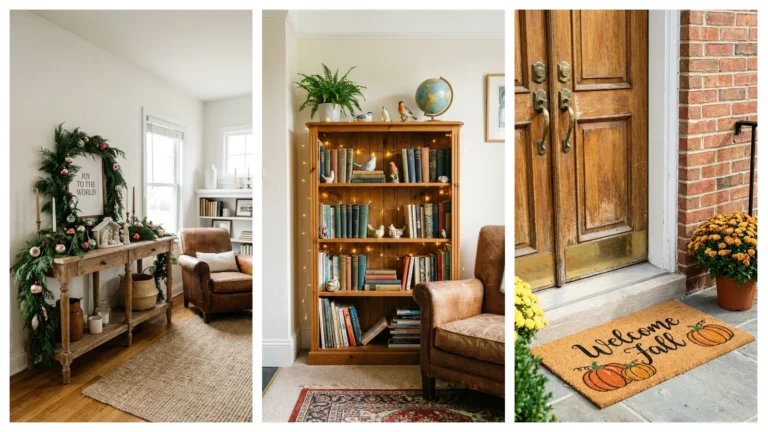
When styling an open bookshelf, grouping books and objects by color within your established dominant, secondary, and accent categories creates a more intentional, cohesive display than organizing purely by size or genre. This is a detail-oriented application of the rule, but it makes a genuine visual difference in how organized a shelf feels.
Using a few accent-colored objects, bookends, a small vase, or a single colorful book spine turned outward, gives the shelf visual interest without overwhelming the overall room’s color balance. This kind of small-scale styling decision is where the 60-30-10 rule genuinely shows its value in the details.
40. Apply the Rule to Choosing a Shower Curtain

In a small bathroom, a shower curtain functions as either a secondary or accent element depending on its overall pattern boldness and size relative to the room. A shower curtain in a bold pattern or saturated color often works best treated as your accent, provided the rest of the bathroom stays within your calmer dominant and secondary tones.
Since shower curtains are relatively inexpensive and easy to swap, this is a good place to experiment with a bolder color choice if you’re hesitant to commit to something more permanent elsewhere in the room. This flexibility makes the shower curtain one of the more forgiving accent choices available in a small bathroom.
41. Use the Rule to Balance a Small Room With High-Contrast Flooring

If your small room has flooring in a color or tone you can’t change, like dark hardwood or bold tile, treat that existing floor color as a fixed, non-negotiable part of your dominant or secondary calculation rather than trying to ignore it. Building your remaining color choices around this fixed element prevents an unintentional clash between floor and furnishings.
This consideration is particularly important for renters, who often have no ability to change flooring at all. Working with, rather than against, an existing floor color is usually far more successful than trying to visually override it with competing wall or furniture colors.
42. Apply the Rule to a Small Nursery

Wall color and crib finish typically form the dominant tone in a small nursery, while a rug or curtain set carries the secondary color. Small decor items, a mobile, or a single accent wall detail then deliver the 10 percent accent in this compact, function-focused room.
Keeping the dominant color soft and calming matters especially in a nursery, similar to a bedroom, since this space is meant to support sleep and quiet activities. Reserving brighter, more playful colors for the smallest accent details keeps the room feeling both age-appropriate and genuinely restful.
43. Use the Rule When Combining Metals and Color

Beyond just paint and fabric, metal finishes throughout a small room, from light fixtures to picture frames to furniture hardware, should be considered alongside your color percentages rather than as a separate category entirely. A consistent metal tone, chosen deliberately, functions almost like an additional accent thread running through the room.
Mixing two metal tones, like brass and black, can work well if approached with the same restraint as your color accent choices, treating the secondary metal almost like a small percentage detail rather than an equal partner. This nuance helps a small room feel intentionally curated rather than randomly assembled from whatever hardware happened to be available.
44. Apply the Rule to a Small Rental You Can’t Paint

If you’re renting and can’t change wall color at all, your existing wall color effectively becomes your fixed dominant tone, and your entire color strategy should build outward from that starting point. Large furniture pieces, like a sofa or bed frame, in a color that complements the existing walls can still fulfill much of the dominant role’s visual weight.
This constraint actually simplifies decision-making in some ways, since one of the three color decisions is already made for you. Focusing your creative energy on choosing strong secondary and accent colors that work with your fixed walls often produces a more successful result than fighting against a wall color you can’t change anyway.
45. Trust the Rule, But Adjust It to Fit Your Actual Life

While the 60-30-10 rule provides an excellent starting framework, the most successful small rooms ultimately adjust the exact percentages slightly to fit real living, more secondary color in a room that needs to feel more energetic, or a smaller accent percentage in a space meant purely for rest. The rule is a guide, not a rigid law that overrides your own genuine taste and how you actually use the room.
Don’t feel pressured to measure percentages with scientific precision, since the value of this rule lies in its general proportional thinking rather than an exact mathematical formula. A small room that roughly follows this structure, while still reflecting your personal style and practical needs, will almost always feel more successful than one that either ignores color proportion entirely or follows the rule too rigidly at the expense of genuine comfort and personality.
Frequently Asked Questions
1. Does the 60-30-10 rule work differently in a small room compared to a large one?
The rule’s core logic stays the same, but the stakes are higher in a small room, since color imbalance is more visible and impactful with less square footage to absorb it. Getting the ratio right matters more, not differently, in a compact space.
2. Can I use more than three colors and still follow this rule?
Yes, as long as you group any additional colors within one of the three existing categories rather than treating them as a fourth independent color. Multiple accent colors, for example, can share that same 10 percent allocation if kept genuinely small in scale.
3. What if I can’t paint my walls because I’m renting?
Treat your existing wall color as your fixed dominant tone and build your secondary and accent choices around it. This is a common, very workable adjustment to the rule for renters who can’t change their walls.
4. Should black and white count toward my color percentages?
Yes, black and white function just like any other color within the 60-30-10 framework and should be assigned to whichever percentage role they’re actually filling in your specific room. A white dominant wall, for example, counts fully toward your 60 percent.
5. How do I know if my accent color has become too dominant?
If your “accent” color shows up on more than a few small items, or on any single large piece of furniture, it has likely outgrown its intended 10 percent role. Step back and assess whether that color now needs to be reclassified as your secondary tone instead.
6. Can this rule apply to a room with patterned wallpaper instead of solid paint?
Yes, treat the wallpaper’s dominant color as your 60 percent, then build your secondary and accent choices around whichever tones appear within that pattern. This approach works especially well with a wallpaper that already contains a built-in, cohesive color palette.
7. Is it okay to break the exact 60-30-10 percentages?
Absolutely, the specific numbers are a helpful guideline rather than a strict rule, and slight adjustments based on your room’s function and your personal taste are completely reasonable. The goal is proportional balance, not mathematical precision.
Conclusion
The 60-30-10 rule gives small-space decorators a genuinely simple, reliable framework for choosing colors that work together rather than fighting for attention in limited square footage. From walls and furniture down to throw pillows and plant pots, every element in a small room has a natural place within this three-part structure.
Start by identifying your dominant color, then build outward through your secondary and accent choices, checking your work against the ratio as you go. Your small room might just feel considerably calmer and more cohesive once its colors finally have a clear, intentional structure behind them.